Is it possible to set up a task like below?
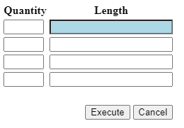
I want a kind of tabular entry for some data. The closest I can get is this:

But that is too wide, the tab sequence is not as expected and I would like to have the labels gone or at the top.

Hi René,

It is possible to come close to your example:

Task pop-up​​​​​​

By utilizing Task parameters with a datatype that uses the Label domain control type, it is possible to "Label” the parameters below it. I achieved this pop-up by doing the following:

Task - Main screen
Task parameters

*Note that label_2 has Field in next column = 1

It looks like the Form columns will be taking up space as wide as the largest Form field width. Meaning if one field has a width of 300px, the Form columns will have a width of 300px per column:

One field 300px, Form columns become 300px each

Does this help?


Hi Mark, Thanks for the tips. Especially the ‘label’ tricky, that can be useful for other purposes.

I'm getting closer but I don't think the tab sequence can be fixed. It tabs from quantity to quantity before entering to length. I've tried using a default overriding this (jumping from quantity to length), but unfortunately this doesn't work always (enter key only, tab not, and depending on the input changed/yes/no). I still have a too wide column, but that should be probably a setting. This wat I currently have:

I think we should do a layout like this:

This fixes the tab sequence issue.


Hi René,

I also think that is the only solution. The GUI doesn't dynamically calculate the width of each Form column, it rather uses the width of the widest field. That means the first Form column will also be “too wide”. Using only one Form column, like in your second example, will solve it.


I've changed it a bit, but the spacing between groups is quite big. Is there somewhere a (theme) setting to reduce this spacing (red rectangle)?


In Tasks there is currently no option to reduce the spacing between fields. When using a New group, one field of space will be left empty at the end of the previous group.

In Subjects you do have the option to change the height and width between fields, but not for Tasks.


Hi René,

Something I completely forgot about it the option to show fields after each other. When using the field Field no. of positions further = 0, you can get the following result:
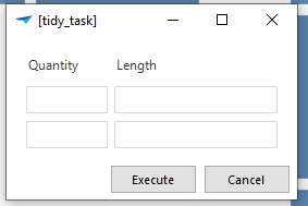
Task
SF


This is probably what you are looking for. Please ignore my previous suggestions as this is much better :wink:


Thanks, that works 🙂.


Reply