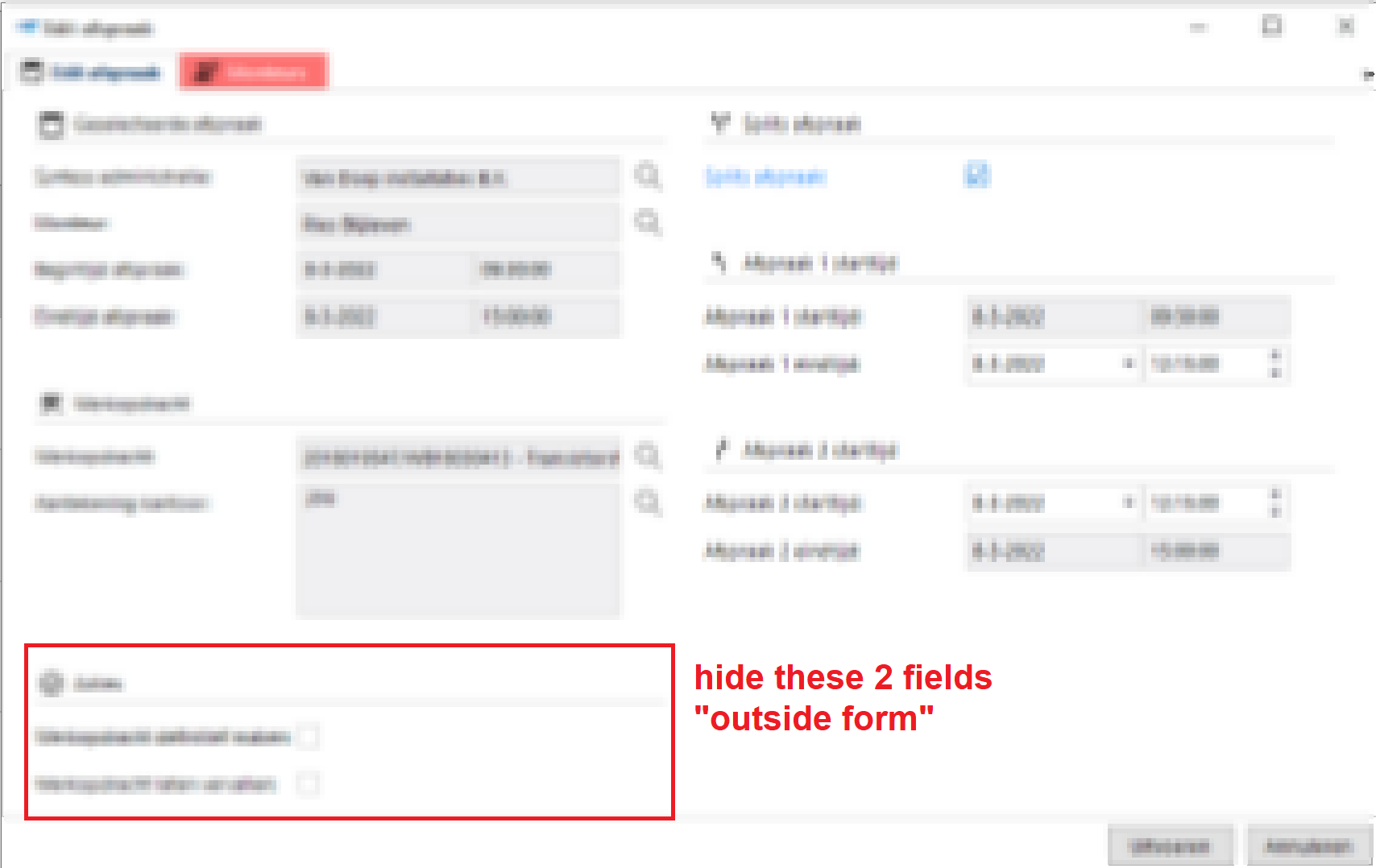
I am trying to understand the rules that govern the height of the task window.
It seems to be determined by the total height of the first column (I think) but on this occasion it is not.
Context:
We are using the tasks available to us through the resource scheduler extension.
In this case we are trying to enforce the correct layout for the double click appointment task.
Example:
This task has fields that need to be hidden/shown based on the appointment clicked (type of appointment, state of appointment etc...)
In our “standard” state our task looks like this

Now we also have a “ready/definitive state” for our appointments this means certain actions are no longer available. So we hide them.

Now our result suddenly looks like this

Now our 5th field suddenly jumps to the next column pushing all the fields further and further. None of the fields on the left have the checkmark next column.
My question is:
What determines this behaviour and how is the minimum height of a task-window determined?
Possible solutions in this case.
A possible solution would be to make the fields read-only instead of hiding them.
We could try hiding them “inside form” but then our group label would still show up.


