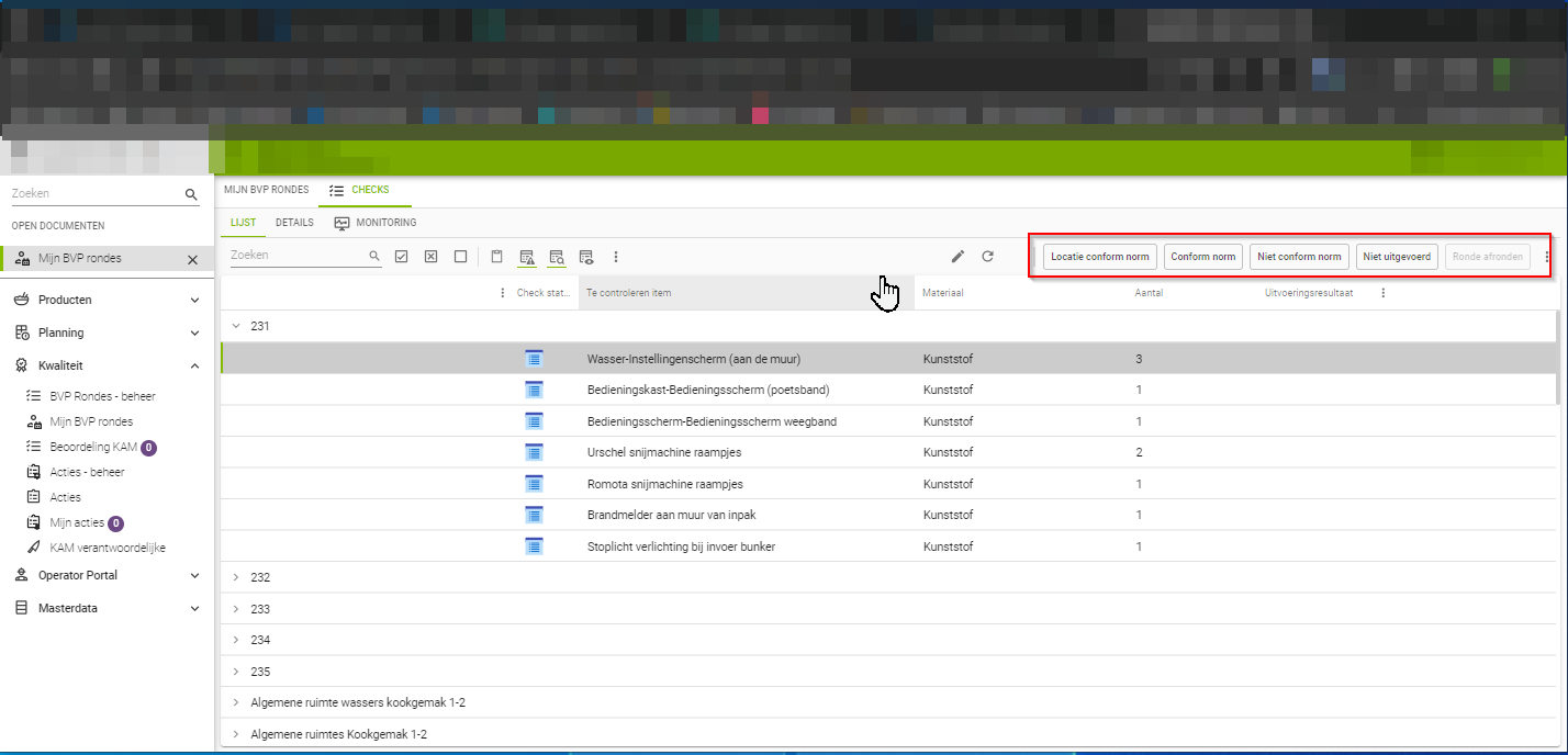
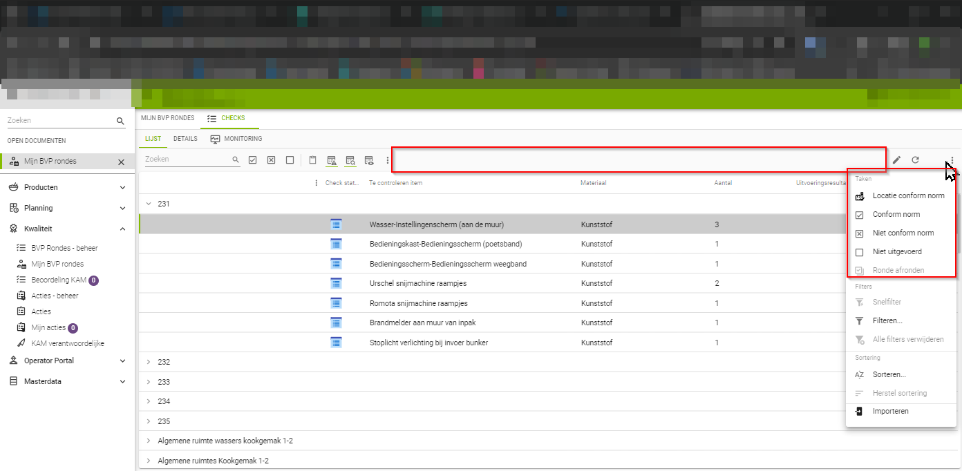
When using universal on tablets, the space available in the screen becomes increasingly important. We are now in the situation where users go into the factory with the tablet to do various safety checks on various machines. Now we see that tasks are quickly truncated from text+icon to icon, with the display type set to "Icon + text (> text > icon). Yet we see that there is still very much space available in the action bar. Can we soon expect better use of this available space, or can we influence this ourselves with screentypes?


