Question about badges and breadcrumbs (and action bar)
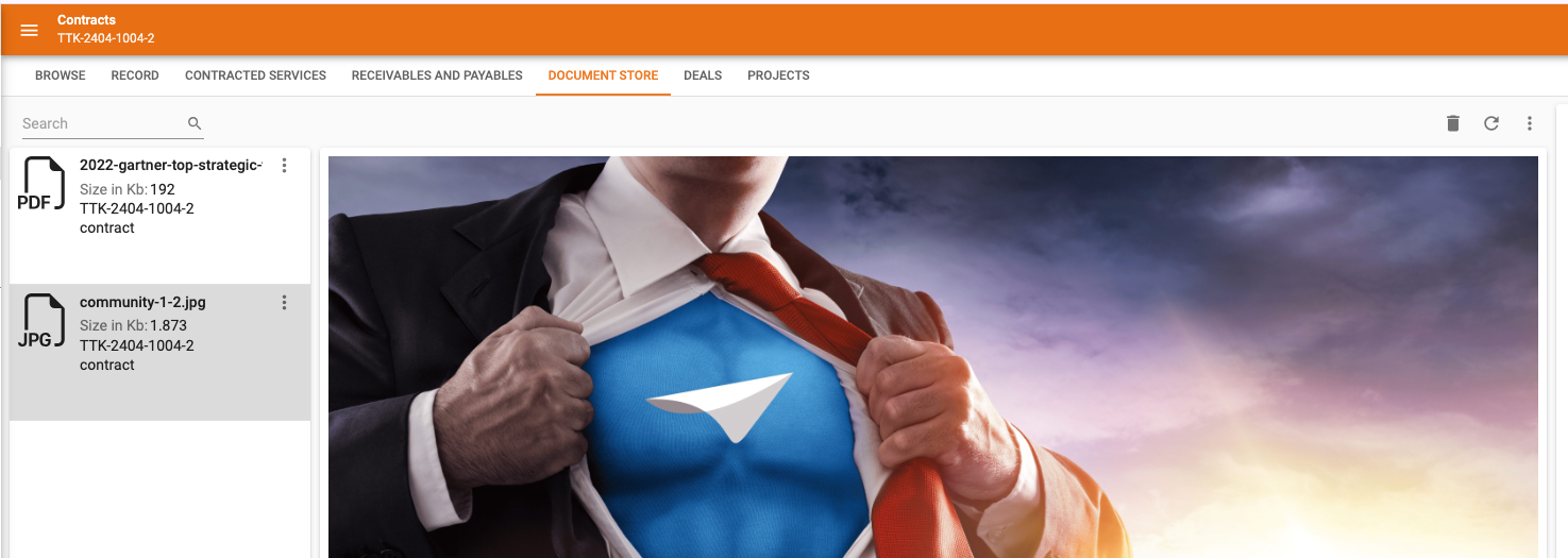
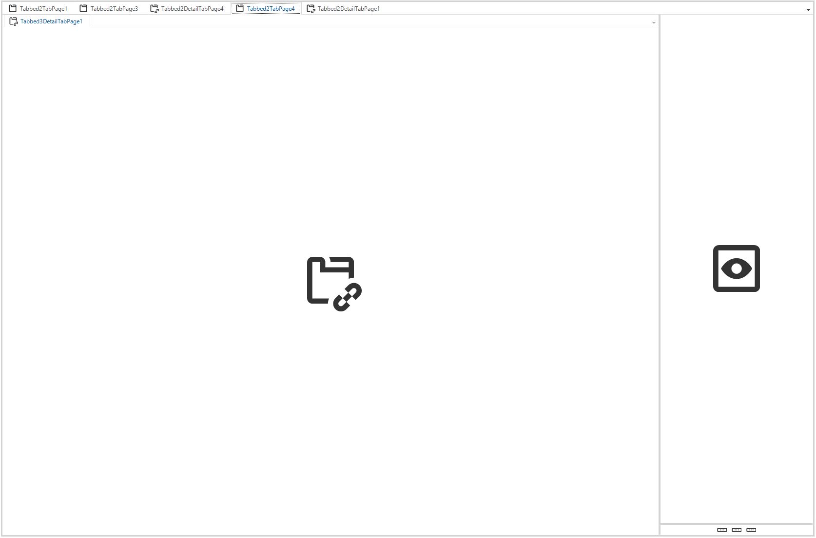
The following setup. I have x main subjects and all have a document store. To have easy upload we use a custom drag/drop component. I have the following screen-layout. (see below)
The following questions/remarks:
The breadcrumb stops if the detail is inside a component tab-page.. So with details its like main subject > detail line .. when you put it like below it doesn't go further than main subject. Is this going to be 'fixed'?
With badges you have a similar issue. I want to show the number of attached documents. However this badge number has to be shown at the top component tab-page. Is there going to be a solution to achieve this? And this setup is needed because my main subject will have the url with data parameters to steer the upload custom component (to the right).
In this scenario I don't want a action bar in this component tab-page, if I remove the action bar it's added automatically. When is the solution 'ready' to define per tab-page if you want the action bar or not?
Page 1 / 1
@Freddy Have played around a little bit myself to get to useful answers for you.
As far as I can see, the Breadcrumb does work for Details in a Component tab. However, upon opening the Component tab, the Detail tab and it's Grid record is not automatically ‘activated’. Once clicking on a record in the Detail tab, it should show in the Breadcrumb. Could you confirm this works for you too?
Know that we don't intend on changing this behavior, as theoretically you could also have a ‘Main’ Grid on the left side of the Detail tab, instead of the Preview component you currently have at the right. In that case it would actually be confusing if the Detail tab record was automatically selected and highlighted in the Breadcrumb.
We don't intend on changing the behavior for Badges in this example. Similar to the above argument, there could be multiple Detail tabs within a Component tab, each having their own Badge logic.
As for your remark on why your particular setup is needed for the upload custom component, please check if my post here (and other posts) might help you out:
In the Gif you can see that a separate Detail tab for Attachments is used, but there also parameterized logic was used to re-use a single Multi-file upload HTML page in multiple locations within the GUI, each using information from the Main Subject and the PK of the selected record to determine to which Detail Subject the file had to be uploaded. If you manage to do the same, you can have Badge logic on that Detail tab.
We're doing our utmost to implement a comprehensive solution for your below Idea with the 2025.1 Release in February, which will allow you to configure Action bars more granularly, including not displaying an Action bar at all for a particular Tab page.
Does this help?
Hi @Arie V . Thanks for the answers.
The detail (documents) is not showing in the bread-crumb, even clicking on the document doesn't change it.
As for the multi-upload.. I know that topic, but it doesn't really change your options. Your you put a custom component on the main subject like we have now.. But then you have to use a component tab to bring together upload component and in this case documents (meaning no badges)
Or you have to create a view where you cross join the main subject with the documents so you can put the custom component direct in the detail and reference it directly (then you will have badges).
I understand that you can have more details in the component, but that is a bit the developers responsibility. You can even say as if this component page has only one detail i'll show the badge.. if there are more I do not. But may more clients will ask for it and the stance will change :)
Cannot wait for at least get rid of the auto action bar. It creates unwanted scenario's.. Any other granularity is also very welcome.
@Freddy Thanks for adding the screenshot to your reply. Based on that I indeed managed to reproduce the missing Detail breadcrumb. It's due to the particular combination of a Detail tab inside a Component tab AND using a Cardlist (for Grid and/or Form it works fine). I have raised TCP 10635S on your behalf.
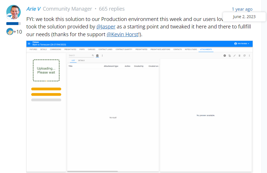
On multi-upload: I tried to link to the particular Gif in my reply of the 2nd of June last year, not the Gif made by Jasper (see below screenshot). Somehow that doesn't work properly. But indeed, at Wagenborg a view is used. However, I believe this is a very simple view that only consists of the Main subject's PK and the URL for the Multi-upload page. As such the Multi-upload page/Preview component is a Detail tab in itself. If you need specifics I can recommend contacting @Richard Elderman.
On your suggestion for a smarter GUI that ‘inherits’ the Detail tab Badge if only one Detail tab exists inside the Component tab: I can understand where you come from, but it won't be something we'll implement in the near future, if ever. However, if you have a compelling Use Case, you're always welcome to raise an Idea and mobilize the Community and change our mind!