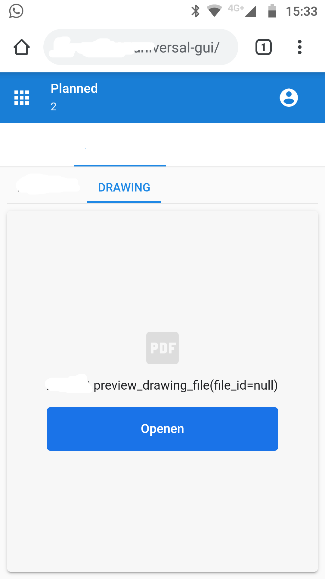
I'm trying to preview a PDF document in the Universal GUI, turns out the behaviour of tablets / mobiles is different, as they cannot preview PDF documents.
Is this something to add as a feature request, or should we remove the preview component and only provide a download link? Or is there maybe another way to preview pdf documents on mobile devices?
Page 1 / 1
Hi René,
Could you demonstrate the behavior? Using the developer tools to force a certain screen size does not fully represent using a table or mobile device.
This is what I see on my mobile phone (Android). Although I have Acrobat installed, Chrome on the mobile device doesn't allow plug-ins. I assume the behaviour is the same for tablets and iOS devices.
What I actually try to achieve is easy access to drawings with a single click. This could be a preview, or download a PDF file. If you've read my other topic about the url in the card list (
) you might notice I'm struggling a bit.
For some context: A workshop user has a list of items he has to do. He picks one from the list (click) and then should display the details. Most important detail is the drawing file, which contains all measurements he needs for his work.
I've tried the download in the card list, but that doesn't work as expected (described in that other topic), I’ve also tried. So I've also tried this previewer detail, but doesn't work unfortunately. Alternatively I could try the grid, but that isn't really mobile friendly (e.g. very difficult to target the proper column(width)s to different devices). The card list would be ideal, if you could click and open a new screen.
What I actually want is when a user selects a row (card list), a new page or detail should open. It's kinda weird you have to click an element, and then move to it's detail (drawing) tab. I haven't seen a single mobile application doing this. All items you click, you always navigate to a new screen unless it's the end (and there are no tasks / options available).
The way the Universal GUI now works is in my opinion not really useful and logic on mobile devices. For comparison please use your e-mail client (Gmail for example). When you click on a e-mail (row) you'll open a new page and there you have all the tasks regarding that single e-mail. If you would build your e-mail application in Thinkwise you would click on the e-mail (row) and nothing happens. You have to click again in a detail tab page, or task, to do something. This feels really unlogic to me. It doesn't match all the other apps I have on my smartphone.
The behaviour described above does fit for desktop purpsoses, but when targeting mobile devices it doesn't.
I haven't tried it, but maybe there is something possible with process flows and “go to row” and then open a “Form” w/ detail display, but I'm not sure if that will work because you cannot navigate back yet.
@René W FYI: although I'm not too enthusiastic about Preview behavior on mobile devices, the Preview component does work pretty much the same on iOS (Safari) as it does on desktop.