i'm trying to create a pie-chart with values to see the amount of days it takes for a certain department to process a request.
I want to show this pie-chart in the details tab of the request.
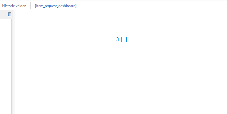
When i try to get the chart working with some test values, it only shows this:
what can i do to fix this?
Best answer by Blommetje
We also have a lot of struggling with getting the BI as we wanted. Perhaps an idea 💡 to write some showcases, update the manual on this and explain it more? In the end we usually get things working, but cases like the above happen quite often and it’s sometimes just frustrating. And when delivered, the client suddenly wants a bar chart instead of a pie and things need to be figured out again. I would very much like more examples/showcases on this!
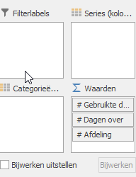
I believe you are missing the dimensions. The values are calculated based on the dimensions, so I think you would need to add "Department” as a dimension and add a filter to only show one particular department. More on that here: Business Intelligence | Thinkwise Documentation (thinkwisesoftware.com)
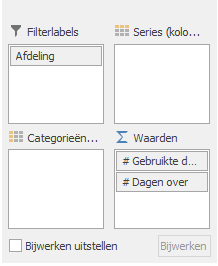
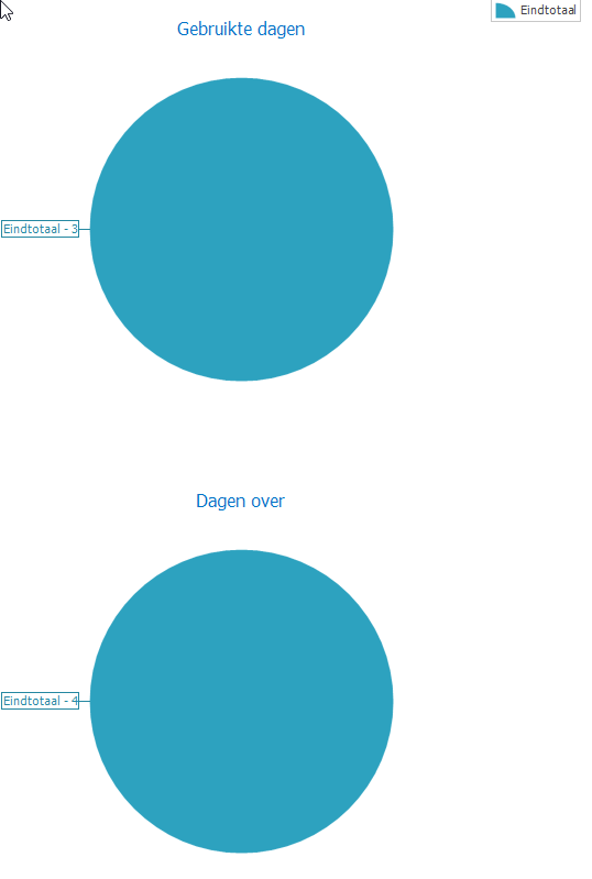
It's a little better, but now indeed we need to get it into one single pie chart. The "Gebruikte dagen” en "Dagen over” should also have a corresponding dimension inside the Department. I believe that will do it.
We also have a lot of struggling with getting the BI as we wanted. Perhaps an idea 💡 to write some showcases, update the manual on this and explain it more? In the end we usually get things working, but cases like the above happen quite often and it’s sometimes just frustrating. And when delivered, the client suddenly wants a bar chart instead of a pie and things need to be figured out again. I would very much like more examples/showcases on this!