Hi all,

I have a finance overview grid, with three group label.

  1. General
  2. Cost
  3. Revenue

Is it possible to have the group label border extend through the grid? 

This would greatly improve on the usability. 
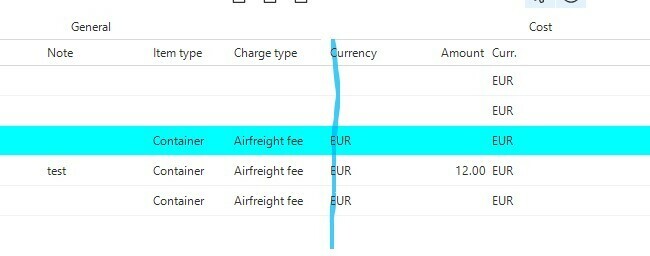
 

Hello Blommetje,

This feature is not supported in the current version of the Software Factory. You could post this as an idea in the ‘Got an idea?’ subforum.

In the meantime; what are you trying to achieve in the context of usability? Could it be a solution for you to give all the columns under a group a color under ‘conditional layout’? With this I mean something like this:

(note; I Photoshopped the gray background for the example, your results may vary.)

Kind regards,

Bart Metselaar


Hi Bart,

thanks, i did that for now. However, with 4 group labels, is should have 4 colors. Which makes it look like a rainbow. 

For now I colored one group, so create a focus point. 

However, this is not ideal because the colors of in both the grid and the form. And i only want to color my grid. In the grid I have less columns than in the form, so it looks a bit messy in the form with some fields not colored between the colored ones. Sure, I can color all fields, but that is also not ideal.    


Hi Blommetje,

I understand your point. I highly recommend to submit your idea in the ‘Got an idea?’ subforum, I can't seem to find your idea yet.

You could try to adjust the alignment of the fields to give it a more comprehensive ‘look and feel’, to have a bit more space between the colums which separate the groups.

Kind regards,

Bart


Hi Blommetje,

I see your posted request, awesome! As you can see, there are already 7 votes for your idea, a good starting point I guess! Everyone's input helps us to elevate our products and services to new levels. 

Thanks for now, I suggest to shift our attention towards the ‘idea’ thread. 

Kind regards,

Bart


Reply