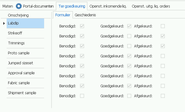
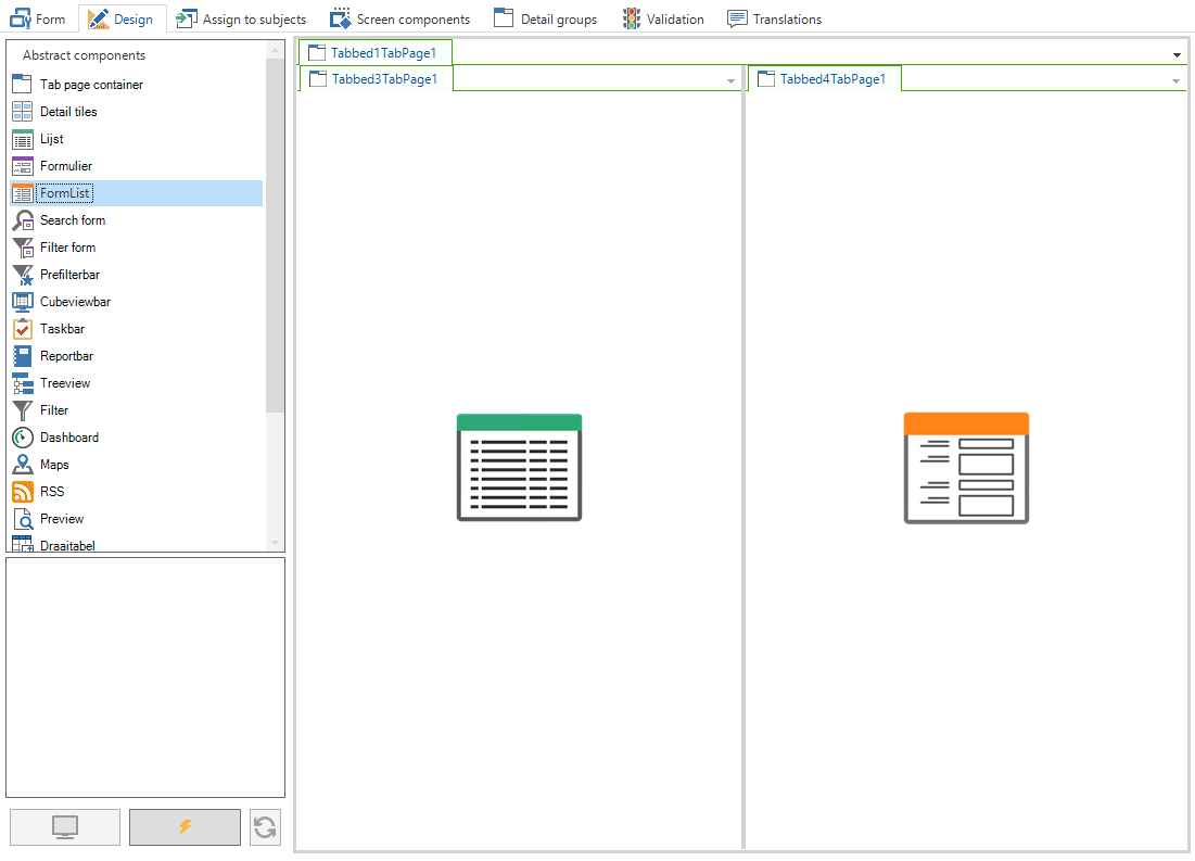
I am attempting to set a grid and a formlist side by side in such a way that the lines and fields of both line up perfectly. I set a grid row height of 34 pixels and a formlist field height of 33 pixels. This makes the rows of both appear equal in height. However the formlist is shifted downward somewhat.
I have already attempted to tweak both field height and height between fields in the form settings but that doesn't produce the result I am after.
Is there another option I can try?
Solved
Grid row height grid vs formlist field height
Best answer by Erik Brink
The behaviour of the radiobuttons indeed is a bug which we will resolve in the near future.
To put the "omschrijving" inside the formlist without being able to modify it, you can change the Control type of the columns domain to "label" in the SF.
I think, seeing your screenshot, the rows are equal in height, but the formlist contains more padding around it or the controls are different aligned vertically in a row.
It's not recommended to try to align screen component this way pixel perfect, because we can not guaranty you it will be in all our products this way and maybe even not in the same product.
I hope you are satisfied with the current solution you have found, and hopefully the formlist offers you a even better solution later, after the bug is resolved.
Maybe you could bring on some ideas to improve the formlist to get the desired solution.
Regards, Erik
This topic has been closed for replies.
Enter your E-mail address. We'll send you an e-mail with instructions to reset your password.


