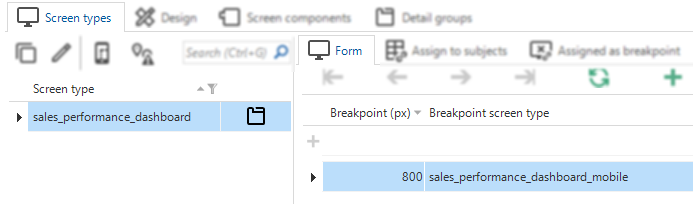
In the software factory, I set a breakpoint at 800 pixels. However, I’ve noticed that when reproducing this breakpoint using the Toggle Device Emulation in the web browser, the software switches to a different screen type at 807px, rather than the expected 800 pixels.
Breakpoint 800(px)
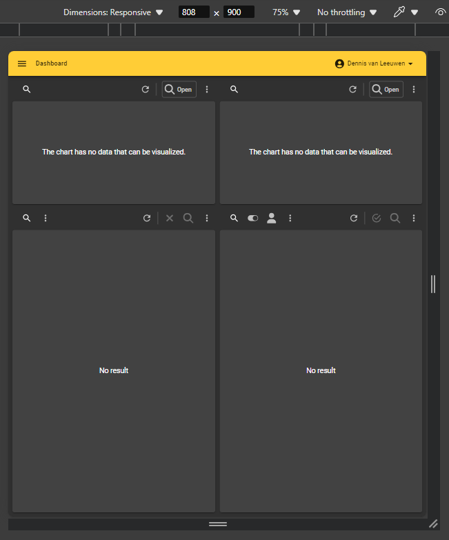
Width 808(px)
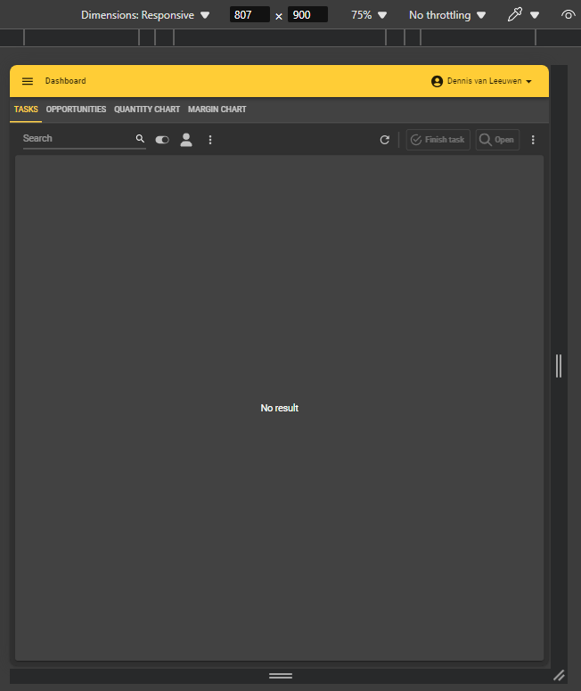
Width 807(px)
Could someone explain whether this is intentional behavior, and if so, why? As a developer, I rely on the exact pixel values defined in the software factory for my screen design.
Best answer by Alexandra Egri
Hello Dennis,
The padding is a technical explanation but it needs to be understandable by users and hence isn't expected behavior. We need to fix this.
Regarding your second comment, we appreciate your suggestion, as it highlights the complexity of ensuring breakpoints trigger seamlessly across all display scenarios. Can you, please, create a ticket for this in TCP and add all the mentioned details?
I think this might have to do with the padding of the components. A 807 pixel screen may result in a < 800 pixel component. Maybe @Alexandra Egri can confirm or enlighten us?
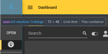
Upon further consideration, I understand the principle of accounting for the padding of the components. This ensures that the breakpoint is reached in all conceivable scenarios of the list bar display (hidden, collapsed with only icons visible, expanded with icons and text).
Reserved space for list bar
However, I have another question, or rather an idea for improvement. It seems that a document is first loaded with the assigned screen type, and the breakpoint is only triggered after the first responsive event. Wouldn't it make more sense to approach a screen from a lower breakpoint and work upwards, instead of the other way around? I’ll try to explain this with an example.
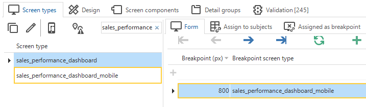
Our dashboard screen is opened with the screen type "sales_performance_dashboard" and switches to "sales_performance_dashboard_mobile" at 800px. When I open this screen on my mobile device with a resolution of <800px, the screen first loads as "sales_performance_dashboard." Then, when I rotate the screen and rotate it back, it recognizes its breakpoint and switches, but until that point, the user is stuck in the wrong view.
Breakpoint Behavior Mobile Device below a configured breakpoint
You mentioned that I could create a ticket in TCP, but after your explanation, I am wondering if this is necessary. Based on your clarification, I believe this is the expected behavior. Do you agree?
In my second comment, I also asked another question. What is your opinion on that?
Upon further consideration, I understand the principle of accounting for the padding of the components. This ensures that the breakpoint is reached in all conceivable scenarios of the list bar display (hidden, collapsed with only icons visible, expanded with icons and text).
Reserved space for list bar
However, I have another question, or rather an idea for improvement. It seems that a document is first loaded with the assigned screen type, and the breakpoint is only triggered after the first responsive event. Wouldn't it make more sense to approach a screen from a lower breakpoint and work upwards, instead of the other way around? I’ll try to explain this with an example.
Our dashboard screen is opened with the screen type "sales_performance_dashboard" and switches to "sales_performance_dashboard_mobile" at 800px. When I open this screen on my mobile device with a resolution of <800px, the screen first loads as "sales_performance_dashboard." Then, when I rotate the screen and rotate it back, it recognizes its breakpoint and switches, but until that point, the user is stuck in the wrong view.
Breakpoint Behavior Mobile Device below a configured breakpoint
The padding is a technical explanation but it needs to be understandable by users and hence isn't expected behavior. We need to fix this.
Regarding your second comment, we appreciate your suggestion, as it highlights the complexity of ensuring breakpoints trigger seamlessly across all display scenarios. Can you, please, create a ticket for this in TCP and add all the mentioned details?


