Hi,
Is there any way to change the visualisation of the cubes in the universal gui? Or are there plans to change this? We would really like to use cubes more, since it is a great way to visualize the data, however the current visualisation has too many limitations to make it actually work.
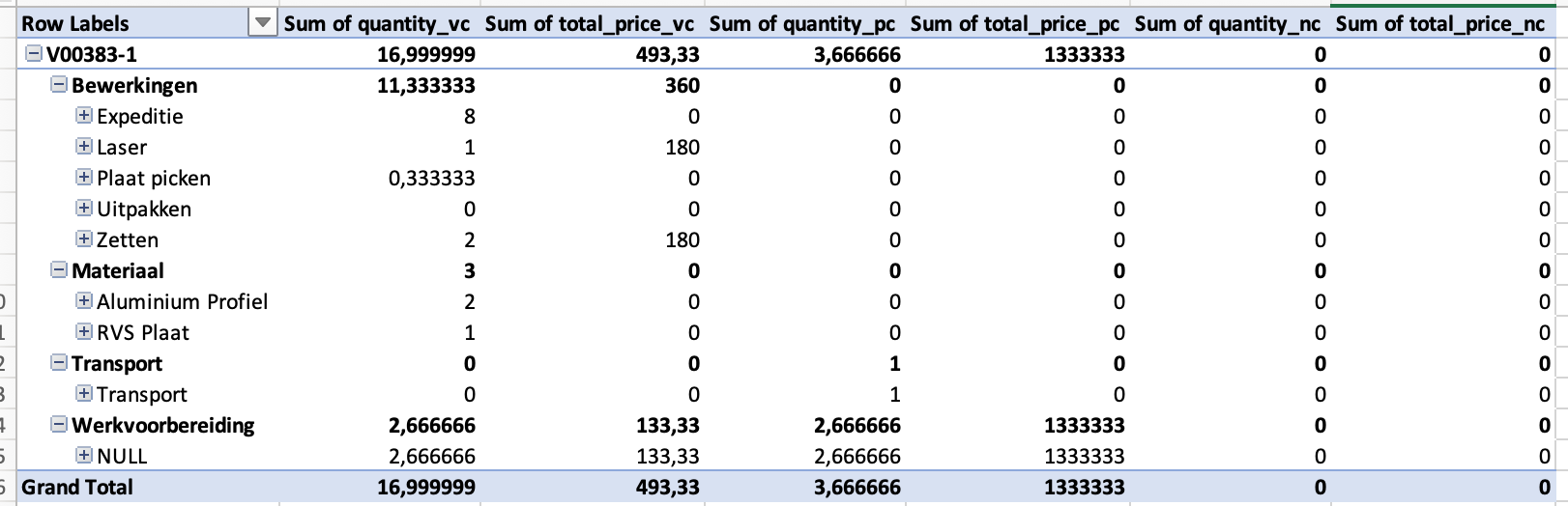
Here is an example. The rows are all displayed next to each other, and therefore takes up a lot of space. Also looking at the number it is not clear what row is a sum of what is below it and which rows are details of the one above.
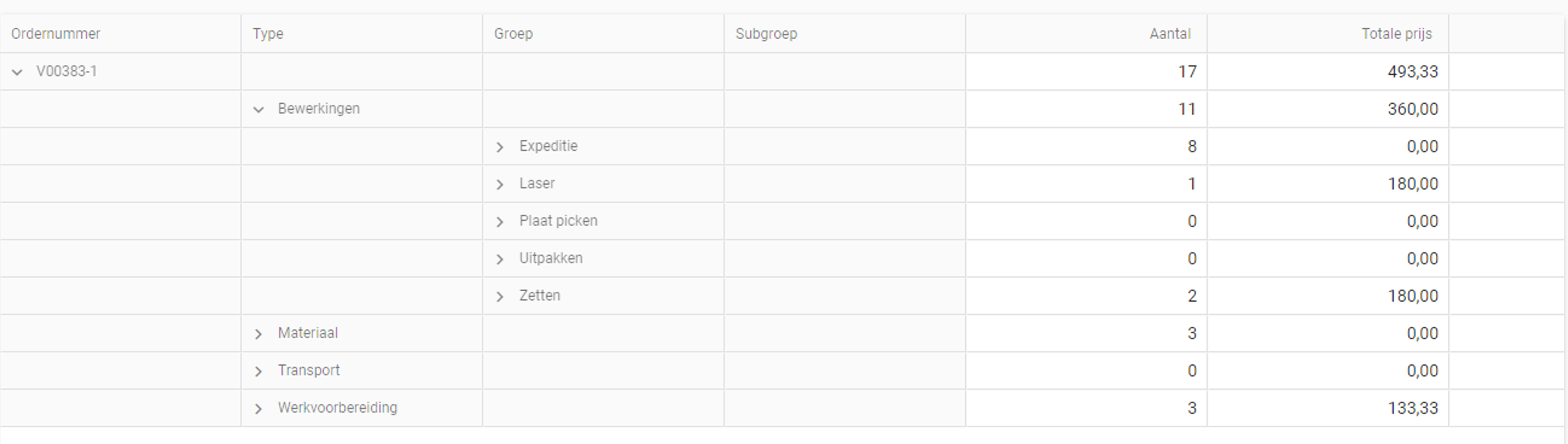
We want to have it look more like it is in Excel: Rows are displayed more compact, and with lines and bold text it’s easy to see what’s a sum and what is the detailed information. Is there currently a way to achieve this or are there plans to make this possible?