
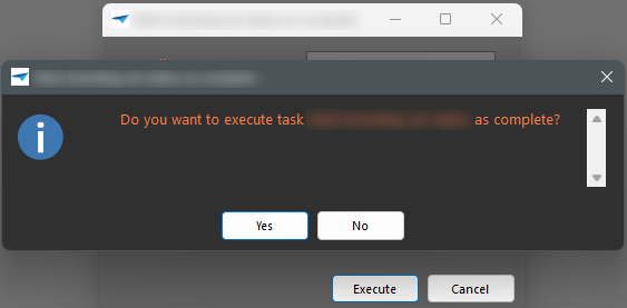
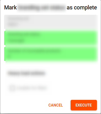
As it turns out the behaviour of the Windows GUI and the Universal GUI differ when it comes to the order of the buttons on a Task and the Confirmation to execute a task

Windows GUI:


Universal GUI


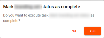
Can I influence it somewhere to have the default order again as the Windows GUI? We also have “messages” which we can change the order from, but that is useless if they will align with one GUI, but not with the other.

Hi Mark,

First of, we changed this behavior because a common practice in modern platforms follows the Gutenberg Principle, where this principle “describes the general movement of the eyes when looking at a design in which elements are evenly distributed,” in which a Z pattern can be found.

Based on this pattern, this change of button order supports the natural movements of the eyes and ‘closes’ the sequence with the confirmation button at the end in the Universal GUI, reducing cognitive load. 

Second, what issue are you trying to solve? What problems do your users encounter that makes you want to change the button order? 


Hi Bart,

de issue is our customer complaining that they do not like the order in which the buttons are, so we try to at least conform the “Message” to fit the same as is forced by the Universal GUI. The consequence is now the Windows GUI users suffer from this change as the message will have opposite options as to all the other buttons.

I can understand the initial complaint of our users as I myself have no apps or programs that seem to show the “No”/”Cancel” option before a “Yes”/”Confirm”. I am luckily one that reads the options, but still move to the Left option first to have to change my navigation to the Right option as that is the Yes/Confirm.


Hi Mark,

I understand your worries and your users’ complaint. The challenge is that this behavior, in the eyes of our UX team, has been wrong in the Windows GUI, which contradicts our future intents for the Universal GUI. 

However, have you tried the Model Enrichments? In the table on this page, we have the ‘Update message options’, which I believe supports your question. 

Keep in mind though, that this is a custom change from the default behavior of the Universal GUI, which falls outside of the support!


Hi Bart,

thanks for your answer. The Enrichtment is only for the custom Message Boxes and not the normal screens like that of tasks and the “are you sure?” popup.

I guess my question is answered that this is no configurable.

Are you sure though that the chosen option to put “No/Cancel” left and “Yes/Ok/Confirm” on the right is the correct route to take? Being a bit more aware of question boxes now I see Universal being the “weird” one compared to the other software, apps and websites I use. I imagine that the users sending us the questions have this same experience, as to why they ask us to change it.


Reply