Solved

Color mandatory fields

  • 20 June 2024
  • 8 replies
  • 146 views

Hi,

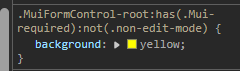
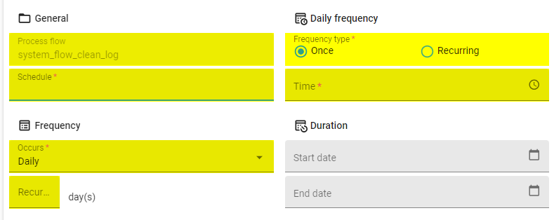
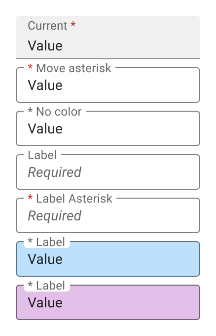
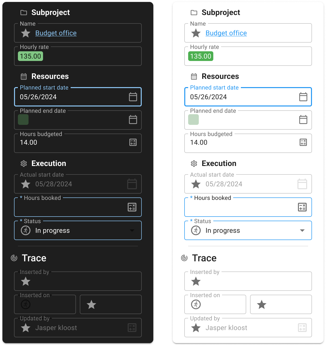
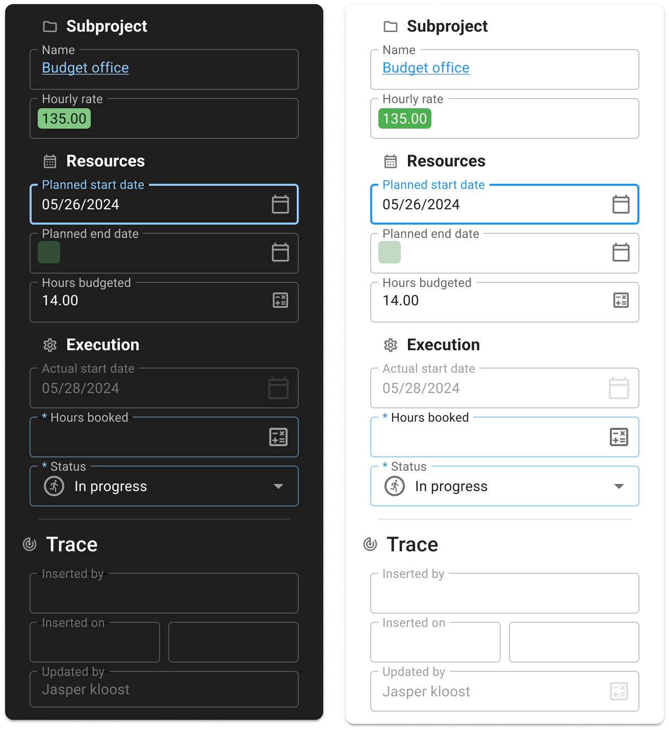
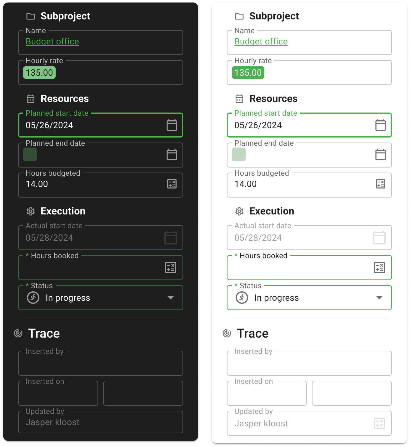
Currently the universal gui shows a little * if a field is mandatory. Since this is not super visible, it would be nice if we could color these field, to have them stand out a bit more. In the web gui, this was quite easy. 

If this currently possible, or on the backlog? 

Thanks! 

Blommetje

8 replies

Userlevel 7
Badge +23

Hi Blommetje,

It appears you can do this with CSS using the following:

:has() :not()

With .MuiFormControl-root:has(.Mui-required):not(.non-edit-mode), you can say whenever a form field is required and only when not in non-edit-mode, make the background a color; for example yellow. Not a recommended color 😉.

Result

Not sure this works in combination with Custom CSS as I tried this directly via the Developer Tools, but it's worth a shot! 😄

Userlevel 6
Badge +4

This works via custom CSS, but a better option is to have modifications like these within the SF purely because of maintainability

Userlevel 7
Badge +23

This works via custom CSS, but a better option is to have modifications like these within the SF purely because of maintainability

Understandable, there is an idea to move the Custom CSS file to the Software Factory: Maintain custom.css in SF | Thinkwise Community (thinkwisesoftware.com)

How many theme options we want to support is still unknown as we are currently focusing on resolving many Universal GUI tickets. We surely love to hear which configurations are mostly used so we can expand upon the currently limited theme options.

Userlevel 3
Badge +2

Hi all!
Although I understand the tendency that giving the background of a mandatory field a color would emphasize to the user that this field needs something, it would also introduce a lot of implications.

  • How will we indicate mandatory fields with a conditional layout?
    • What would differentiate Mandatory fields vs fields with conditional layout? How will our users know this?
  • Contrast values between the values and background can become too low

I do think we can improve on indicating mandatory fields, but I think we can also look for different approaches.

  1. A quick fix would to change the location of the Asterisk to the start of the label
  2. Instead of a Label as a Placeholder in our text fields, we could place a text like ‘Required’ as an actual placeholder on every mandatory field

Something like the following examples (this is the new Outlined input style which we are now in the process of introducting for the Universal GUI).

The last two fields I filled the background color to show the issue with a colored mandatory field and a mandatory field which has a conditional layout. You'd still need an extra indication that the field is mandatory, which still introduces a cognitive load to your user. This is something we deliberately stepped away from.

I am curious to what you all think of these options.

Userlevel 1
Badge +2

We also had some discussion on colloring mandatory fields, our conclusion was that colloring the whole field is too intrusive, especially when they have a value.

We went for a grey line for optional-editable fields and a blue line for mandatory fields (only visible in edit-mode). Read-only fields have no line.


In the new Outlined input style I would like something similar by colloring the box line blue (not the whole field).

Userlevel 3
Badge +2

@Peter Keeris what do you think about this concept:


In this example, ‘Planned start date’ is the focused field, while ‘Hours booked’ and ‘Status’ are mandatory fields.

The blue color is the Primary color of the application (so the color is in the hands of the developer)

Userlevel 1
Badge +2

It looks great, it remains subtle but still shows a clear indication. 

The only thing I don't really like in this example is that it is hard to separate the focussed field from the unfocused mandatory fields. Is only the focused field in the Primary color or also the mandatory fields?

My preference would be that mandatory fields are always blue and the focused field has the primary color.

Userlevel 3
Badge +2

Both the focused and mandatory fields indeed get the primary color.

Introducing a solid predetermind color for mandatory fields is something we advice against. It would interfere with color choices of customer brands in the future (the error color alone is a challenge as some customers have red as their brand color)

We could change the opacity of the outline on mandatory fields:

Or with a shade of green for primary color:


Reply