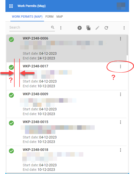
The card list is wordt quite good now in Universal when running on a smaller screen.
Two little optimizations in the layout would make it almost perfect.
- Is there a way to make the margin between the image/icon and the text area smaller?
- Is it possible to get rid of the image download button? When download of images is needed it will be done via the form i guess in most cases.


