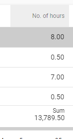
Regardless of whether we move the columns or screen types, the aggregation values remain cut off.
how do i fix this?

Regardless of whether we move the columns or screen types, the aggregation values remain cut off.
how do i fix this?
Best answer by Mark_Plaggenborg
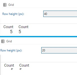
This is probably related to the pixel size used for the grid row.
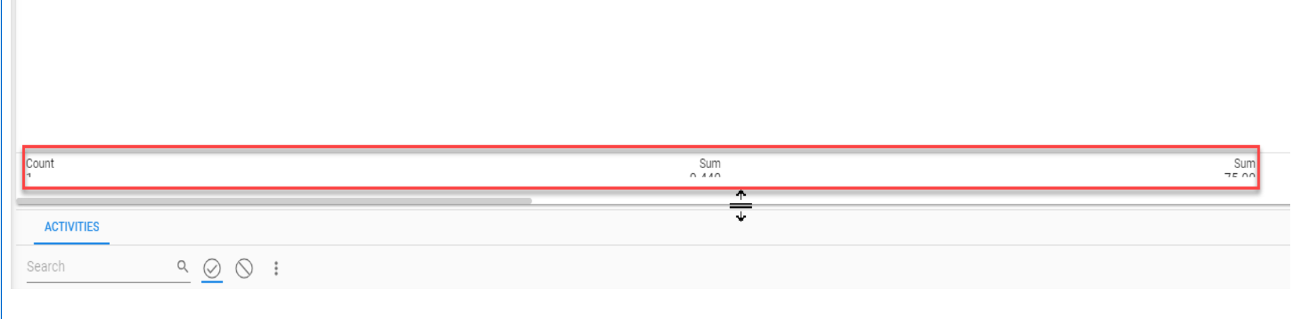
I still have a TCP ticket open myself about this issue where I disagree about the need for a “huge” grid row size to only make an aggregation readable.
The correlation between the value is explained here:
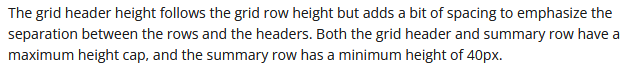
Even though it says the minimum value of the summary is 40px, it still cuts of the text, but leaves white space the have the bars height 40px.
The latest Universal GUI as mentioned by Mark, still has this issue of cutting off the summary.
Enter your E-mail address. We'll send you an e-mail with instructions to reset your password.