


About a year ago we posted a blog on our community page, sharing some ideas we had for our Universal UI and asking for your thoughts. Back then, our challenge was to make the visuals more appealing, increase data density, and create a theme that felt truly universal.
We knew right away this wasn’t something we could do on our own. That’s why we asked for your input and wow, did you deliver. The response was amazing, with so many of you taking the time to share feedback and ideas. Bart’s blog on the new Universal styling especially stood out and the support it received showed us just how powerful this collaboration can be.
That experience gave us a lot of energy. It showed us that together we can really make a difference. So let’s keep that momentum going. With your creativity and input, we can make the Universal UI better than ever.
This blog continues in that spirit. It follows the knowledge session I hosted together with my colleague Bart Metselaar on August 19th. In that session, now available to rewatch on the Thinkwise Academy, we looked back at the developments and changes made to the Universal UI features over the past year. What follows is a summary of those improvements, along with a closer look at the new possibilities ahead.
Web domains for customized login
You can now customize the login environment based on the domain using Web domains. Configuration is managed in IAM under Settings → Web domains, where you define domain-specific branding, login providers, and other login-related settings.
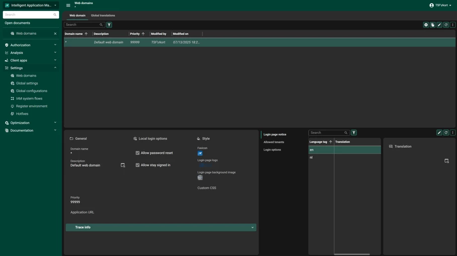
This makes it easy to support different scenarios within a single environment. For example, an internal login page might focus on a collegial tone and house-style branding for employees, while an external portal (such as a Customer or Supplier portal) can be designed with a more corporate or marketing-driven look and feel.
By tailoring the login experience per domain, you ensure that every user group feels at home, without the overhead of deploying multiple Indicium or Universal UI instances.
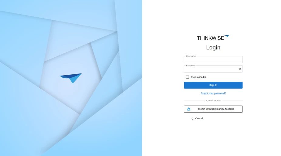
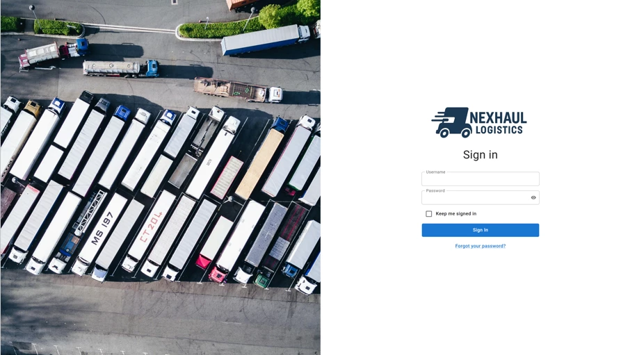
Flexible Menu Color Selection
Since release 2025.2 it is possible to define a separate menu color in the Universal UI. Previously the menu inherited the main color which often led to visual issues such as menus that stood out too strongly, clashing contrasts in dark mode or branding colors that worked well for buttons but felt overwhelming when applied to an entire navigation area.
With this new flexibility you can fine tune your design by choosing a dedicated color for the menu. Our advice is to keep the menu subtle. It should guide, not distract. Avoid overly saturated or attention grabbing tones especially in light and dark mode where contrast behaves differently. In fact consider using different menu colors per mode to ensure readability and a balanced experience in both.
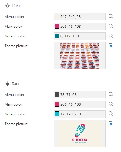
Finding a color that works in both light and dark mode can be a real challenge. A single brand color does not always adapt well to every situation or client need. That is why it helps to think beyond just one shade. Tools like Adobe Color Wheel can inspire you to discover complementary colors that bring balance and harmony to your design. Start with your main color and let the tool suggest accents that strengthen clarity and consistency. By also playing with tones you can gracefully shift between light and dark modes ensuring your UI feels intentional and refined in every context.
This way the menu complements your brand while keeping the focus where it belongs on the content.
Guiding Users with the Action bar and Primary actions
Since release 2025.2, the Filter button is by default placed next to the Search bar instead of inside the Overflow menu of the Action bar. This provides a more intuitive and consistent filtering experience across the Universal UI. For existing models, this change can be applied through an enrichment, ensuring you can adopt the new standard without requiring manual adjustments.
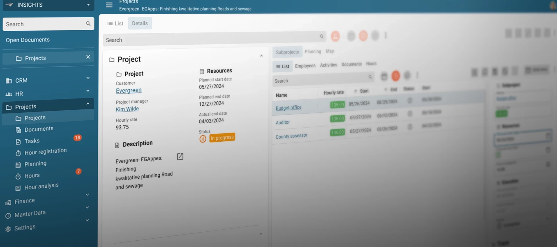
It is also possible since 2025.2, to highlight specific buttons as a Primary action. This helps guide users to the most important next step on a page. For example, on a sales order page the Approve order button can be emphasized, making it clear which action should take priority.
You can configure this in the (Custom) Action bar, where a new Primary action section is available. Here you can highlight actions, tasks, and reports directly.
- Actions can be marked as Primary action in the Action bar.
- Table Tasks and Reports can be highlighted in the Subjects, using the same approach as in the Action bar.
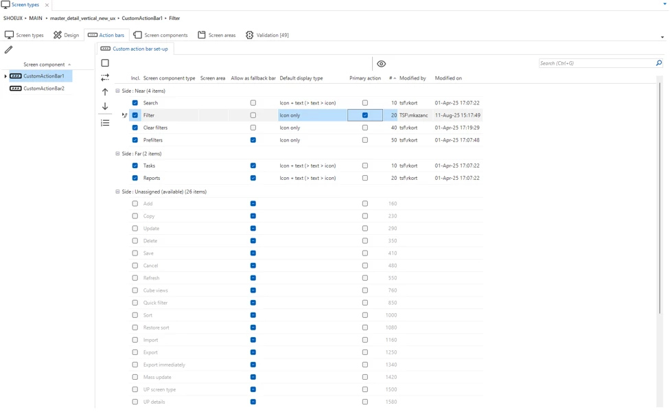
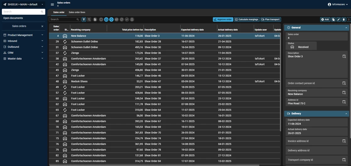
This way, the interface not only looks cleaner, but also actively supports users in completing their work more efficiently. More on the Action bar in below blog:
New Screen Type setup
With release 2025.3, a new screen type has been introduced in the Base Model: master_vertical_detail. On smaller resolutions it automatically switches to hierarchy_cardlist, ensuring the layout adapts seamlessly across devices. We recommend setting master_vertical_detail as the default in Subjects → Default settings so applications immediately benefit from a consistent and responsive design.
To further improve form structure, the Field on next tabpage option can be used to create collapsible Sections. From the selected Field onward, the Universal GUI starts a new Section, which can be named using the Tabpage label. This makes long or complex Forms easier to navigate, while also allowing practical layouts such as placing a multi-line Field across the full width of the screen.
Check out below blog for more insight in Form behavior:
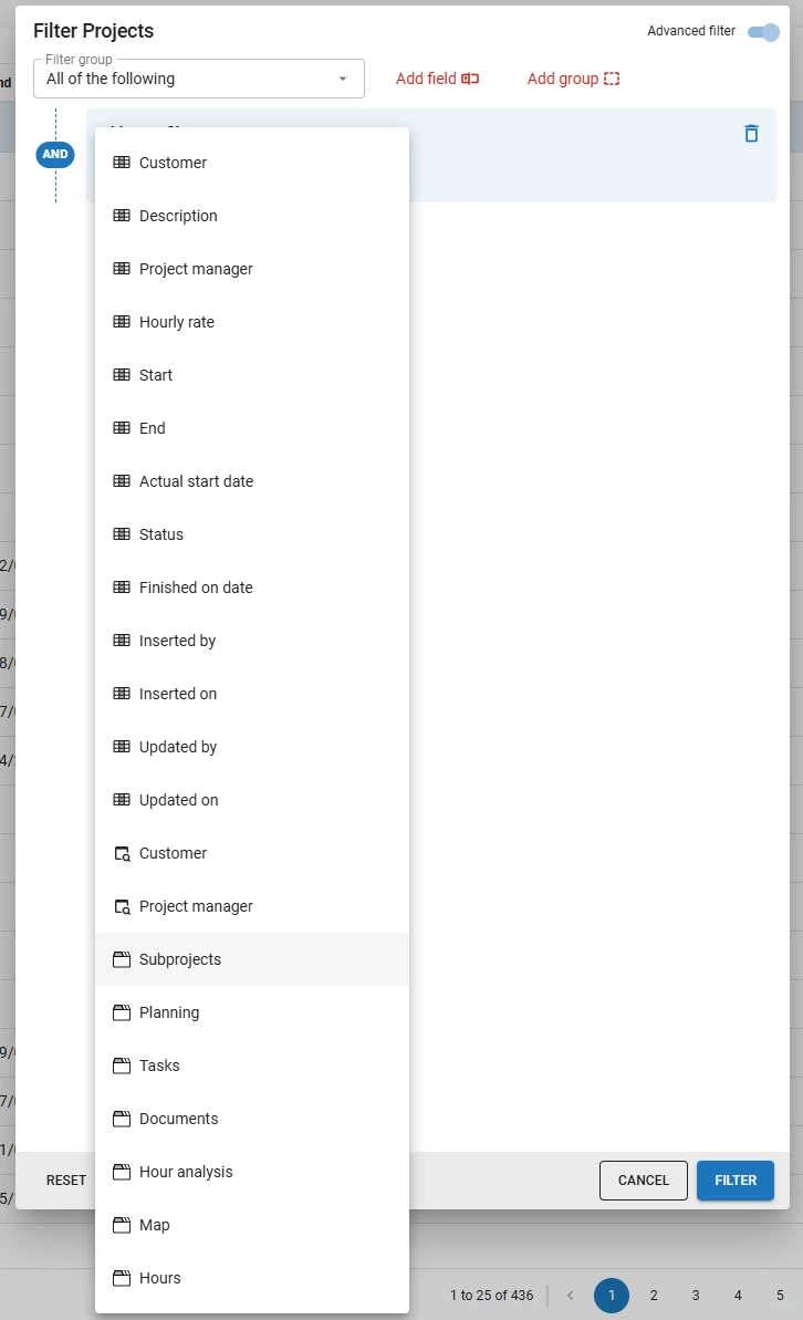
Filter Visibility for Detail and Lookup References
In recent releases we’ve made great progress in making filtering more powerful and user-friendly, with features like advanced filtering and multi-level filtering. If you want to dive deeper into these improvements, check out:
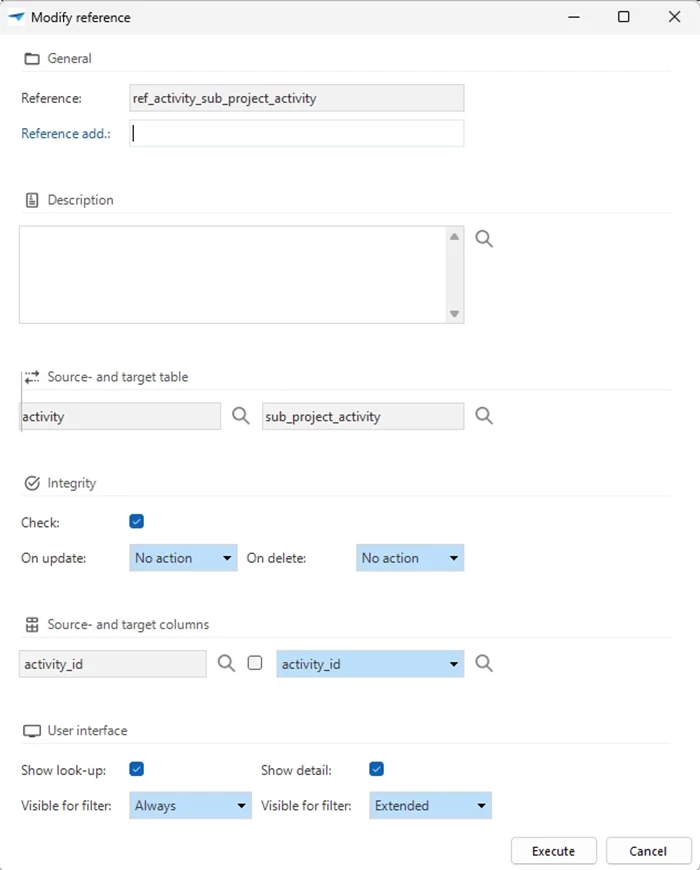
Since release 2025.2, you can configure how Detail and Lookup references appear in the filter pop-up with the new Visible for filter setting. This can be managed in the Software Factory under Data → Data model → References, by enabling Show look-up or Show detail.
You can choose from three options:
- Always – The reference is always visible in the filter pop-up.
- Extended (default) – The reference only becomes visible when a user adds it manually.
- Never – The reference is excluded from filtering to reduce clutter or improve performance.
For example, a reference between Activity and Sub_project_activity could have the Look-up (activity_id) set to Always, making it constantly available for filtering, while the Detail (sub_project_activity) is set to Extended, appearing only when a user adds it manually. Rarely used tables, such as internal log tables, can be set to Never.
With release 2025.3, this filtering flexibility is further enhanced by the ability to save Advanced filters as Pre-filters. This lets users store and reuse commonly used filter configurations, reducing the need to set up standard Pre-filters manually. By combining visibility settings with saved Advanced filters, you can ensure that filters remain clear, relevant, and efficient, while also giving users quick access to frequently used configurations.
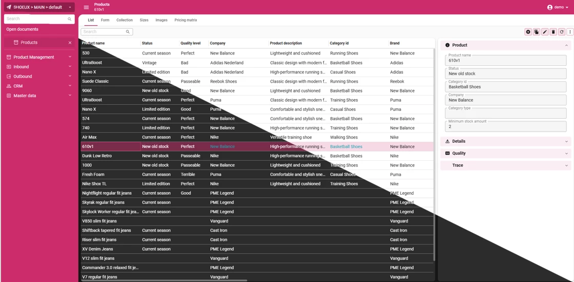
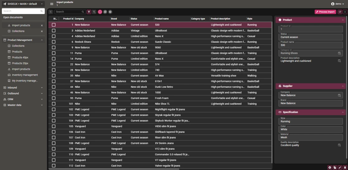
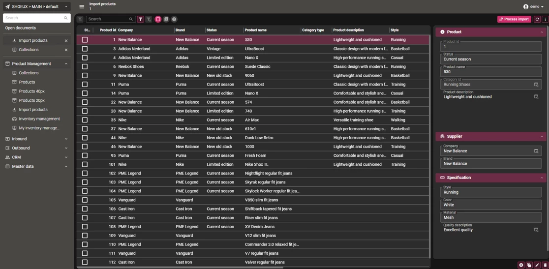
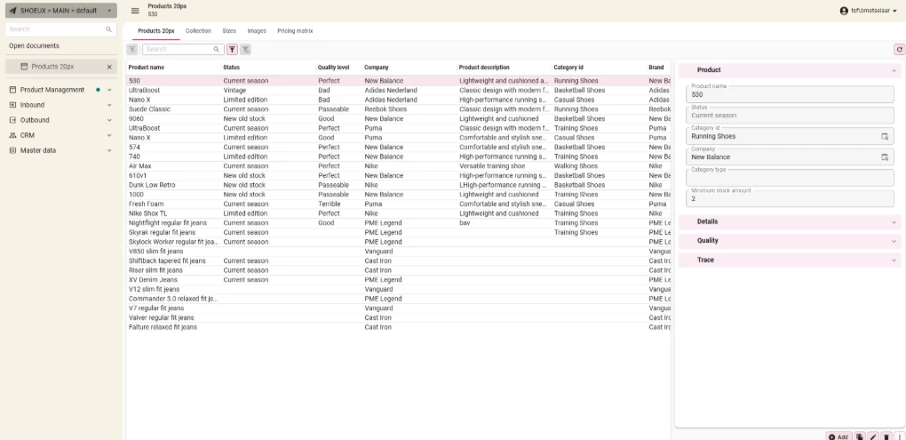
Data Density in Grids
Grid row height has been reduced from 36px to 30px, with a new minimal option of 20px for both editable and non-editable grids. Column headers are now independent of row height, and horizontal padding has been halved (8px → 4px), making it easier to display more information without clutter.
These settings can be configured in the Software Factory under Subjects → Default → Settings → Components → Row height
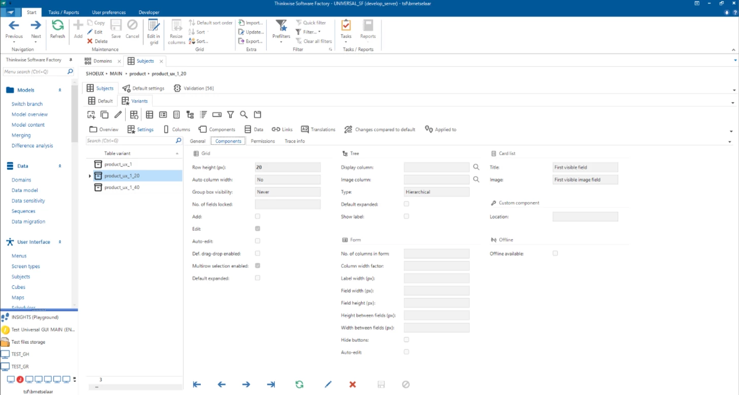
While this improves efficiency, keep in mind that smaller rows may impact accessibility and touch usability. We recommend applying these changes carefully to strike the right balance between data density and readability.
For a full overview of our Data Density improvements, see our detailed blog post.
As always, your feedback is welcome. Feel free to share your thoughts or questions in the comments below. Because together, we make the Universal UI even more efficient and user friendly.