SQL server management studio is the tool to use for creating SQL scripts and for database management. However to make optimal use of SSMS you might want to adjust the default settings.
Below are several tips to increase the user experience of SSMS. Please note the following tips are based on SSMS 2017, other versions might not have some of these options or the settings can be found in a different menu.
Custom connection colors
With the basic settings each connection has the exact same look and feel. On the bottom there is a yellow bar with connection details. When working on several SQL servers or instances at the same time this can get very confusing if all the screens look the same.
To improve distinctiveness between connections there is the option to give each server connection its own distinct color for the connection bar. Below you can see an example where the local server has the color green assigned to it. The color settings are adjustable per SSMS and per SQL server (instance).
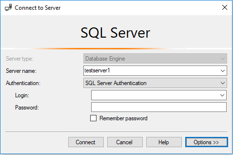
- While setting up a connection click on ‘Options’.
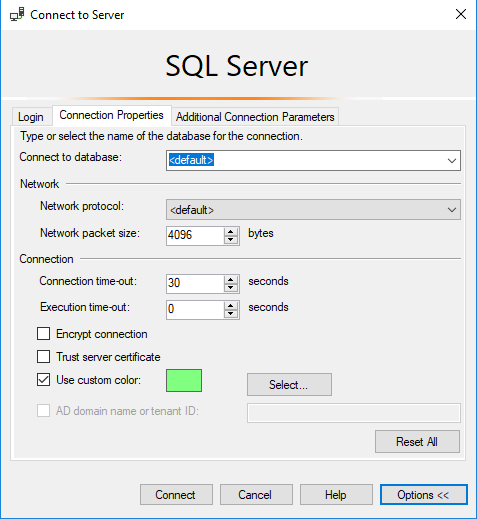
- Then select ‘connection properties’ and click on the checkbox ‘use custom color’ and select a color to use.
After opening a new tab the connection bar will now be shown in the chosen color.:

Below an example of two different server connection next to each other.
With default colour settings:

And with custom color settings:

Better naming for tabs
The default SSMS settings for tab naming shows a lot of information that most of the time doesn’t fit within the tab. Due to the long tab names the SSMS screen can show 4 or 5 tabs at the same time. The limited amount of tabs to show can make your SSMS overview a bit convoluted.

To make your tabs more efficient you can amend them to your own personal settings. In the taskbar click ‘Tools’, ‘Options’, and go to ‘Text Editor’, ’Editor Tab and Status Bar’. Here there are several options for the naming of tabs. Depending on the length of the database names you might want to hide them. In most cases the login name is not relevant and when using the custom color schemes the server name becomes irrelevant.
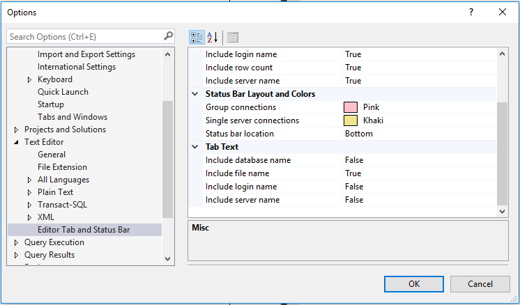
Below an example with only the ‘include file name’ option active.

Now you can fit twice as many tabs on one screen, besides that the tabs are also easier to identify due to the short names.
Code preview scroll bar
By default SSMS has a scrollbar on the right side of the query screen. The scrollbar gives an indication of the length of the code. When you have a large SQL code the scrollbar can be a bit tricky to use when trying to find a specific part of the code.
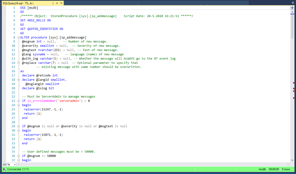
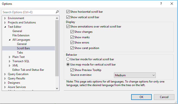
Fortunately there are also a couple of options to improve this, these options were introduced in SSMS 2016. Right click on the vertical scrollbar and select ‘scroll bar options’. In the menu ‘Scroll Bars’ there are several options for scroll bar ‘Behavior’. The standard is ‘Use bar mode for vertical scroll bar’. Amending this to ‘use map mode..’ will give a preview of the code instead of the vertical scroll bar. Depending on your screen size and personal preference you can change the size of the preview code by changing ‘Source overview’.
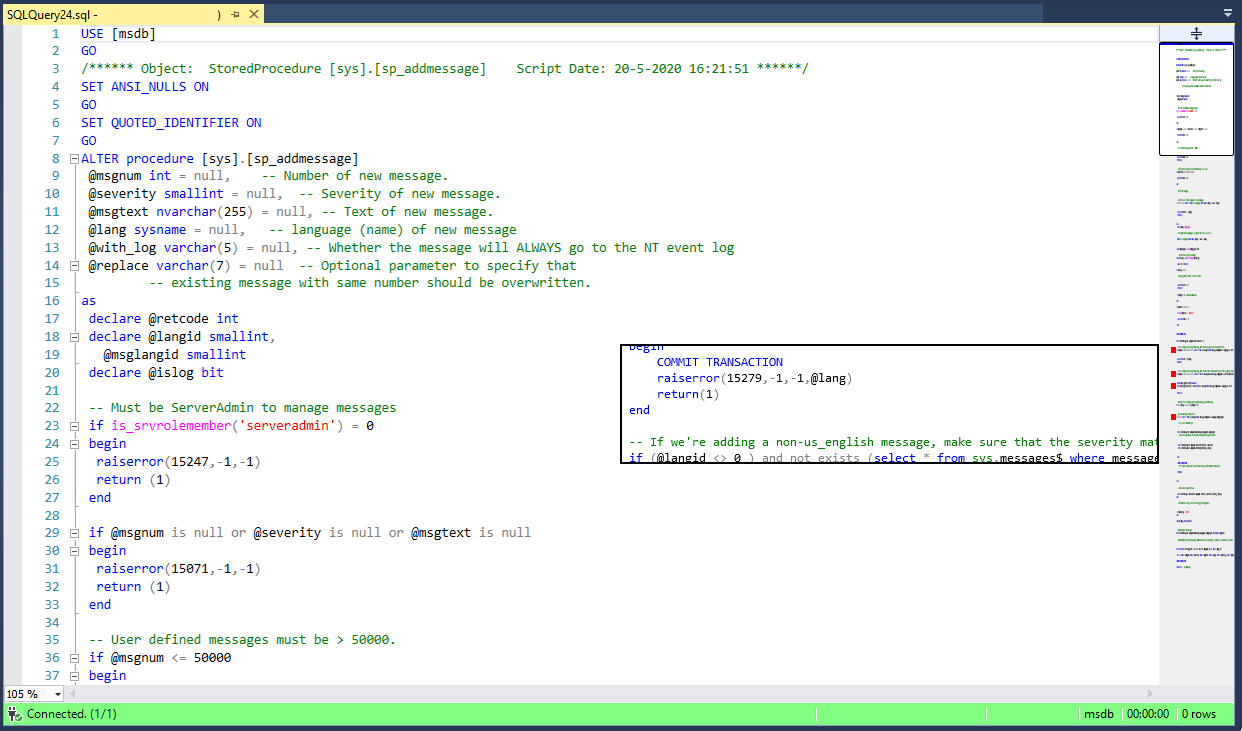
Below you will find an example when ‘use map mode’ is activated and source overview is set to medium. On the right side of the screenshot you can see that the scroll bar has been replaced by the code preview bar. With this setting it becomes much easier to find a certain part of the code.
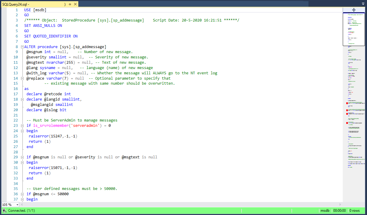
When ‘Show preview tooltip’ is active you will get a small snippet of the code in a popup when hovering the mouse on the code preview bar.
