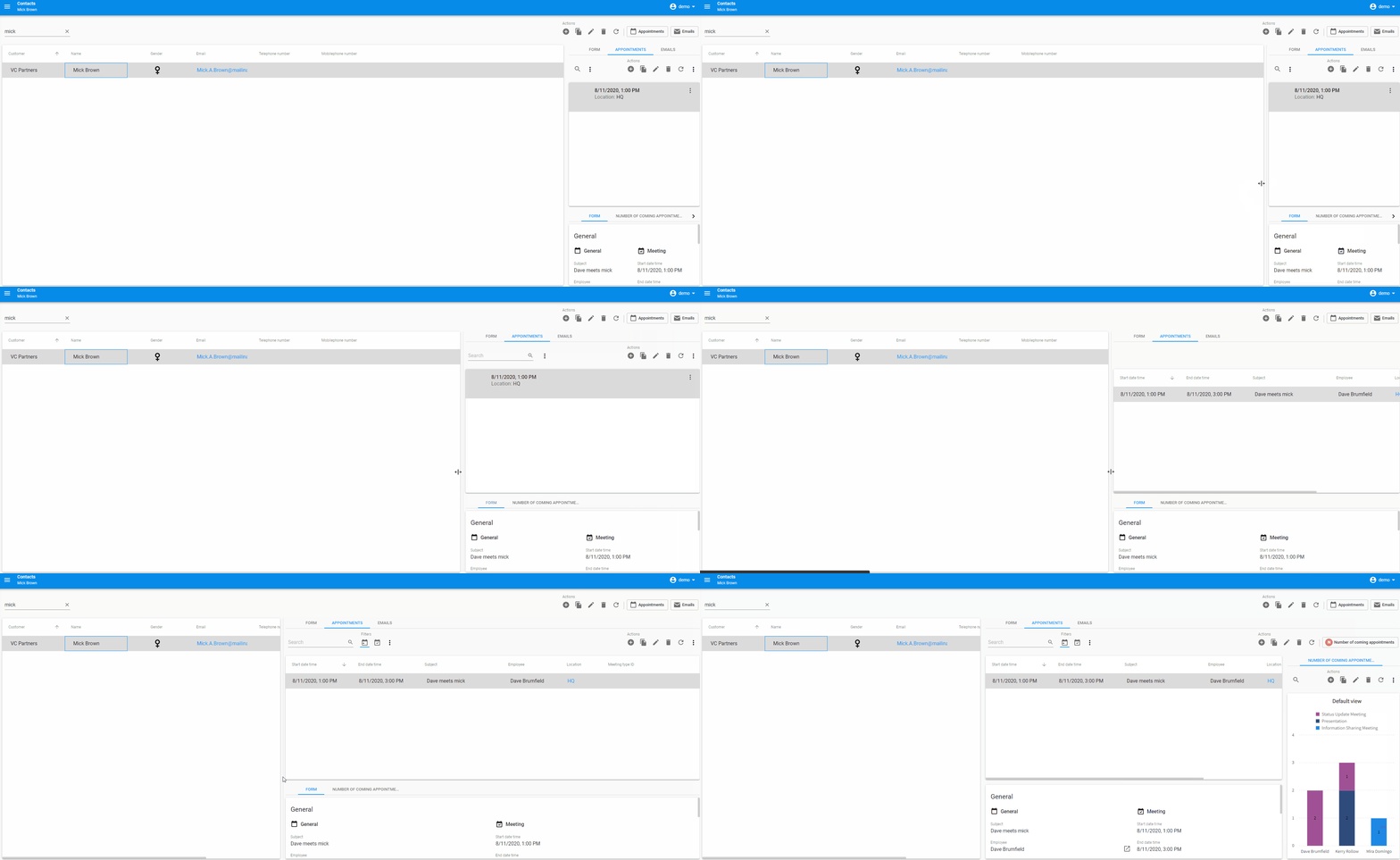
When we started development on our new Universal GUI, one of our main goals was to create a User Interface that worked well on all platforms, be it desktop, tablet or mobile. This feature was so important to us that it even inspired the name.
One important distinction between all these platforms is the amount of available screen real estate, or in other words the amount of pixels on a screen that you have to work with. Something that works great on a desktop client might not look so hot when it’s all mashed together on a mobile device. And resizing certain elements on the screen can drastically impact how useful certain screen elements are. Resizing the form on a screen can make it so that the grid that was displaying so much information before now only shows a handful of columns.
To make sure everything looks the way you want it to, the Universal GUI makes use of breakpoints. This means that when the screen size or the size of a screen element hits a certain width threshold the components can be changed to better work with the new available space.

Adding breakpoints to a screen type
With the 2020.2 release of the Thinkwise platform, breakpoints can be assigned to screen types as well.
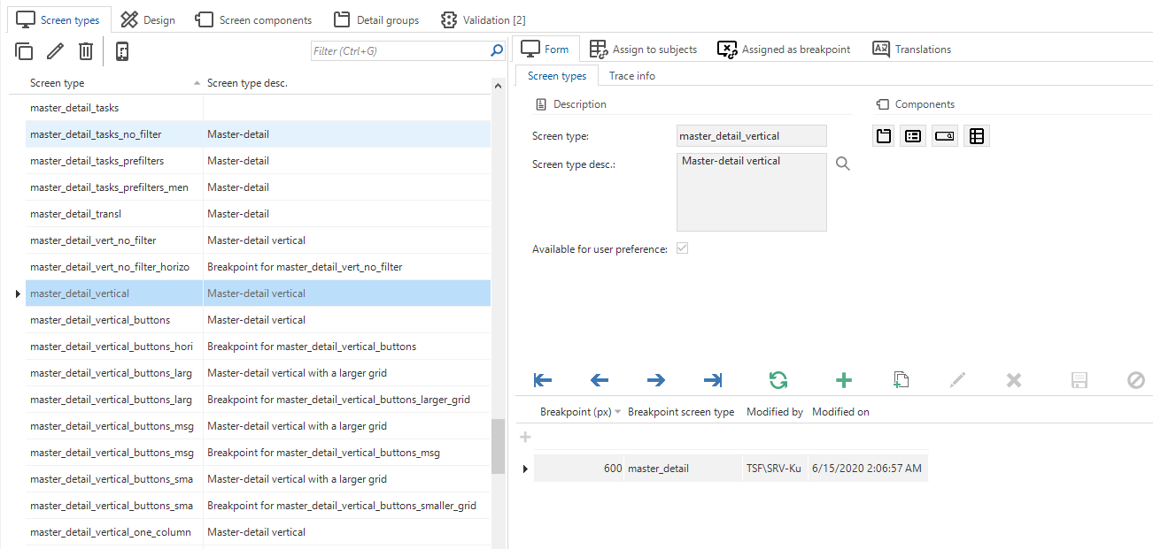
Something you’ll quickly notice when you go to screen types is the new addition of the breakpoint detail under the screen type form. A breakpoint can be added here by assigning a pixel width and an alternate screentype. Any time the component that the screen type is assigned to gets below the width threshold, the screen type will be changed to the screen type assigned to the breakpoint. Assigning multiple breakpoints is also possible.

We’ve also created a task that will help you get set up quickly with some new screen types for smaller user interfaces. If you have a screen type that makes use of vertical splitters, you can use the task Create horizontal screen type as breakpoint to automatically create a new screen type that incorporates horizontal splitters instead. This will make the screen type easier to use on smaller devices where horizontal space is limited.The only input required by the task is the pixel width for the breakpoint. It will then also automatically be added to the main screen type as a breakpoint.
We hope you’ll enjoy using this feature as you create your own amazing responsive User Interfaces!


