


Goals of this feature request:
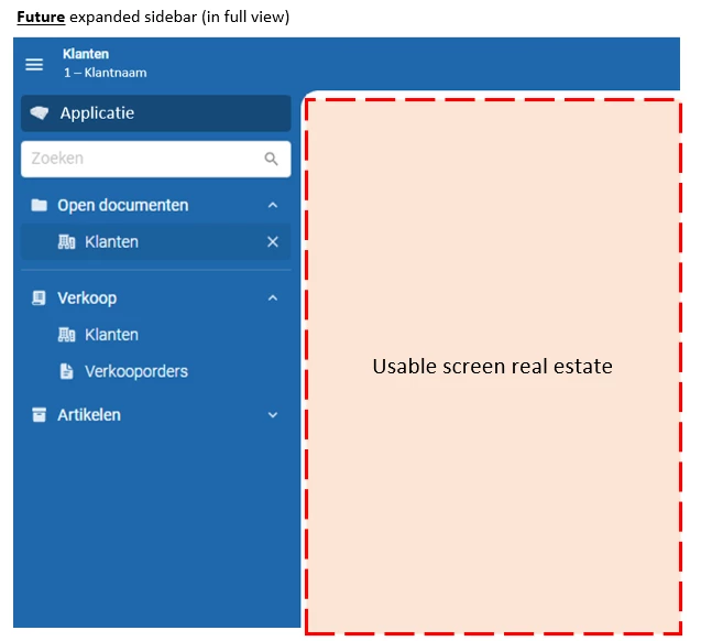
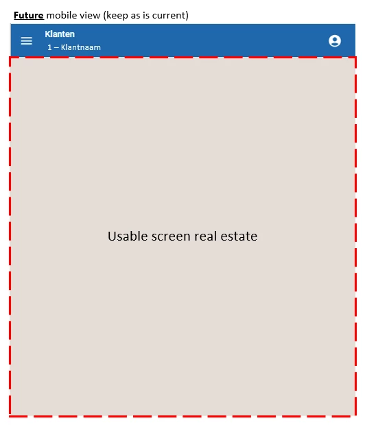
- The sidebar navigation menu hamburger icon and screen name can be positioned more logically and consistently across all screen sizes (mobile / desktop).
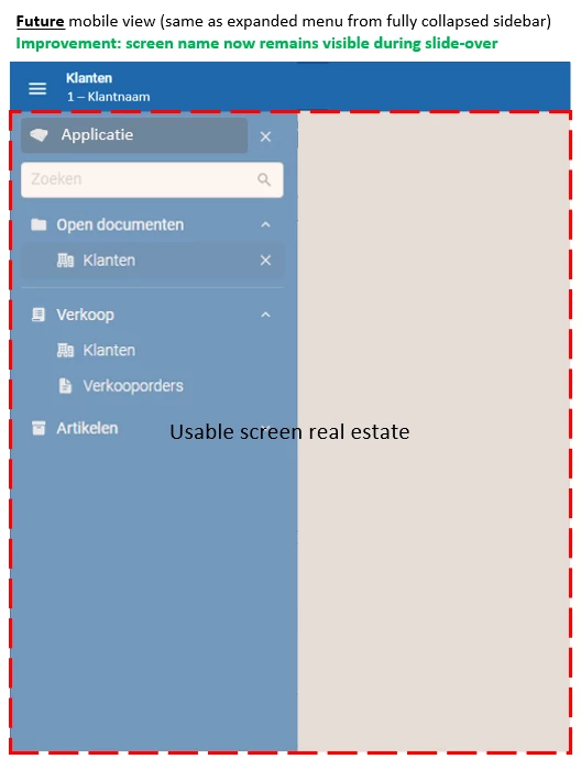
- On expanding the menu from a collapsed state, the user currently no longer sees the screen name. Make this visible.
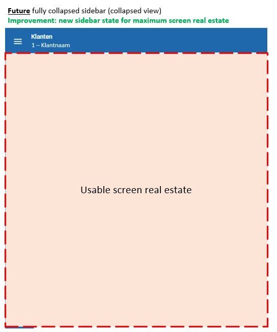
- Introduce a fully collapsed menu state for maximum use of horizontal screen real estate.
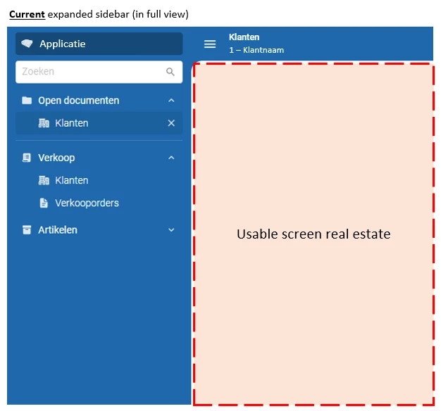
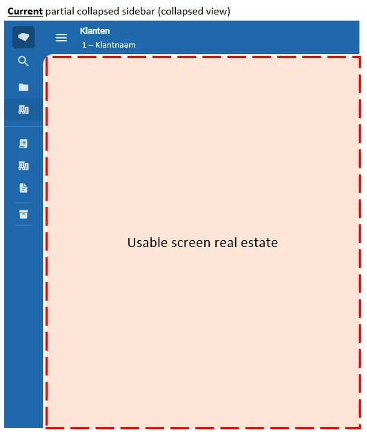
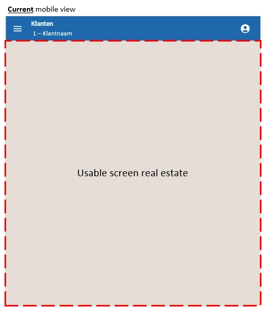
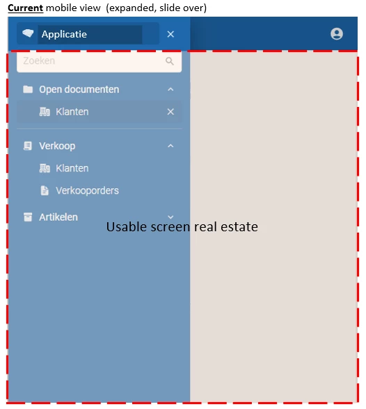
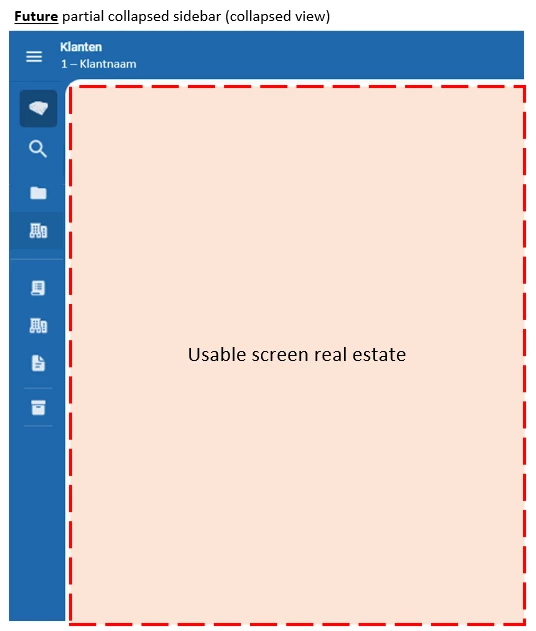
The current sidebar states are as following:
We suggest to make the hamburger switcher stick to the left of the topbar. And then let the navigation sidebar work from below the topbar (it currently overlays it).
Also introduce the possibility for a three-state navigation sidebar (instead of two-state) by clicking the hamburger icon (sequence 1 > 2 > 3 > back to 1):
- Fully expanded state
- Partially collapsed state
- Fully collapsed state (maximum horizontal screen real estate
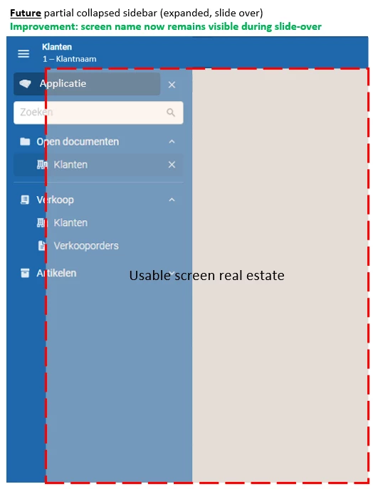
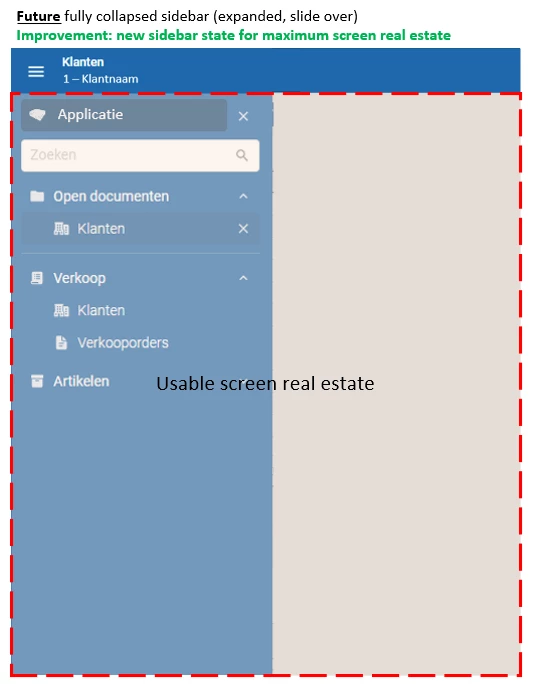
In a sidebar collapsed state, the menu should expand when the user hovers over the hamburger icon (this is something currently missing as well). This behavior is required to expand the sidebar from a fully collapsed state, while still be able to collapse it again when the user leaves the hover-over.
This feature request also coincides with another feature that is already underway, and that is being able to use ALT + M shortcut to automatically set focus to the search field of the navigation sidebar.
For power users (which most users are using Thinkwise systems) the fully collapsed sidebar state in combination with ALT + M to quickly find the menu-item they know (and return to new screen with collapsed menu), provides them with maximum screen real estate to work on at all time while still attaining a fast navigation flow.
The end result is also a consistent hamburger menu positioning and sidebar menu behavior across all device types.
