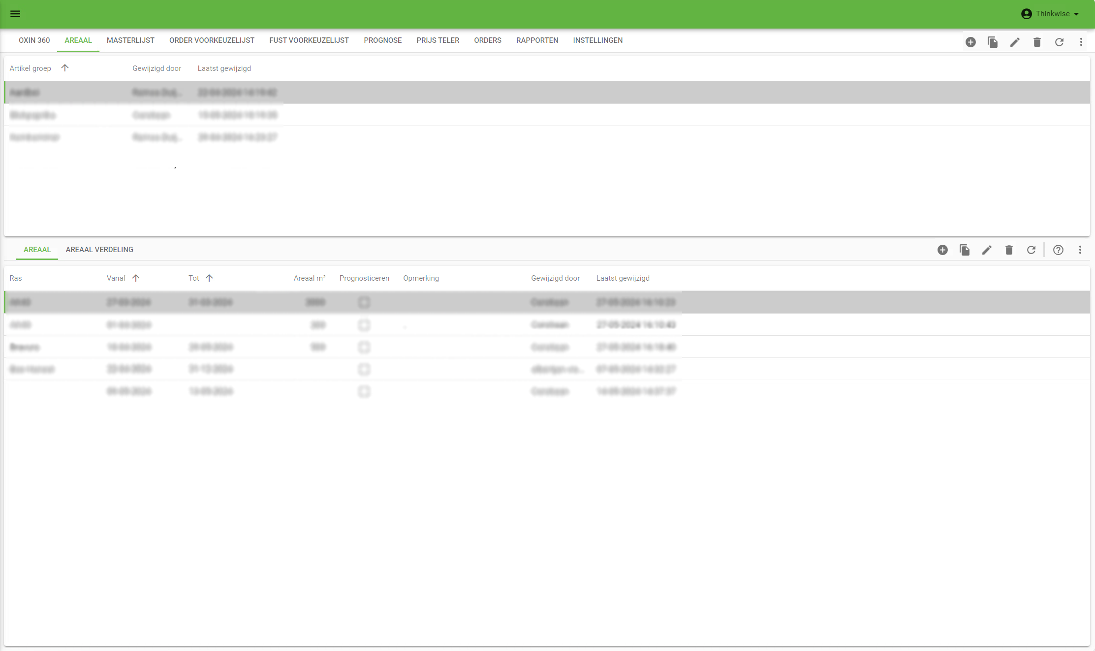
To use the available screen space more efficiently, I would like to be able to move the CRUD-buttons/action-bar to the tab-bar, instead of having a separate action-bar.
In the example I moved the action-bar/CRUD-buttons up (The filter/search could be moved up as well). As you can see, this saves a lot of space. I believe it’s still clear what table is being edited/filtered since the current tab is colored and underlined.
If the action-bar/CRUD-buttons won’t fit on the screen next to the tabs, I would expect it to fall back to the current situation and be placed below.
I’m also curious of what you think of this. I currently see a lot of empty/unnecessary space that can be used to show more data. Do you think the same or do you think this possible solution makes things unnecessarily complicated?
| Current | Example |
|---|---|
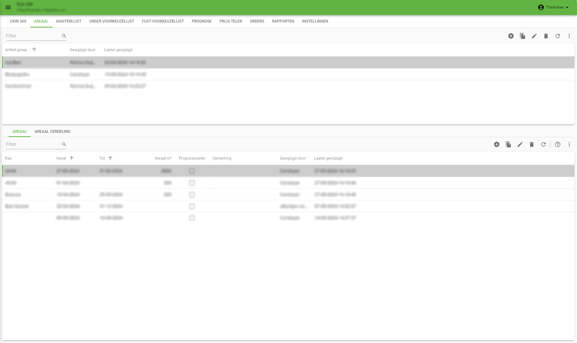
| 
|


