Closed

Reduce clickiness of the data modeller

Related products:Universal GUI

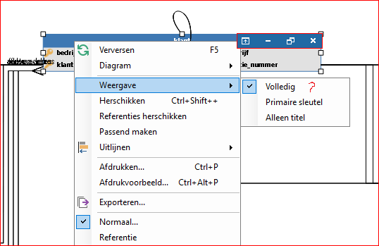
Would it be an option to add little icons in the top bar of entities in the data modeller, like in my mock up below? The functions would be the same as in the context menu with the red question mark.

My reasons for asking are twofold:
  1. It takes three clicks to switch one entity to another display mode, at least two more than I'd like;
  2. Often I find myself staring at the little screen and wondering what it was I had intended to click on arriving there: "Full view is already selected, primary key is displayed and only title is not what I was looking for. Now what?"
The white X would of course replace the red one in the context menu, the maximize/restore button switches between full list or just keys, and the minimize button minimizes to title only. The upgrade button is reserved for future use.

Edited by moderator to show image:

Did this topic help you find an answer to your question?

Mark Jongeling
Administrator
Forum|alt.badge.img+23
I like the idea. The data models I make are getting too big and this solution can help me for sure.

Hi Mark, thanks for uncovering the image. At my side it showed while editing the post, but now it is not there anymore. Now when I edit, it is shown as base64. Peculiar... I'll leave it as is an refer people to your post for the image 🙂

Jasper
Superhero
  • August 13, 2019
Hi Boudewijn, thanks for the idea. We'll certainly keep this in mind when we are going to develop the data modeler for the Universal GUI.

Jeroen van den Belt
Administrator
Forum|alt.badge.img+9

Unfortunately, this idea has not received enough votes. Because we want to keep the focus on ideas that are in high demand in our Community, we are closing this idea.


Jeroen van den Belt
Administrator
Forum|alt.badge.img+9
Open→Closed


Cookie policy

We use cookies to enhance and personalize your experience. If you accept you agree to our full cookie policy. Learn more about our cookies.

 
Cookie settings