Model actionbar elements

Related products: Software Factory Universal GUI

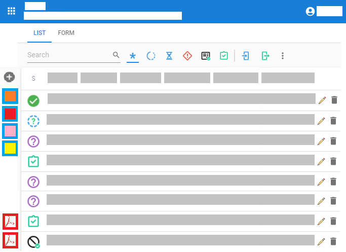
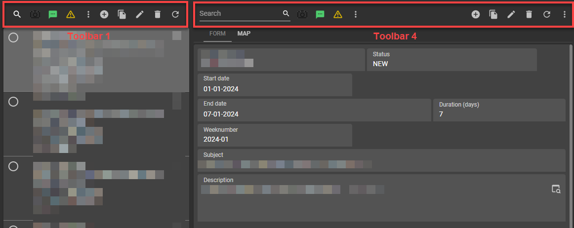
Especially with the introduction of the actionbar component, where you can freely position the actionbar it has become more a necessity to model the action groups of the actionbar. I see the taskbar has the following main groups:

  • Filter
  • Pre-filter
  • Tasks
  • Reports
  • CRUD actions (incl. import/export)
  • Refresh

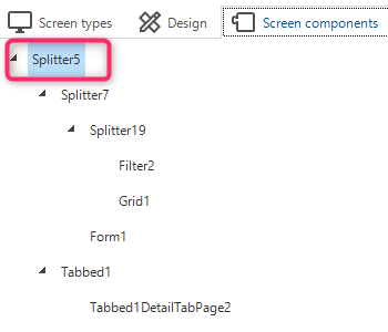
It's not uncommon that you have a grid, form and for example a preview/cube/ or other element not being a reference.. If you put them all on a separate tab all the component gets all the action bar items. 

Functionally and personally this is unwanted. 

  • the filter, pre-filter and mass update for example do not make sense on a form level (exceptions are there of course) because you are looking at a single entity. 
  • In the U-GUI we use the previewer to load external apps.. Basically you don't want to have search, filter, CRUD actions there (again exceptions are possible)

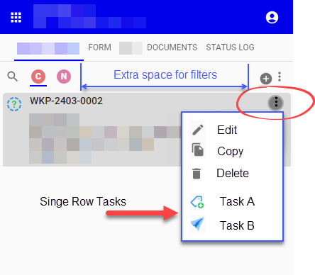
It would be really great if the option to hide action bar could be extended by modelling at screentype level which action-bar items you would like to see. 


Example: 

If you put a form on a separate tab, the search /filters are most likely unwanted because it will most like likely changes your context if you (accidentally) fill something in the searchbar or activate a pre-filter. 


If you have, like we external components that base themselves like a form on a single entity you have the same situation.. you probably only want to see tasks/reports and a refresh button here..  Especially when you are not familiar with the concept of Thinkwise it's odd to see have search / CRUD actions here. 


@tiago @Yara 

NewOpen

Hi @Freddy,

If I understand your idea correctly, it looks like this is the same idea as mentioned here:

The way I read it, both ideas focus on being able to determine which elements of the action bar should be shown, depending on the context.

Would it be an option to merge these ideas, and that you add your business case as described above to that idea as a reaction?


It has overlap, but my idea goes further:

  • I want to actually hide for example the combined search and pre-filters in a situation when there is only  form. 
  • I want to hide standard CRUD actions, search, pre-filters etc in a situation where a preview component is used on a third tab with only the previewer. It now gets the full actionbar and this is unwanted. And the hide main action-bar removes it from all tabs, not just that one. 

So you can merge, but make the solution comprehensive..  


To make the Universal GUI more intuitive, I'd like to be able to shape most of the basic screens something like this:

Grid / Card List:
- ADD ROW + TASKS on the left side at the top (vertical)
- FILTERS at the top
- DELETE ROW + EDIT ROW on the right side in the line
- REPORTS on the left side at the bottom (vertical)


Form:
- EDIT, SAVE, UNDO, DELETE
- REPORTS on the left side at the bottom


The first steps are already taken for this in the latest 2023.3.13 release of the Universal GUI. Please check the "Action bar and taskbar improvements” chapter.

(I just noticed the links in the “Contents” section doesn't work as expected. We will fix that ASAP.

This doesn't offer the possiblity yet to specify the toolbar content per tab.


Hi @Erik Brink,

Just to be sure, is this new Action bar feature now working partly or not at all?

I tried to apply this to a toolbar above a card list:
{"start": ["Search","Prefilters"]}

But I see no difference.


@Harm Horstman perhaps I am mistaken your message, but you need to apply it to the top component in the “Screen components” tab of the screen type. Which can be anything and does not have to be the Action bar.


It does seem to fail with certain orders or perhaps in combination with components used, but those end up in errors (popup happens to report this). A reminder though: You probably want to copy your value before you start editing the screen type as it could result in removing that top component.


Hi @Mark_Plaggenborg ,

I thought that it would be possible to make various action bars in 1 screen type, by adding a screen component for each action bar…


@Harm Horstman I expected the addition needed to be added to the Action bar as well at first. Maybe someone of Thinkwise will respond as to why this is not the case.


Hi Harm,

Nice addition indeed.

That would be the next phase of this feature. We didn't implement it yet. That's why I mentioned this as partly fixed.

Best regards,
Erik


Erik,

Ok thanks for your response, now it is clear.

I assume this is part of the Win/Web parity program?


It is not planned yet. We will inform you when it will be.


We have looked at this idea and we think we really like it.

We have now allowed for setting the different sections via the toolbar_order screencomponent property, but you now only do this for the ‘main’ toolbar component. We now think we should allow you to have multiple Toolbar screen components with their own toolbar_order screen component property. This would allow you to make any combination.

@Harm Horstman technically it isn’t part of the parity program, the placing of all the individual screen components like the ‘Prefilter bar’ as a screen component is, but we think this might be a really good addition so we moved this up in the first quarter planning. 


OpenPlanned

Would you consider splitting up the CRUD option, so that individual CRUD actions can be set per Toolbar.

Reason why I think this is desirable.

The toolbar above a cardlist is generally quite narrow, only the 'Add New' button would suffice, leaving more room for filters.

Having the "Save" and "Cancel" buttons above a Card List is not relevant as the Card List is read-only.

And wouldn't it be a good idea to put the Edit/Delete/Copy + Single Row Tasks buttons in the Card List menu, like below.


@Sebastiaan Meijerink , I hope you like this idea too 


@Sebastiaan Meijerink Great to read that more flexibility will be introduced on the Toolbar settings!

@Harm Horstman Regarding your latest comment: not sure if we really need to be able to set the availability of individual CRUD buttons for each Screen Component's Toolbar. But the CRUD part being responsive to available width is definitely something that is needed. We have an (unfortunately way too long) open TCP 6697S issue regarding the overflow menu being pushed outside of the screen in Comfortable mode on mobile devices in a couple of scenarios. Instead, the CRUD buttons should be gradually moving to the Overflow menu (which should always remain available).


Update: the latest 2024.1.13 release does a big step in the right direction, but doesn't cover this request entirely.

In the past we supported individual task bars already. Now support for all other types of bars is added.

All types of bars can be placed side-by-side.

And… vertical toolbars are supported.

On subject/screentype level you can still tweak the actionbar using the JSON setting. Next step would be to specify this per actionbar instance on the screentype.


@Harm Horstman for triggering edit and delete tasks from a grid line, please check out the cell double click feature of the 2024.1 platform. The processflow can handle this logic. Let's keep it out of scope of this topic.​​​


PlannedPartially completed