




Since the latest version of the Universal GUI, labels are now presented as expandable/collapsible sections (which I believe are commonly referred to as 'accordions' in React front-end UI/UX design terminology), which is a highly appreciated improvement in terms of usability and user experience 👌🏼.
By default, all sections are expanded and visible. When a user clicks on a section label, it collapses to hide the associated fields.
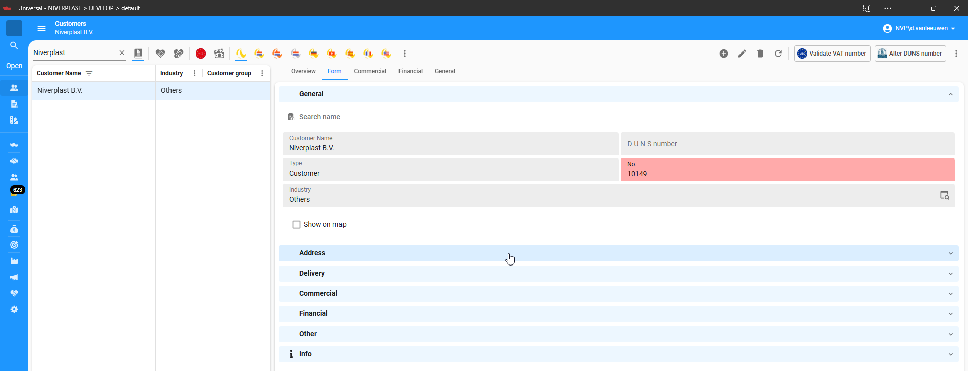
💡I would like to propose making it configurable within the SF (Subjects ▸ Components ▸ Form ▸ Group collapsed) whether a screen should open with specific sections expanded or collapsed by default.
Specifically:
-
There should be a setting available per section (label) to define its default open or collapsed state.
-
For example, it should be possible to configure that "Address" and "Delivery" are collapsed by default, while the other sections remain expanded when the screen is opened.
This enhancement would allow for a more flexible, user-friendly experience and better alignment with specific business processes.