



With the help of breakpoints we are now able to design screens that work well on almost any screen size.
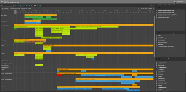
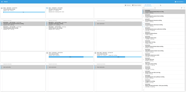
However, some screens are specifically designed for the desktop and it makes no sense to have them available on smaller devices, such as those of a mobile phone or tablet.
I wish there was a way to indicate this in the model. By means of a special breakpoint, or menu item setting, which ensures that menu items for these screens are only available for screen sizes within a certain range.
Typical examples are schedulers or plan boards.