
Ability to show table tasks on grid line
- July 9, 2019
- 24 replies
- 854 views
- Sidekick
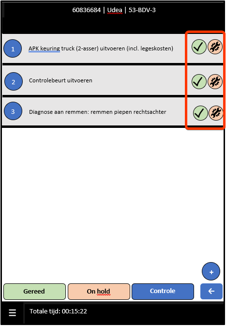
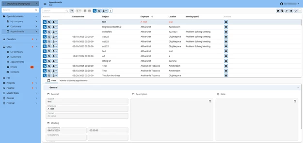
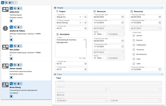
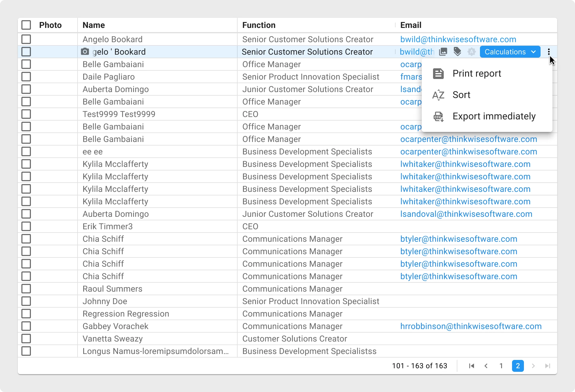
Currently you can show tasks on the top or bottom of a grid in mobile. To start a task for a specific record you should select a line first and then select the concerning task. In the described case it is faster to select the task direct on the line.
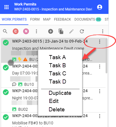
See print screens for further explanation.
Task on top of grid (current situation)
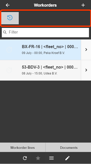
Example tasks on grid line
24 replies
- July 12, 2019
Thats a great idea, an we've actually just recently investigated the feasibility to implement this in the Windows and Web GUIs. Unfortunately, the impact was quite big there, but we'll definitely keep this in mind for the Universal GUI.
- Administrator
- November 4, 2022
All the votes have been transferred into this idea.
- January 30, 2023
Is there a way to see when an idea gets implemented or whether it is going to be in near or far future? This request is already 3 years old. It feels like a good idea, but I would be interested to know what the actual status is.
- Administrator
- January 30, 2023
Is there a way to see when an idea gets implemented or whether it is going to be in near or far future? This request is already 3 years old. It feels like a good idea, but I would be interested to know what the actual status is.
Hi
Concerning the first part of your question, an idea is expected to get implemented in the near future when its status is ‘Planned’. Concerning the second part, the moment on which the idea is reported is not so relevant to us as some other factors. For more information, I'd like to refer you to this article where all criteria are explained:
Concerning this idea specifically, I see that we did not properly update the status for this one. It should be ‘On the backlog’ instead of ‘Open’. I will update it right away. Thank you for bringing this to our attention.
Jeroen
- Community Manager
- December 18, 2024
All the votes have been transferred into this idea.
- Superhero
- May 27, 2025
Hopefully you can create some sort of overlay menu that works for both the rows in a grid and the rows in a card list.

It should be possible to indicate which tasks should be visible in the action bar and which in the overlay menu at row level.
- Community Manager
- October 18, 2025
All the votes have been transferred into this idea.
- Community Manager
- November 14, 2025
All the votes have been transferred into this idea.
- UI/UX Designer
- March 19, 2026
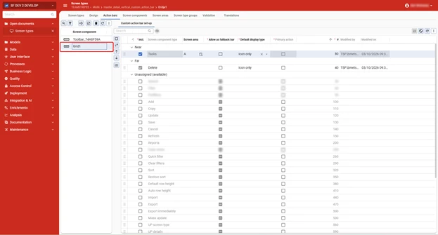
Actions in grids and cardlists
We want to let developers place actions inside grids and cardlists, directly next to the data they act on.
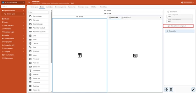
Enabling this will be straightforward. In the subject settings, check a single option to allow a grid or cardlist component to show actions. That component then becomes available in the Action Bars tab, where you configure it just as you would at a regular action bar.
As these actions will be row specific, we are only going to offer Tasks, CRUD actions and Reports on rows.


What will actions in context of the record look like?
We want to keep the look and feel consistent with that of the buttons shown in the action bar. This makes them instantly recognizable as functional elements for your users.
Grids
For Grids, the actions can be shown in a dedicated Action column, where the Near setting would set up an Action column as the first column of the grid, and the Far setting would then place an action column as the last column of the grid.

There are considerations to take into account:
- Based on the button size, the grid rows will have a default minimum height of 30px.
- Alignment of actions will always be to the left
- Action columns will not be available as reachable elements in the subjects settings, they are to be considered as dummy columns, only for action button visualization.
- The width of the Actions column is based on the amount of buttons shown within them
Cardlists
In Cardlists, the actions will be placed at the top (Near) and/or bottom (Far) of a card.

General considerations:
- Row actions only apply to the selected row
- Multiselect is ignored when using a row action. Multi-row operations remain the responsibility of the (Custom) Action Bars.
- Performance will be affected when taking Context and Layout procedures into account. That is why actions on Grid line and Cardlist don’t evaluate Context and Layout procedures.
Gesture interactions
We're also exploring this idea about swipe gestures for touchscreen environments. For grids and card lists, users would swipe left or right on a row to reveal its actions. The Near/Far configuration determines which actions appear on which side.
We want to know your opinion
With these settings, you’ll have a great set of tools to bring actions closer to the context where the user needs and expects them, making your applications more intuitive, flexible and user friendly.
We welcome your feedback about these ideas, so let us know what you think!
- Captain
- March 20, 2026
I am not really happy about the current limitations. I would at least expect the buttons to evaluate the layout/context of the selected row. Also having to sacrifice grid height is a bit of a pity after we just switched to lower heights now that it is supported with edit in grid.
Ideally we would like to be able to place specific tasks behind (or in) specific columns in a grid. So for the user it is clear the task interacts with the object in the column.
As for layout, the buttons draw away quite some attention right now, maybe it could be a bit more subtle? For example that the blue box only is visible on hoover or on the selected row.
Considering "The width of the Actions column is based on the amount of buttons shown within them" there still seems a lot of white space in the action column behind the buttons of your grid screenshot.
To end with a positive note, I do see a nice use case of this feature to add multiple rows in link-tables by making a add-task that opens a fake-lookup screen in which each row has an 'Add' task button in front. This way a user could add multiple rows from one lookup window in an intuitive manner (https://community.thinkwisesoftware.com/ideas/adding-multiple-rows-at-once-through-a-lookup-6653).
- Superhero
- March 20, 2026
A great development if tasks and actions can be executed at row level. This will really help enduser adoption of applications.
However, I do have some considerations:
- The tasks should be presented in a more subtle way.
- In grids, I would show the tasks only on the active row, ideally layered on top of the row’s content, so the underlying data remains scrollable.
- In card lists, it would be very useful to place the tasks inside an overflow menu. This keeps the interface clean while still allowing task names to remain visible when opened.
- The overflow‑menu button in the card list should also be shown only on the active card.
- An additional advantage of showing tasks or overflow‑menu buttons only on the active card is that it becomes immediately clear to the user which card is currently active.
This keeps the focus on the card’s data and ensures optimal use of limited screen space on smaller devices. - A possibility of swipe menu functions, would be great. A default swipe-down to refresh the data in a cardlist would also be nice.
- Community Manager
- March 20, 2026
As for layout, the buttons draw away quite some attention right now, maybe it could be a bit more subtle? For example that the blue box only is visible on hoover or on the selected row.
- The tasks should be presented in a more subtle way.
- In grids, I would show the tasks only on the active row, ideally layered on top of the row’s content, so the underlying data remains scrollable.
Only showing the Actions for the selected record would solve both the Context & Layout performance challenge and the visual clutter challenge. In return, this would however mean that you effectively need 2 clicks to initiate an Action on a different records: first select the Record, then click the now-visible Action. That would be very similar to the Lookup hyperlink behavior. Would you be fine with that?
We’ll consider displaying the ‘On hover’ and the Cardlist overflow options, but since Context & Layout are only evaluated for the Selected row, the ‘On hover’ would then only have an effect on the Selected row.
Ideally we would like to be able to place specific tasks behind (or in) specific columns in a grid. So for the user it is clear the task interacts with the object in the column.
This is an interesting angle to explore as well! Rather than having multiple Tasks at the start or end of a Grid row based on the Action bar concept, this would be more of an extension to the Task Double click column feature. If I understand you correctly, you are basically proposing a different way of visualizing such a Double click task, effectively allowing to visualize it and single-click it in/near the linked Grid column. Is my understanding correct?
- Captain
- March 20, 2026
Only showing the Actions for the selected record would solve both the Context & Layout performance challenge and the visual clutter challenge. In return, this would however mean that you effectively need 2 clicks to initiate an Action on a different records: first select the Record, then click the now-visible Action. That would be very similar to the Lookup hyperlink behavior. Would you be fine with that?
I think it is dependent on the use case. Would it be an option to make this configurable for the developer?
What about if all actions are shown as disabled on non-selected rows? Selecting the row executes the layout+context and makes the buttons active. This way a user could double click on a button of a non-selected row and it would still work (first click activates the row, second click executes the task).
Note: If the context hides a button, it should make all other buttons stay in the same place to prevent the user from clicking the wrong button.
This is an interesting angle to explore as well! Rather than having multiple Tasks at the start or end of a Grid row based on the Action bar concept, this would be more of an extension to the Task Double click column feature. If I understand you correctly, you are basically proposing a different way of visualizing such a Double click task, effectively allowing to visualize it and single-click it in/near the linked Grid column. Is my understanding correct?
Yes, exactly. It would make it more intuitive for the user and add the option to use multiple tasks for the same column.
- Superhero
- March 20, 2026
On hover could bet nice, but does not work for touch-screen, so I would avoid the use of that in this case
- Captain
- July 10, 2026
Hi
- Community Manager
- July 10, 2026
We’re actually already working on this and we’ll release this with 2026.3 for sure. Most likely already in an earlier STS release!
- UI/UX Designer
- July 13, 2026
Hi all!
Regarding that sneak peak peek

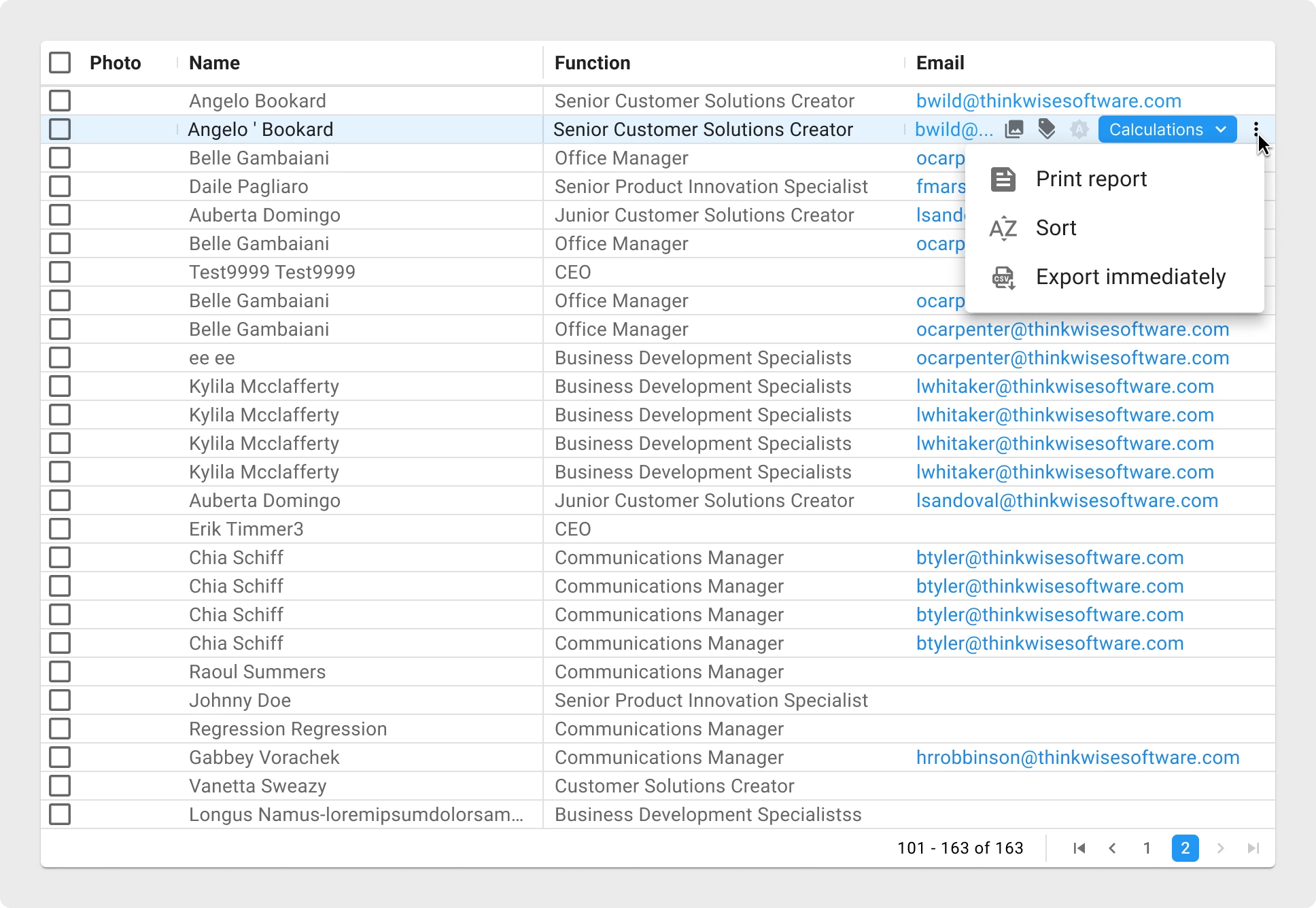
This is a design example of how actions on grid rows will look like.
On hover of the active row, the actions will be shown, where they are placed above the data (as you can see in the image, underlying data will be truncated)
If a grid has been marked to allow inline actions, this component will become available in your Action bars tab of your screentypes screen, where you'll be able to set the actions as you need.
- Rookie
- July 14, 2026
Hi
Could you please clarify the intended scope of this planned improvement?
In an earlier mock-up (approximately 3 months ago) you showed row specific actions that were always visible and in your latest comment the actions appear only when hovering over a row. Should the latest example be understood as replacing the earlier concept or is the hover functionality another possibility of displaying row actions?
Our use case involves touchscreen users, so hover would not be a practical way for them to access this action. Ideally, we would like to configure different task buttons in different columns within the row so that we can spread them across the row to reduce the likelihood of users accidentally clicking on the wrong task on a touchscreen.
Could you also please clarify whether the planned functionality will support:
- task buttons remain visible without hovering; and
- placement of different tasks in separate grid columns or positions;
Thanks in advance!
- UI/UX Designer
- July 14, 2026
Hi
Happy to ablige.
Yes, the latest design I shared is replacing the earlier concept.
Based on the feedback we received on the earlier designs, we had to take the Context and Layout logic into account. To prevent this logic immensely impacting screen loading times (as this logic would be checked on every single row), we had to decide to show the actions on the active row. To allow user to see the data behind the floating actions, we are going to show the buttons on hover (of the active row) on desktop grids.
On touch screens, we are always going to show the buttons on the active row, as there is indeed no hover state.
The placement of the buttons will be based on the Near and Far settings (as all action bars).
The Near buttons will be placed on the Left side, the far buttons are placed on the right side of the visible screen, to prevent the user having to scroll to reach the buttons.

We are not going to introduce actions in separate grid columns at this stage.
Regarding your suggested use case: what kind of touch devices are your users using? Why are you using a grid for your use case? Do they have to scroll side ways to reach data further away? How many columns do your users have to go through?
Keep in mind that we are also going to introduce actions on cardlists, which might be a better component for your use case!
- Rookie
- July 15, 2026
Regarding your suggested use case: what kind of touch devices are your users using? Why are you using a grid for your use case? Do they have to scroll side ways to reach data further away? How many columns do your users have to go through?
Keep in mind that we are also going to introduce actions on cardlists, which might be a better component for your use case!
Thank you for your quick response Bart.
- iPad 8th gen - ios 18.x
- We’re using grid because its transactional data - we could use cardlists if that is more workable
- No - users do not need to scroll side ways
- ~11 columns
I'm interested to know: what have these answers helped you understand about the use case?
- Superhero
- July 26, 2026
🙂
Enter your E-mail address. We'll send you an e-mail with instructions to reset your password.