
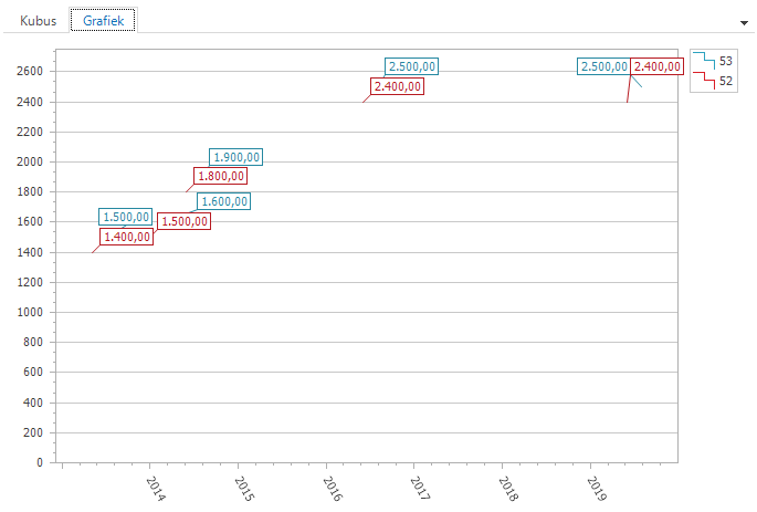
I am running into a scenario where I want to show a graph for salary growth where 4 persons are shown at once. Horizontal axis I want the dates and on the vertical axis I want the amount they earn. Once somebody got a raise I want it to be represented on that date. For example, for one person it would look like this:

Once we add more collegues and fill the graph with more data we get empty fields, because not everybody gets a raise on the same date. This results in a graph that is scattered and has gaps.

I know in excel you can connect these gaps in graphs (https://support.microsoft.com/en-us/office/display-empty-cells-null-n-a-values-and-hidden-worksheet-data-in-a-chart-a1ee6f0c-192f-4248-abeb-9ca49cb92274)
It would be awesome if we could connect the dots like this in Thinkwise as well.

