
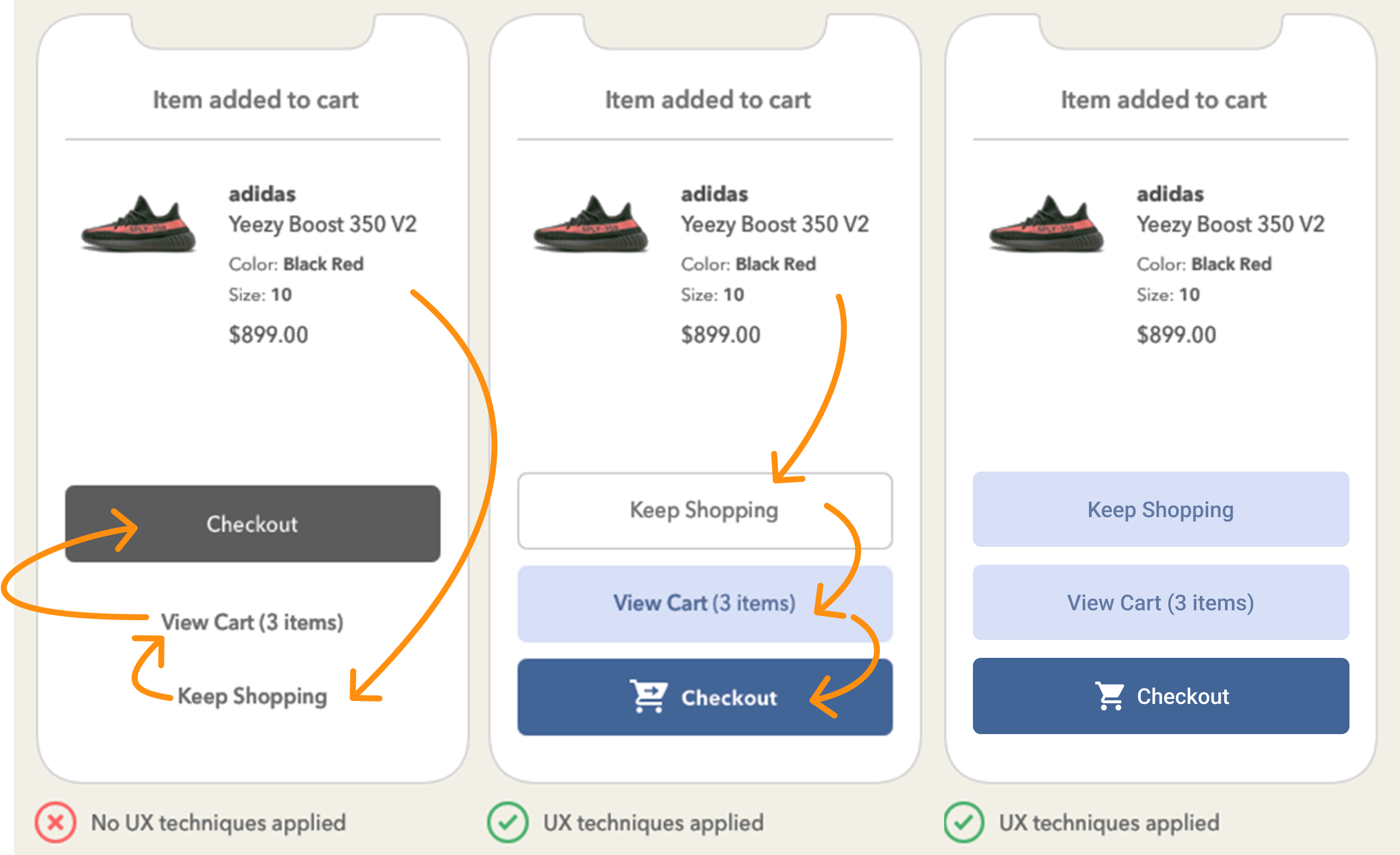
During the developer event the new call to action buttons were displayed. These use a 100% opacity of the background colour of the task. In addition to that, I would like an option to use 50% of the opacity of the colour as a secondary call to action button. 

In addition, it would be nice to be able to override the color of the action buttons when desired.


Awesome to see the direct response and you taking action Ken!

Our new button color options follow this idea of Zander Whitehurst, to offer the user a clear hierarchy what needs to have focus. 

To reiterate the button options:

  • Visual hierarchy: Call to Action (100%) / Default / Disabled / Overflow (/Hidden)
  • Display type: Icon + Text / Text / Icon / Overflow

My point of view: to reduce complexity, when offering buttons, only let one stand out (per action bar). If you need more colors/shades in the amount of buttons you are showing to your user, chances are you are already showing too many options in the first place. The primary Call to Action (100% opacity) is to deliberately draw the attention (so use it sparingly!) to guide the user. Extra levels in that hierarchy introduces functions a user has to recall, what we need to prevent. 

What extra Use Case would be solved with showing another shade to the user? 


@Bart Metselaar Wasn’t your example, during your presentation at the Developer event, of the checkout window not exactly that use case?

I mean the 3 options (terms are probably not accurate to your example image):
- Checkout;
- Continue shopping;
- Cancel

You don’t want customers to Cancel, so no focus on that. Depending on the company, they wish to absolutely have the customer pick one of the the other 2 options, just which would be priority depends on them. So 100% en 50% being used for the Checkout and Continue shopping.

If this was not what you intended, I misunderstood the order of the images and the left on was your advised solution and it not being the “before” state. (One button being black and the others white).


@Mark_Plaggenborg the subject of that slide was how you could use highlighting one of the options to draw the users’ attention and to use it in context to guide the eyes through other buttons. The slide was not meant to focus on the visual styling of the buttons. 

I've extended the image used in my presentation. I emphasized the looking order and in the extra image (on the right) the buttons stay visually the same except for the highlighted one:

An extra visual hierarchy will not offer any extra advantages, other than distraction (which we should prevent)


@Bart Metselaar Understood. Thanks for the clarification.


NewOpen