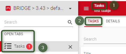
The breadcrumb of an Open Document (in other words: the selected record) is not very clear in the Universal GUI. The Entity name does display in a similar Font size as the regular menu and record Font size, but the breadcrumb info is displayed quite much smaller right below it. Our end users are actually complaining about this. Could this be changed to at least a larger Font?
While you're at it I would like to recommend some improvements that would make us even more happy:
- How about having Entity and Breadcrumb info at the same row? F.e. Opportunities > Company A > Opportunity 1
- Could this navigation information actually be clickable, giving me a quick option to go back to the Account to which the Opportunity is related or to the Opportunities list?
- Could it be possible to right click on the navigation and copy the URL, allowing me to share a deeplink to a specific record?


