Next release

Option to hide collapsible form

Related products:Software FactoryUniversal GUI
  • Maarten

rickwenning
Vanguard

Hi all,

I use the tab page option to create a division between two groups in a form. This way, a specific layout is possible. In platform upgrade 2025.1 the collapsible form is introduced, triggered by the tabpage option.

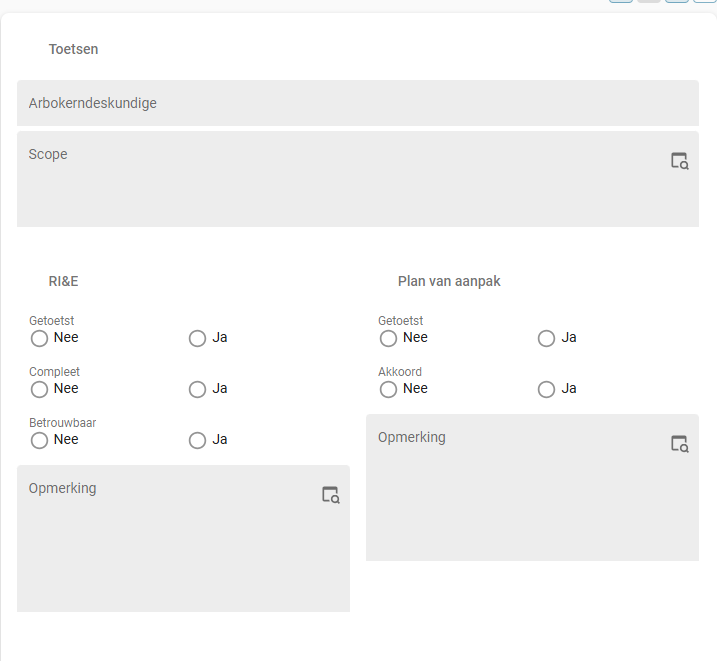
However, there is no option to hide the clickable part of the collapsible form. I want the layout to be the same, without the blue bar.

Tab pages create collapsible forms with a clickable part (light blue bar)

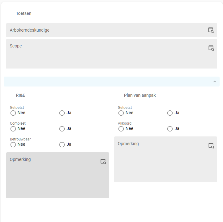
It would be nice to have the option to keep the layout of tab pages in Universal and hide the clickable part.

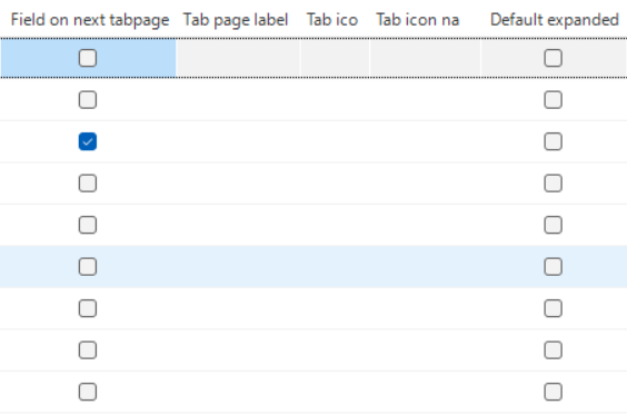
One way to implement this, is to create a checkbox in Subjects → Component → Form. When selected (by default) the clickable part is shown and the form can be collapsed. When the checkbox is empty, the clickable part is not shown, the form is not collapsible, but the layout is the same. 

An option to hide the collapsible form can be implemented in this section.

Kind regards,

Rick

Did this topic help you find an answer to your question?

15 replies

Arie V
Community Manager
Forum|alt.badge.img+12
  • Community Manager
  • 1034 replies
  • April 11, 2025

@rickwenning Without prescribing too much how our Developers should implement this change, but how about changing the newly added ‘Default expanded’ checkbox to e.g. a Domain with Elements that could have the following options?

  • Default expanded - collapsible
  • Default collapsed - expandible
  • Default expanded - not collapsible
  • Hide section bar - not collapsible

The 4th option would then cover your Idea, the 3rd option would be a way to prevent users from being able to collapse in the first place.

On the topic of Collapsible form sections, I’m also curious to hear your opinion on this Idea:


rickwenning
Vanguard
Forum|alt.badge.img+1
  • Author
  • Vanguard
  • 22 replies
  • April 11, 2025
Arie V wrote:

@rickwenning Without prescribing too much how our Developers should implement this change, but how about changing the newly added ‘Default expanded’ checkbox to e.g. a Domain with Elements that could have the following options?

  • Default expanded - collapsible
  • Default collapsed - expandible
  • Default expanded - not collapsible
  • Hide section bar - not collapsible

The 4th option would then cover your Idea, the 3rd option would be a way to prevent users from being able to collapse in the first place.

On the topic of Collapsible form sections, I’m also curious to hear your opinion on this Idea:


Hi ​@Arie V, adding a domain/drop-down with these options would greatly enhance the customizability of the (collapsible) form. 

Regarding Freddy's idea, I think automatically collapsing forms based on customizable logic (e.g. layout functionality) would be great. I upvoted this idea as well. 


Anne Buit
Community Manager
Forum|alt.badge.img+5
  • Community Manager
  • 653 replies
  • April 11, 2025

Is it safe to assume that you only want to remove this visual segment when the section does not have a title?


rickwenning
Vanguard
Forum|alt.badge.img+1
  • Author
  • Vanguard
  • 22 replies
  • April 11, 2025
Anne Buit wrote:

Is it safe to assume that you only want to remove this visual segment when the section does not have a title?

Yes, that is it exactly. 


Anne Buit
Community Manager
Forum|alt.badge.img+5
  • Community Manager
  • 653 replies
  • April 11, 2025

We’ll look into this further; for now, here’s a bit of custom CSS that does exactly that:

.MuiButtonBase-root.MuiAccordionSummary-root.Mui-expanded:not(:has(.MuiAccordionSummary-content span:not(:empty))) {
    display: none;
}

Note that it’s not based on official CSS classes, it has to be verified on Universal releases.


Anne Buit
Community Manager
Forum|alt.badge.img+5
  • Community Manager
  • 653 replies
  • April 14, 2025
NewUnder review

rickwenning
Vanguard
Forum|alt.badge.img+1
  • Author
  • Vanguard
  • 22 replies
  • April 14, 2025
Anne Buit wrote:

We’ll look into this further; for now, here’s a bit of custom CSS that does exactly that:

.MuiButtonBase-root.MuiAccordionSummary-root.Mui-expanded:not(:has(.MuiAccordionSummary-content span:not(:empty))) {
    display: none;
}

Note that it’s not based on official CSS classes, it has to be verified on Universal releases.

Thanks ​@Anne Buit, this works like a charm!


Bart Metselaar
Moderator
Forum|alt.badge.img+3

@rickwenning, regarding the option to remove the collapse controller when no title is given for that ‘Field on next tabpage’, the current work around doesn't show a divider.

Before the collapsible form sections, Universal did show a divider between ‘Field on next tabpage’ sections.

Because you are specifically referring to the layout of your form and the desire to remove the collapse bar; is a different visual dividing element something you'd still expect between sections (like a divider line or empty space to emphasize a section)? 


rickwenning
Vanguard
Forum|alt.badge.img+1
  • Author
  • Vanguard
  • 22 replies
  • May 8, 2025
Bart Metselaar wrote:

@rickwenning, regarding the option to remove the collapse controller when no title is given for that ‘Field on next tabpage’, the current work around doesn't show a divider.

Before the collapsible form sections, Universal did show a divider between ‘Field on next tabpage’ sections.

Because you are specifically referring to the layout or your form and the desire to remove the collpase bar; is a different visual dividing element something you'd still expect between sections (like a divider line or empty space to emphasize a section)? 

@Bart Metselaar I think a divider line would enhance the UX. However, the group title is also a divider. 

If possible, a dropdown option to select which kind of divider (none, line, collapsible) would be great.


Arie V
Community Manager
Forum|alt.badge.img+12
  • Community Manager
  • 1034 replies
  • May 22, 2025
Under reviewPlanned

Arie V
Community Manager
Forum|alt.badge.img+12
  • Community Manager
  • 1034 replies
  • May 22, 2025
Anne Buit wrote:

Is it safe to assume that you only want to remove this visual segment when the section does not have a title?

We'll basically implement this as default behavior in the Universal UI: if the Section has no title (Tab page label is null), we will remove the Section header bar.


Leroy Witteveen
Moderator
Forum|alt.badge.img+3
PlannedWorking on it!

Arie V
Community Manager
Forum|alt.badge.img+12
  • Community Manager
  • 1034 replies
  • May 27, 2025

Maybe I shouldn't jinx it, but this change might even make it to next week’s Universal release candidate already! Go ​@Leroy Witteveen and ​@Alexandra Egri 💪


Leroy Witteveen
Moderator
Forum|alt.badge.img+3
Working on it!Next release

We will be releasing this with the release expected on the 7th of July. 🙂

Forum|alt.badge.img+5

I created a css script that comes closer to the current situation, and I think that a section separation without text should remain visible as a line like it is now.

The problem with this solution is that using the accordion feature on some pages becomes difficult.

Prefixing everything with for example

[data-tab-id]:not([data-tab-id^="ams_"])

Makes it possible to use the feature where you want it, and keep the current state for now where you don’t want it, but it will probably break in a future release.


.MuiButtonBase-root.MuiAccordionSummary-root {
    pointer-events: none;
    cursor: default;
    background: none;
    padding-left: 8px;
}

.MuiAccordionSummary-expandIconWrapper {
   display: none !important;    
}

.MuiAccordionSummary-content h2.section-title .text-icon-container,
.MuiAccordionSummary-content h2.section-title .text-icon-container .text {
  font-size: 1.3125rem !important;
  line-height: 1.16667em !important;
  font-weight: 400 !important;
}

.MuiAccordionSummary-content h2.section-title .text-icon-container span:first-child,
.MuiAccordionSummary-content h2.section-title .text-icon-container span:first-child svg {
  width: 20px;
  height: 20px;
}

.MuiButtonBase-root.MuiAccordionSummary-root:not(:has(.MuiAccordionSummary-content span:not(:empty)))  {
   display: none !important;
}

.MuiPaper-root.MuiAccordion-root:not(:first-child) {
  border-bottom: none !important;
  border-top: 1px solid rgb(127,127,127) !important;
}

.MuiAccordionDetails-root {
    padding: 0px !important;
}


Reply


Cookie policy

We use cookies to enhance and personalize your experience. If you accept you agree to our full cookie policy. Learn more about our cookies.

 
Cookie settings