Merged

Move filter options to overflow menu of the filter bar instead of the task bar

Related products:Universal GUI
  • October 22, 2024
  • 5 replies
  • 56 views

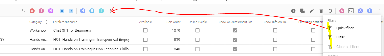
Having search and pre-filters together, it makes much more sense to move the filters also to those 3 dots


And maybe also manage prefilters


Did this topic help you find an answer to your question?

5 replies

Bart Metselaar
Moderator
Forum|alt.badge.img+3
NewOpen

Bart Metselaar
Moderator
Forum|alt.badge.img+3

I understand your opinion, especially as the task overflow continues to get more functions and can become ‘crowded’, making it harder to look through that menu. 

However, I want to encourage everyone to also dare and take a step back and look at the challenge more deeply:

  • the amount of prefilters can vary a lot per subject and customer, making the prefilter overflow menu potentially harder to find instead of the task overflow menu which, up till now, is always at the top right of a subject. This would make the Quick Filter potentially harder to find.
  • In grids, we seem to ‘hide’ these funtions in the overflow menu. Is that correct? Or can we take another approach? Should filtering maybe become more prominent feature?

To give a quick example:

The filter options now stand next to the ‘Search’ icon, giving a dedicated location for the filter options

Actually, now that I think of it, filtering in the Windows GUI ánd the Universal GUI both have several different ways to achieve a filtered set of data. 
We have the Filter, Prefilter, FilterForm and QuickFilter, and they differ a lot visually and functionally.

And they are placed at different locations in both GUI's as well. 

I think filtering as a whole can benefit from a lot more love than ‘just relocating overflow funtions’.


Forum|alt.badge.img+5
  • Author
  • Vanguard
  • 32 replies
  • November 6, 2024

I like the example. Putting all the filter options behind the filter icon next to the search. This reduces distractions for the user. On the other hand, how will the user see which filters are active (something that, incidentally, is also not visible in Excel)? In any case, it should be clear that filters are active (not hidden), so the user can open the filter list.


Bart Metselaar
Moderator
Forum|alt.badge.img+3
  • UI/UX Designer
  • 114 replies
  • November 15, 2024

There are several ways to do this, of course (like with badges, or a different visual cue when a filter is activated)

My opinion, prefilters now always demand space. They are either on or off. I wonder if we can take another approach. Like, when the filter button is selected, a dropdown with all (pre)filters opens, and when a prefilter is activated, it is shown on the grid. When a filter is defined, this is also shown (maybe the user can give it a name, and add filter values to it, shown with a badge to give info how many filter options are added)

To give an impression of my idea:


Jeroen van den Belt
Administrator
Forum|alt.badge.img+9
Updated idea statusOpenMerged
Idea merged into:
Freddy

All the votes from this idea have been transferred.

Reply


Cookie policy

We use cookies to enhance and personalize your experience. If you accept you agree to our full cookie policy. Learn more about our cookies.

 
Cookie settings