


Granted, detail tiles and layout logic didn’t make it to this release. Instead many small issues and bugs have been fixed and the design for the beforementioned features has been greatly improved. We prefer to resolve the issues and bugs right away instead of letting them pile up in favor of new features.
Like last time, a demo environment of Universal on the Insights application is accessible here using demo/demo as login.
Configuration screen & Alpha download
Universal had a link to our development Insights IAM. This link was written hard-coded in the source code, forged in the crucible of the TypeScript compiler to an unchangeable constant in the runtime.This was a bit of a problem. The Insights is a nice application and all but we want to run Universal on every Thinkwise platform product imaginable. We’d need either a config screen or an INI.
The config screen is the most accessible way of configuring the application and the values configured will be remembered by your browser. This way, an INI will not be needed for a while.
Pointing Universal to the correct Indicium
Universal is configured by pointing the service URL to https://server/indicium/. Right now, only IAM is supported. Running Universal on SF will follow shortly, we just need to be able to point to the right runtime configuration.
Universal does not need an application pool and can be deployed as a regular folder in IIS.
Universal folder installation, next to Indicium
Please note the following important details:
- Universal must be deployed on the same server as Indicium. Browser security prohibits us from deploying this otherwise. For now.
- Universal only works with version 2018.3 of the Thinkwise Platform.
- Furthermore, make sure you run all hotfixes on the IAM and SF that you plan to use for Universal.
- Make sure you are on the latest version of Indicium.
- This is an Alpha version, there is no compatibility plan in place for Universal just yet. Indicium updates and IAM hotfixes will eventually break this Alpha release.
Access to details
While the design of detail tiles is being finished up, much of the technical implementation has been developed. We didn’t want to keep this away from you all, so instead of detail tiles a combo has been added to open a detail.The functionality described here is called zooming. Accessing a detail as a new document, based on the selected parent row in the original document. As soon as the zoomed document is opened, it is no longer connected to the original document. Switching rows will have no effect on the zoomed document.
This functionality is present in the current user interface by double-clicking on a detail tab, clicking on a detail tile or through a zoom process action in a process flow.
The detail combo can be found next to the action bar
Breakpoints
This has been hinted at for a while now in previous blogs. We would soon see the magical Breakpoints…Well, they are done! But what are they?
In the Windows and Web GUI’s, a screen type is responsive to the width and height of the application. When the width changes, the components within the screen type become smaller. The components in the screen are often adaptive. They don’t shrink their contents but they respond to the available space by reorganizing themselves. The form changes its layout by creating tabs tabs, the grid creates a scrollbar.
With Universal, we are planning to allow screen types to grow vertically beyond the visible boundaries. This will introduce vertical scrolling. This means that the developer no longer has to worry much about limited height, both for screen types and components. There is no need for a screen type to be responsive or adaptive when it comes to vertical space.
This is all good and well, but how do we deal with limited horizontal space? A responsive screen type can make the components so narrow, the components will eventually not be able to solve the problem, no matter how adaptive they are.
Breakpoints save the day here. Instead of a fixed component layout for your screen type, you can define multiple component layouts for your screen type, depending on the available width. Universal will choose the correct component layout depending on the available width for the screen type. Basically, the screen types become adaptive to changes in horizontal space!
A table or variant will still have a main, detail, look-up and zoom screen type. But this screen type will have as many component layouts for different horizontal sizes as the developer wants. You can even choose completely different components for various breakpoints. For instance, the developer can choose to replace a grid with a card list when the width becomes too small.
When there are multiple breakpoints defined for a screen type, the largest breakpoint that fits will be used.
Specific screen types for Mobile should not be needed anymore because of this. This is part of the effort to ensure the entire application can be accessed from every device.
Breakpoints in action
Furthermore, this not only applies on Mobile but also on a desktop or browser window that is resized. Expanding or collapsing the menu can also change the applied breakpoint for a document.
When detail tabs are implemented, the available horizontal space for the detail tab will also determine the breakpoint used for the detail. Keep this in mind; a narrow breakpoint is not equal to a mobile device.
Breakpoints – How to model them
The Software Factory has not yet been updated to allow breakpoints to be modeled. Instead, a temporary solution is in place to allow breakpoints to be defined, called breakpoint screen types.A breakpoint screen type can be added by creating a new screen type with the same name, suffixed with _(lessthan)###, where ### is the width in pixels where the breakpoint should kick in. The breakpoint screen types will be loaded on-demand.
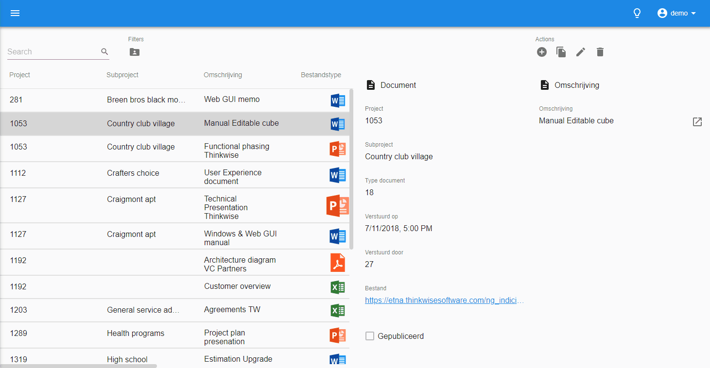
For example, most of you are familiar with the screen type master_detail_vertical. For the sake of simplicity, assume this is a grid and a form next to each other. Universal will always use the configuration of this screen type when no breakpoint is active.
A simplified master_detail_vertical screen type
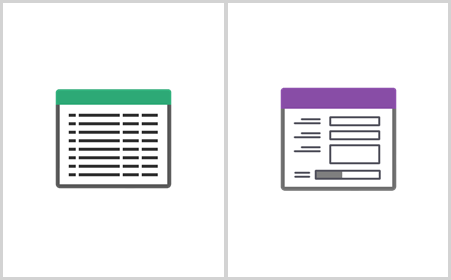
The developer can create a breakpoint that will become active at 640px width by creating a new screen type called master_detail_vertical_(lessthan)640. The developer can choose to put the grid above the form in this breakpoint screen type, since the form would get very limited space at 640 pixels and less.
The breakpoint screen type master_detail_vertical_(lessthan)640
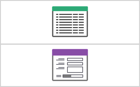
Say the developer want a second breakpoint at 400px, to replace the grid with a cardlist, since the grid is also getting too small. This breakpoint screen type would have master_detail_vertical_(lessthan)400 as id.
The breakpoint screen type master_detail_vertical_(lessthan)400
The breakpoint screen types are a temporary solution and should not be used anywhere as a screen type and should not be available for UP. Universal doesn’t treat them like screen types, so using a breakpoint as a screen type will result in an error message reminding you that this cannot be done.
With the next Software Factory release, we plan on formalizing breakpoints in the Software Factory so they will be part of the screen type instead of separate screen types with weird ids.
Many, many minor fixes
This chapter will probably be a part of every Universal development update, but I cannot stress enough how much work goes into ensuring a top-quality GUI.- The filter now properly splits words on spaces and generates an orred-filter
- Visual improvements and alignment improvements of the grid
- Look-ups no longer crash on multi-level resolved display values but instead show the data value (for now)
- Multiline controls on cardlists have been fixed to span multiple lines
- Badges have been fixed when Universal is connected to a product via the Software Factory
- Form now translates look-ups properly when reopening for a second time
- Datasets are loaded properly when rapidly opening multiple documents
- Performance improvements when it comes to drawing the sidebar and conditional layouts
- Performance improvements when it comes to drawing the grid, form and cardlist
- Badges have been improved to only execute once per input instead of once per occurrence
- The action bar now waits for data before showing itself
- Is anyone still reading this
- Prefilter button order and alignment has been fixed
- Prefilter icons have been provided when they do not have an icon
- Input labels in specific form controls no longer shrink when the value is an empty string but look like a null-value
- Technical updates, such as framework upgrades, improved compilation times, build times and bundle size
- And many more!
What we are working on next month
December – the jolly time of year with presents, good food and holidays. We are going to be running on limited capacity in December as many of the team will be going on a well-deserved break around Christmas.At any rate, we’ll be working on the following things:
- Quality: There are 38 identified bugs – we plan to squash about half of them
- Detail tiles
- Refresh button
- Improved look-up mechanisms
- Look-up display value resolvement
- Sorting on display value
- Filtering on display value
- Layout logic for the current row
- Titlebar and breadcrumbs
When will we get edit mode?
The Indicium team has just started working on a massive modification to make security air-tight. This will probably be discussed in a separate blog. After the rework, changes will be in effect that limit users calling the Indicium API directly.With the modifications, the following changes will be in effect:
- New rows and rows in edit mode will be managed by Indicium.
- Values of the parent row when adding in a detail will be set by Indicium instead of the GUI
- Values of the original row will be copied by Indicium when copying a row
- Default values will be set by Indicium instead of the GUI
- The user can no longer set a look-up value outside of the look-up prefilters
- Column rights for new rows and rows in edit mode will be checked by Indicium
- The user can no longer add or edit a row if editing is disabled by the Layout logic
- The user can no longer ignore the access type set by the model, rights or the Layout logic
- The user can no longer ignore mandatory fields
- The user can no longer save the record if saving is disabled by the Layout logic
- Default logic will be executed by Indicium
- The Default logic is not bound by rights and can change fields and set values not accessible to the user
This introduces a massive improvement in security, opens the way for Indicium to manage the process flows and paves the road for column and cell-level data selection autorization. A small step further is to provide these levels of authorization on variants as well.
Naturally, this will have a quite some impact on the way Indicium and the GUI’s communicate when it comes to adding and editing rows.
We planned to build adding and editing for Universal before this change would be implemented. However, Indicium caught up and we’ve gotten to the point where we would need to rebuild adding and editing in Universal very shortly after the development for Universal would be finished.
Because of this, actual editing and adding rows will be implemented once the change has been implemented in Indicium. Any groundwork we can do, the UI modifications neccesary to edit and add rows, will be developed in advance.
Thanks for reading, see you next year!