


As always we made a demo for you: try it here.
We'll keep you updated regularly about Universal's progress.
Alpha build
Like with every blog, we've released an alpha build so you can test Universal out for yourself. Don't forget the documentation and be sure to keep the following in mind:- Universal must be deployed on the same server as Indicium or it should be an allowed origin in appsettings.json.
- Universal only works with version 2019.1 and up of the Thinkwise Platform.
- Furthermore, make sure you run all hotfixes on the IAM and SF that you plan to use for Universal.
- Make sure you are on the latest version of Indicium Universal.
- This is an Alpha version, there is no compatibility plan in place for Universal just yet. Indicium updates and IAM hotfixes will eventually break this Alpha release.
Responsive toolbar
The responsiveness of Universal continues! So next up; responsive toolbar with an Action and Filter components.For now the Action component will contain:
- CRUD
- Tasks
- Details (details of a screen will be later removed from the Action component, for now it's in the Action component)
- Search (formerly: Filter)
- Prefilters
Overflow menu
When the content from an Action and / or Filter component doesn't fit in its available space it gets pushed to the overflow: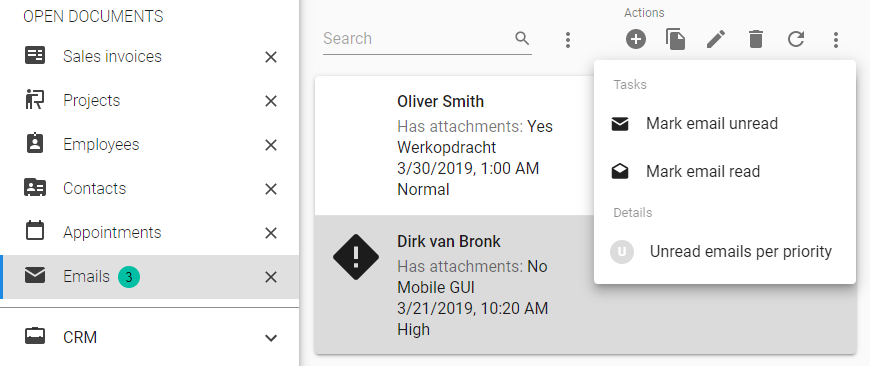
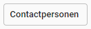
Tasks and details in the overflow menu
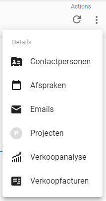
The prefilter overflow menu will always shows all prefilters. This helps the user get an oversight of all prefilters, their names and a to get an overview of all active / inactive prefilters:
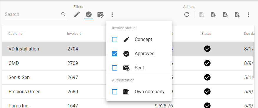
Prefilters and their state in the overflow menu
Before content gets pushed to the overflow menu, the Action and Filter component tries to fit a much content as possible. This results in the following states for a tasks or details (CRUD actions and prefilters are always icons) ordered in maximum to minimum available space:
1. Button with icon and text:
2. Button with text:
3.Icon:

4. Overflow (moved to the overflow menu):
Collapsing into the overflow will happen from right to left. This collapsing will be done per group so tasks, details or prefilters will never be separated from their group.
First prefilter group collapsing
The order of collapsing to the overflow is from right to left (in the future we want to use priority numbers to determine which items should stay the longest in the component).
Tasks collapsing to the overflow menu

Here, both sides are partially collapsed
"But I see white space?" Yes, this is because the task group would never fit with text and thus collapses to icons.
Overlay search field
If the screen gets really small and all the items are collapsed the search field will also collapse to an icon. To perform a search the user has to click the icon that will show the search field in an overlay. If the overlay is closed but there is still a search active the search icon will be in the active state so the user can see that the results are filtered.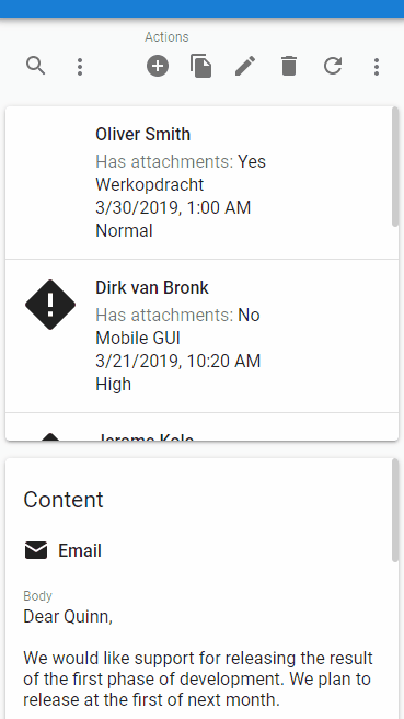
Searching on a mobile device
Future improvements
The work we've done is a huge improvement over what we had, but there still are some things we can do to further improve how toolbars behave.- Enable the developer to define priorities, maybe on some screens, tasks are way more important than CRUD actions.
- Interpret groups for tasks.
- We'll add another step where tasks or reports will collapse into a dropdown, before getting pushed into the overflow menu.
- Use toolbar as a component anywhere in the document.
- Group related actions regardless of their type.
The next bar would have a task that shows all approved invoices that have not been sent to the customer, and the task to send them to the customer.
This approach would enable the developer to create and position their own toolbars. Grouping tasks, prefilters, reports, etc. by what they mean, not just by the fact that they are a task or prefilter. This is however not an easy feat, it is just an idea so it will take a while to accomplish.
Responsive form
Having multiple columns in your form is a great way to make the most use of the screen real estate. But having two or three columns in your form on a small phone will get very crowded very fast. So on small screens, forms will now always have one column.
Form with one column on a small screen
Snackbar component
To show messages to the user we've implemented a snackbar component. Since you might not be familiar with the term, here's what it looks like:
An Indicium error message being shown in a Snackbar
With this we can show any kind of notification, be it from Universal itself, Indicium, messages the developer made, or anything else. We don't load all GUI message translations yet, but we do show some messages. More messages will be added later.
Unit tests
In the past three weeks we've added another 103 unit test cases to the components and inner workings of Universal. This brings us up to 1024 test cases in total.Minor fixes/tasks
Styling
- Fixed a bug on iOS where part of the cardlist would be hidden when scrolling.
Performance
- Universal no longer tries to load detail subjects to get the icons when there are no details.
- We now use objects to style components rather than calculating the style each time where possible.