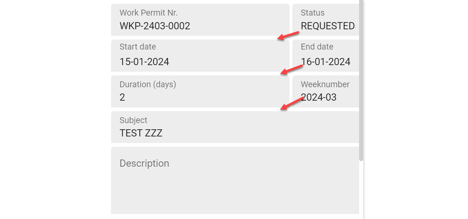
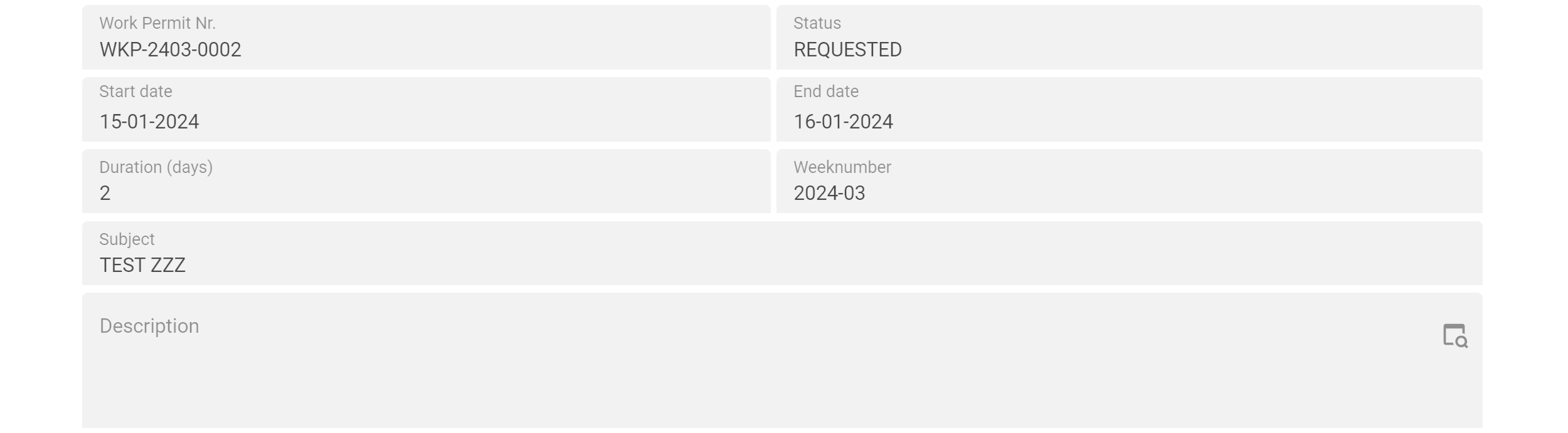
With the help of the breakpoints, we are now able to activate the desired screen layout for any screen size.
But, is it also possible to control the behavior of the UI from the model in such a way that fields are placed below each other instead of next to each other on a smaller screen?
It would be nice if we only had to scroll the screen vertically on mobile devices to see all the fields.
Desktop screen:
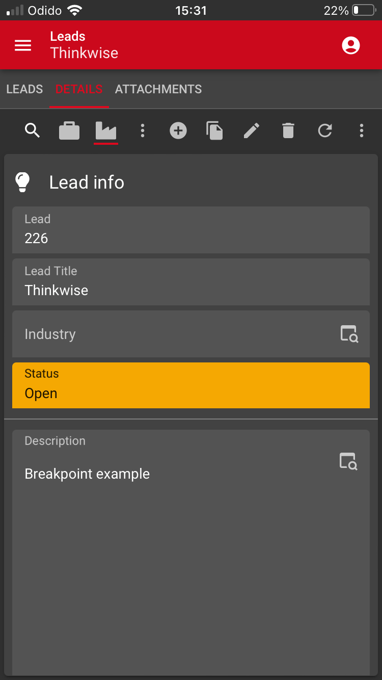
Mobile screen: