
December 21, 2023
- Full release 2023.13
- Fixed:
- We have fixed a bug where the application crashed and displayed a 'submit crash' pop-up when adding a new entry in the grid of the lookup pop-up.
- Includes:
- A prior solution for the chart component incorrectly displaying as 'trial' despite proper functionality and licensing. See Extra release 2023.3.12.1.
Hello everyone,
In this sprint, we have added a number of options for users to adjust their screens to their own preferences. In addition, we have made several improvements to the action bar and the task bar. We have also enhanced the way tasks are managed.
These are only a few of the many improvements we have made. Read on to learn more about all the new features and improvements in this release.
Demo
As always, we have made a demo for you: try it here. Before trying it out, press 'Clear Cache' on the login screen.
Read the Universal GUI user interface guide to get familiar with the GUI.
Universal GUI version 2023.1.13
For more information about setting up the Universal GUI, see the Universal GUI setup guide.
Note:
- Use a modern browser to access the Universal GUI, e.g., a recent version of Chrome, Firefox, Edge, or Safari mobile.
- Deploy the Universal GUI on the same server as Indicium or an allowed origin in the appsettings.json file.
- The Universal GUI only works with version 2022.1 and up of the Thinkwise Platform.
- Run all hotfixes on IAM and the Software Factory that you plan to use for the Universal GUI.
- Use the latest version of Indicium.
Download the Universal GUI version 2023.1.13 here
This is a beta release, which can be used to test the new features. This release is not suitable for use in a production environment. The full release will be available this Monday.
Contents
New and changed
Screen configuration for users
new
We have added a lot of options for users to adapt their screens to their own preferences. Most of these settings are available in the overflow menu of the taskbar.
To configure the availability of these options for your users, see Configure user preferences.
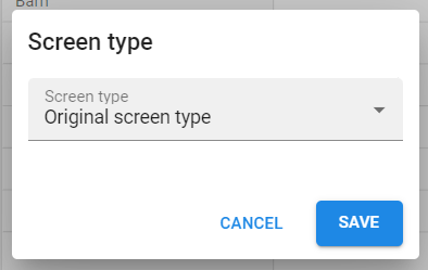
Screen type - Available as of Thinkwise Platform version 2024.1 With the option Screen type, users can select another screen type. In the pop-up, they can select a screen type from the dropdown menu. The screen will refresh, and the screen type will be applied to the current subject. For the configuration of the available screen types, see Available for user preferences.
Details - Available as of Thinkwise Platform version 2024.1 With the option Details, users can reorder and hide detail screens. In the pop-up, they can reorder the detail screens by dragging them to another position in the list. They can hide a detail screen by deselecting its check box. The screen will refresh, and the changes will be applied to the current subject. This configuration affects the displayed details in the tabs and in detail tiles.
Chart - Available now With the option Chart, users can change the chart settings. They can adjust the chart type and the legend. If no legend is available, only the chart type can be adjusted.
For the legend, the following settings are available:
- Horizontal alignment (left, center, right)
- Vertical alignment (top, center, bottom)
- Legend direction (left to right, right to left, top to bottom, bottom to top)
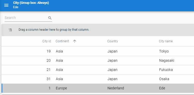
Group in grid - Available now In addition to the settings in the overflow menu, the Universal GUI now also supports grouping in a grid. Users can change the grouping by dragging a column header to a group box. Note that the grouping is not remembered when the screen is refreshed. See also Grouping in a grid.
To enable this feature, two settings in the Software Factory are required:
- Select the Group checkbox in the menu User interface > Subjects > tab Settings > tab Permissions.
- Select the Group box visibility checkbox in the menu User interface > Subjects > tab Settings > tab General. The possible values are:
- Always - The group box is always visible, and it is possible to drag grid columns into it.
- When grouped - The group box is shown only when a group exists in the model.
- Never - The group box is never shown, and it is not possible to change the grouping of the grid.
Action bar and taskbar improvements
new change
We have made several improvements to the action bar and the taskbar.
- The action bar is the one on top that has search, prefilters, CRUD, etc.
- If you use a Taskbar screen component, the task buttons will be moved from the action bar to the taskbar.
The first change is that we have moved all the unrelated items from the prefilter overflow menu to the general overflow menu (next to Export and Import). This change means that the overflow menu of the prefilters will disappear if there are no prefilters. The following items have been moved:
- Quick filter
- Filter
- Clear all filters
- Restore sort order
- Expand/collapse all (for the tree)
Another change is that you can now place both a taskbar and a task tiles component on a screen. Previously, the taskbar would be removed. Multiple taskbars on one screen are also possible.
If you place the taskbar at the top of the screen, it will become part of the main action bar. In that case, it will never be removed from the main action bar, even if the screen contains another taskbar or task tiles component.
A new feature is that you can now reposition the items in the action bar. You could, for example, place the tasks on the left and the search field on the right. You can do this by adding a screen component property called toolbar_order to the top screen component in the screen tree. In the menu User interface > Screen types > tab > Screen components > tab Form > tab Screen component properties, you can enter a Screen component prop (toolbar_order) and Value in JSON format:
{
  "start": [
    "Extra",
    "Crud"
  ],
  "end": [
    "Reports",
    "Prefilters",
    "Tasks",
    "CubeViews",
    "Search"
  ]
}
This JSON object has two properties, "start" (the items on the left) and "end" (the items on the right).
Both properties are arrays that can hold the following values:
- "Search"
- "Prefilters"
- "Crud"
- "Tasks"
- "Reports"
- "CubeViews"
- "Extra"
Most of these are self-explanatory. "Extra" holds the items in the overflow menu like Import, Export, Filter, Restore sort order, etc.
When we implement vertical bars, "start" will correspond to the top, and "end" will correspond to the bottom side of the bar.
Task improvements
new
We have enhanced the way tasks are managed, resulting in the following improvements:
- Timeouts are no longer an issue.
- Each task now features a progress bar, with a spinner visible until the initial message appears.
- Messaging has been improved.
In the Software Factory, you can configure the task progress and feedback. The following options are available in the menu Processes > Tasks > tab Setting > tab General > field Await result:
- Yes: Users have to await the result; a progress indicator is shown, and the GUI is blocked.
- Yes (no progress bar): Users have to await the result; no progress indicator is shown, and the GUI is blocked.
- No: Tasks are executed in the background, allowing users to continue working; no progress bar is shown. Refreshing or executing a process flow is not possible. The task may be part of a process flow.
- Optional: Combines the previous options. The progress bar is visible, but users can cancel it. The subject is not refreshed.
You can enrich the SQL logic of the task by sending progress messages. For more information, see Display progress from a stored procedure. Users will receive these messages immediately, while the progress indicator is visible in the GUI. In this way, you can inform them about the progress of a long-running task.
Known issues:
- When a task is executed on multiple rows ("pop-up for each row"), a request to insert parameters for the next task only appears after the previous task has been executed. This might take some time, depending on the task logic.
- Long-running tasks are bound to the subject on which they are initiated, and the subject should remain open until the task is completed. Users will receive a message when they try to close the document.
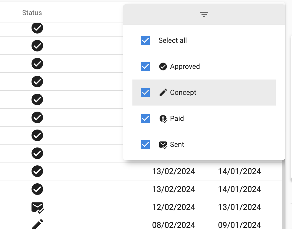
Elements filter for domain controls
new
The Software Factory includes domains that may have elements. You can add elements in the tab Elements tab (menu Data > Domains). You can use this, for example, to add statuses like Approved or In progress to an Invoice column.
Now, if a column holds a domain with elements, its grid header features a new filter for these elements. This is similar to the filter in Microsoft Excel, where all values for a column are accessible in the column header. In other filters and filter forms in the Universal GUI, the elements will be accessible in a dropdown field.
Check for Software Factory and IAM support
new
If a user attempts to log in to an unsupported version of the Software Factory or IAM, the Universal GUI will now attempt to update itself and perform a hard refresh. It will then try to log in again to check if the version is now supported. Only if the version remains unsupported, a 'version not supported' message will be displayed on the login screen.
Config.json file caching strategy
change
If a network is available, the config.json file is now cached using a 'network-first' strategy to ensure it always picks up the latest changes. We maintain a caching strategy to enable Universal GUI usage even when offline.
Reduced size of Universal GUI
change
We reduced the disk size of the Universal GUI by approximately 66%. Users now need to download less when using this GUI, resulting in a better experience with faster loading times. The functionality of the Universal GUI remains the same. We removed, for example, compatibility with older browsers, saving a significant amount of space. The Universal GUI still adheres to the lifecycle policy.
Cube support
new
We have added support for the default cube view type. When a user selects a cube view, the type that you configured in the Software Factory will be shown. For example, if you have configured a cube and a chart on different tabs, the default cube view type determines which one is shown.
You can configure the type in the menu User interface > Business intelligence > tab Tables > tab Cube views > tab Form > field Def. cube view type.
In addition, the active cube view is now remembered if the user changes the cube view.
Support for controls
new
We now support the domain controls CODE EDITOR and SQL EDITOR. These controls are used, for example, in the Software Factory. They highlight the syntax for SQL, JSON, or XML formats.
Multi-select retained
change
When you selected multiple rows and waited for a few seconds for auto-refresh, the selection would not be held by the Universal GUI. Now it will.
You can auto-refresh on a subject in the Software Factory, see Auto-refresh.
Tooltip position
change
We have changed the tooltip position in various places, including the form and grid. It is now located above the cursor for improved legibility of the screen elements.
Minor fixes and tasks
- Tree icons will now refresh properly when editing an item detail.
- When selecting four random rows in the grid and attempting to export them, the pop-up initially displayed the correct number of selected rows. However, after a few seconds, this number would update to 1 due to the grid auto-refreshing. The problem has been resolved, and now the number of selected records remains consistent.
- If auto-save and auto-edit were enabled, row refresh was not working in some cases when navigating to different rows using the up/down arrow keys. This has been fixed.
- We have fixed some issues with the snack bar. It now has a show more button when there are more than 3 messages; otherwise, it displays them in individual snack bars. We have also added space between messages in the Show more pop-up.
- The text in a tile will now continue on the next row if it is too long to fit on one row, ensuring complete visibility of the text.
- In charts with multiple axes, the domain elements on the categories were not translated, and the database value was displayed. This issue has been resolved.
- We have fixed a bug where the application crashed and displayed a 'submit crash' pop-up when adding a new entry in the grid of the lookup pop-up.
What we will be working on next sprint
The next sprint we will be working on:
- User screen configuration - Remember sorting
- Support for default CRUD shortcuts anywhere on the page
- Open document as a modal
- Grid multiline field appearance
Questions or suggestions?
Questions or suggestions about the release notes? Let us know in the Thinkwise Community!