


Situation
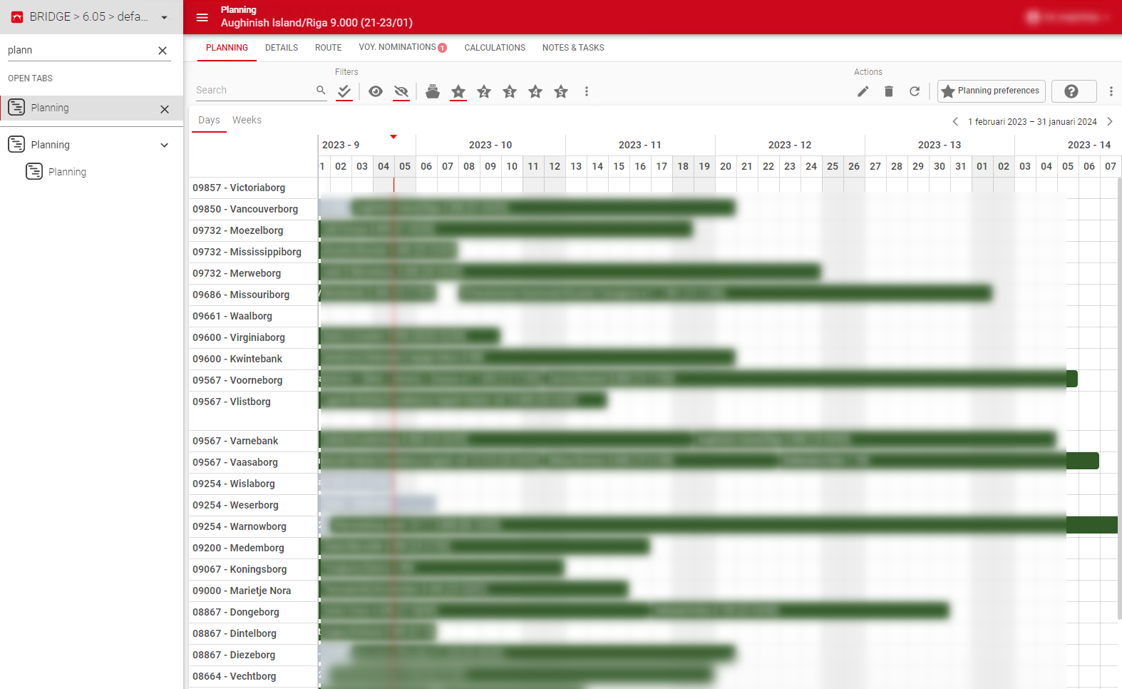
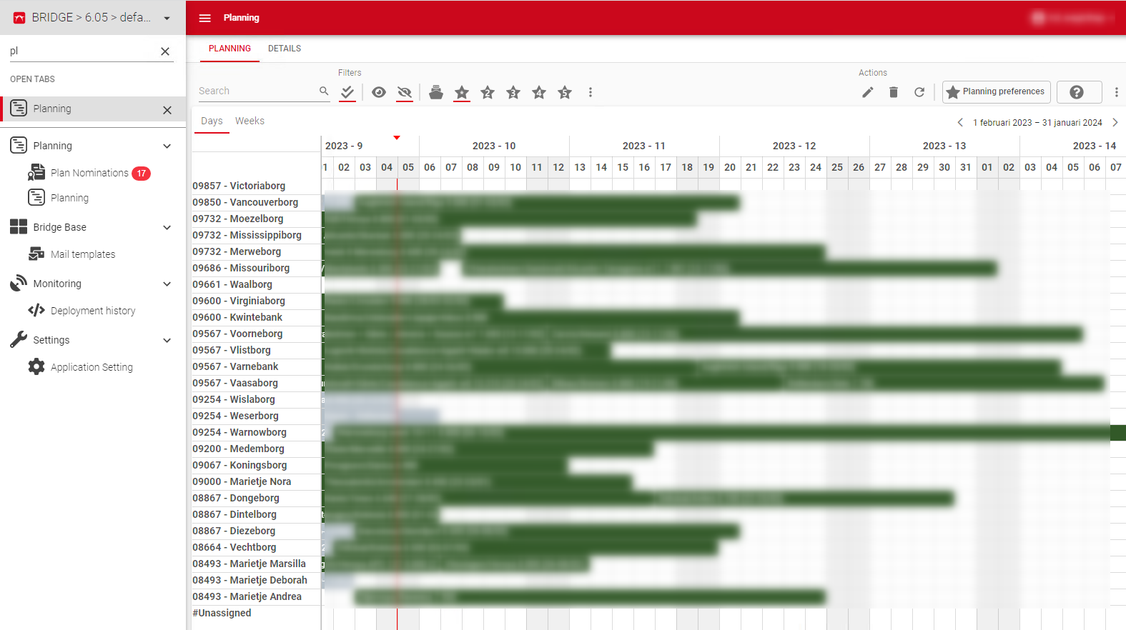
There is currently quite some white space in the resource scheduler, even when using compact mode. Our users would like to have as many rows as possible within their screen so they do not need to scroll to see all relevant information.
Suggestion
Reducing the height of the rows in the scheduler in compact mode would provide more rows for the end user, users who want a more aesthetically pleasing GUI can use comfortable mode.
See images for an example: