On the backlog

Make font size adjustable in Universal GUI

Related products:Universal GUI
  • September 9, 2021
  • 5 replies
  • 206 views
Robert Jan de Nie
Arjan Sollie
Jeroen van den Belt
+41
  • Robert Jan de Nie
    Robert Jan de Nie
  • Andre te Raa
  • Arjan Sollie
    Arjan Sollie
  • Jeroen van den Belt
    Jeroen van den Belt
  • Henk-Jan van Laar
  • Mark Jongeling
    Mark Jongeling
  • Hugo Nienhuis
    Hugo Nienhuis
  • Geurt
    Geurt
  • Mark van Benthem
  • eurban
    eurban
  • Erwin Ekkel
  • Roland
  • Ruben
    Ruben
  • Rony
  • Hugo
  • Freddy
    Freddy
  • Thomas Ofman
  • Sandro Burger
  • Roy van Uffelen
  • Blommetje
    Blommetje
  • Arie V
    Arie V
  • mperrott
    mperrott
  • cornevdlinden
    cornevdlinden
  • mark.visschedijk
  • Marc Ferket
  • Peter van Leenen
  • Sergio
  • C. Lousberg
    C. Lousberg
  • Shawn Adrian Diño
  • Tejo van de Bor
    Tejo van de Bor
  • Peter Ehrenhard
  • Kevin Rosink
    Kevin Rosink
  • Anne Vries
  • Allard Lakerveld
  • HarryA
  • tiago
    tiago
  • AndreKemmeren
    AndreKemmeren
  • Hidde Jan
  • villar
    villar
  • Remco Duijsens
    Remco Duijsens
  • Marius Korff
    Marius Korff
  • Werther
    Werther
  • S Koning
  • BramG
  • Yara
  • Ionut
    Ionut

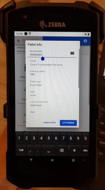
With release 2021.2.16 the compact and comfortable mode have been introduced to the Universal GUI. The point size of the fonts has been reduced from 16px to 14px.

On mobile devices, this point size is too small for many users. At the moment (as far as we know) it is not possible to set the font size from SF.

Can this font size therefore be made adjustable for the Universal GUI?
From a user's point of view, it is desirable to use a different font size for mobile devices than, for example, when using a desktop.

Did this topic help you find an answer to your question?

5 replies

Erik Brink
Moderator
Forum|alt.badge.img+5
  • Moderator
  • 497 replies
  • September 27, 2021

Hi Marc,

I like your thoughts. We prefer to choose our defaults wisely, so everyone could enjoy it.

I will put it up to discussion.

Regrads, Erik


Erik Brink
Moderator
Forum|alt.badge.img+5
  • Moderator
  • 497 replies
  • September 27, 2021
Updated idea statusNewUnder review

Bart Metselaar
Moderator
Forum|alt.badge.img+3
  • UI/UX Designer
  • 119 replies
  • September 30, 2021

Hi Marc!

We decided to deviate from 16px to 14px due to several requests to reduce the size of text on touch devices. 

We came to this setting of 14px after comparing our GUI with other comparable data organizing companies, such as Gmail, on touch devices, where the text size is the same or even smaller compared to what we now use in Universal. 

We are curious to know where your point is based on.
Where are the prominent locations of where the readability is comprimised?
Could you give us information about the resolution of the used devices of these many users? 
What other problems are to be taken into account according to you, due to the smaller text size?


Forum|alt.badge.img+7
  • Author
  • Captain
  • 55 replies
  • September 30, 2021

Hi Bart

Thanks for the reply. We understand that a lot of thought has gone into the customization of the GUI. And we understand that this involves looking at standards and other applications.
For us, 1 thing is actually the most important: is the interface usable (i.e. readable) for our users. The device they use and the environment in which the users work are also important. The work is carried out in cold warehouses (temperatures between 0 and 5 degrees Celsius), the devices sometimes vibrate and the lighting is less strong than in an office environment. Currently, the TW application is made available on a Zebra TC 21 device.

As you can see in the attached photo, the letters of the text are very small. The white space between the lines is very large.
Unfortunately, both are currently not configurable in Universal GUI. We cannot make the letters bigger and the Universal GUI does not take into account the possibly set row height.
In addition, read-only fields are shown in grayscale, which also does not benefit readability.

NB. The outer dimensions of the device in the photo are 8.5 cm wide and 15.5 cm high.
NB2. No screen protector is attached to the device yet. That probably still needs to be done, which makes the readability a bit less.


Erik Brink
Moderator
Forum|alt.badge.img+5
  • Moderator
  • 497 replies
  • March 25, 2022
Updated idea statusUnder reviewOn the backlog

Reply


Cookie policy

We use cookies to enhance and personalize your experience. If you accept you agree to our full cookie policy. Learn more about our cookies.

 
Cookie settings