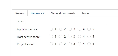
Would be nice it the white space before / after radio buttons can be reduced.
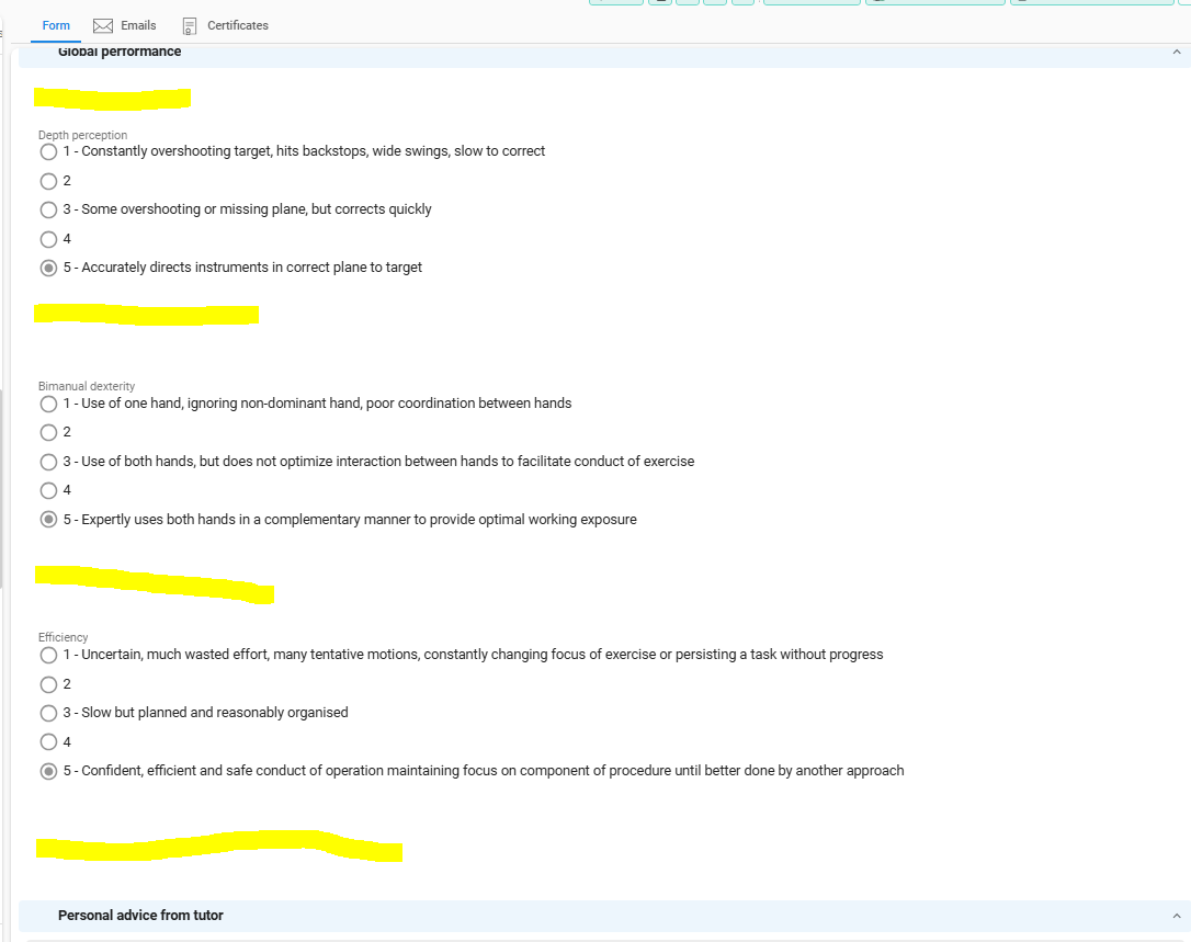

Would be nice it the white space before / after radio buttons can be reduced.
Best answer by Bart Metselaar
Hi
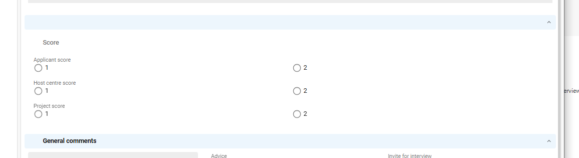
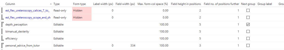
In the UI restyling blog, we commited to also change the Form Field styling to Outlined Form Fields.
In that redesign, we are also going to change the Radiobuttons and Checkboxes alignment. So this will be going to look kind of like this:
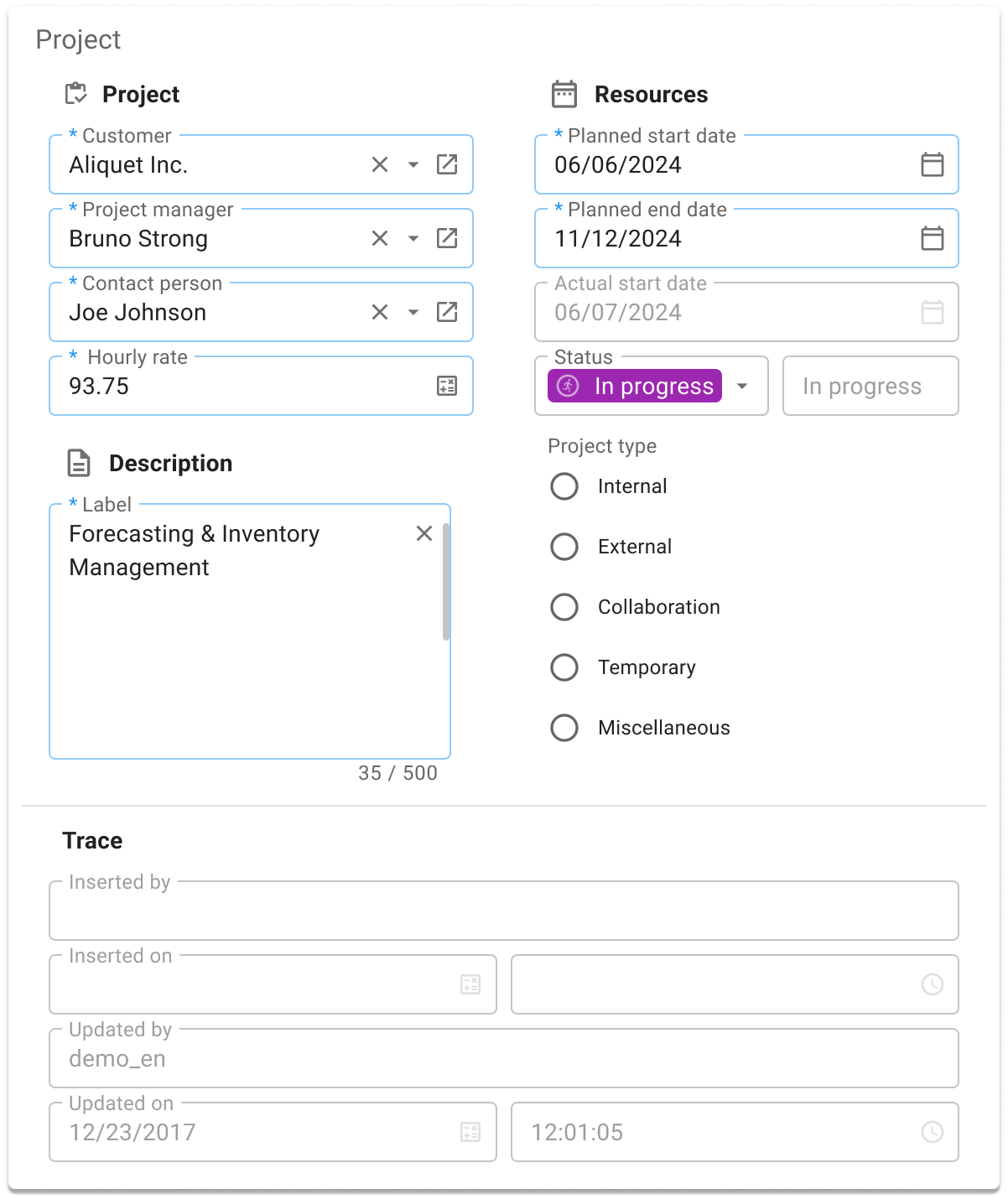
We aim to reduce the amount of space below those radiobutton groups, so be sure to keep an eye out for when we are going to change from Filled to Outlined Field styling!
Enter your E-mail address. We'll send you an e-mail with instructions to reset your password.