


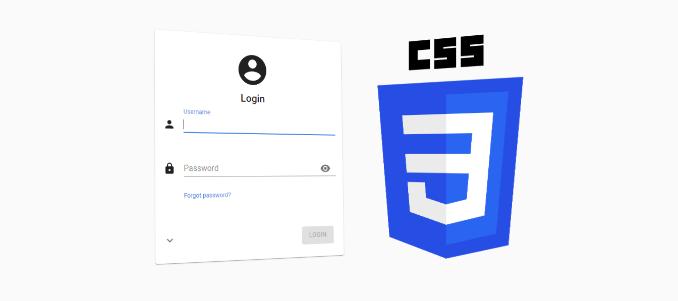
We often get questions about customizing the Universal GUI, particularly the login page. We plan to offer several model-options to customize it in the future, such as the logo, colors, title text and background image, and to display maintenance messages, for example. But with the latest release of the Universal GUI, it is already possible to make these adjustments manually, using custom CSS!
Setup
Starting with the latest (beta) release of the Universal GUI it is possible to inject your own custom CSS to change the styling of various parts of the user interface.
To get started, simply rename the custom.sample.css file in the public folder of the Universal GUI to custom.css. This file will then automatically be loaded by the Universal GUI. By renaming the file, it will no longer be overwritten with Universal GUI updates.
Next, add your own CSS to the custom.css file and you’re off!
CSS classes
The Universal GUI provides static CSS classes for a selection of elements, mainly on the login page, using the BEM — Block Element Modifier (getbem.com) naming convention to structure classes.
Not all components have fixed classes yet, but we will expand this in the future. If you need fixed classes to customize specific controls or components, just let us know!
Please note that we don’t recommend using the generated CSS classes (like css-dz6rn8) for components that don’t use BEM yet, as they will change over GUI versions. In some cases it is possible to use pseudo-classes, like :after or :nth-of-type(x) instead, which are less likely to change.
Examples
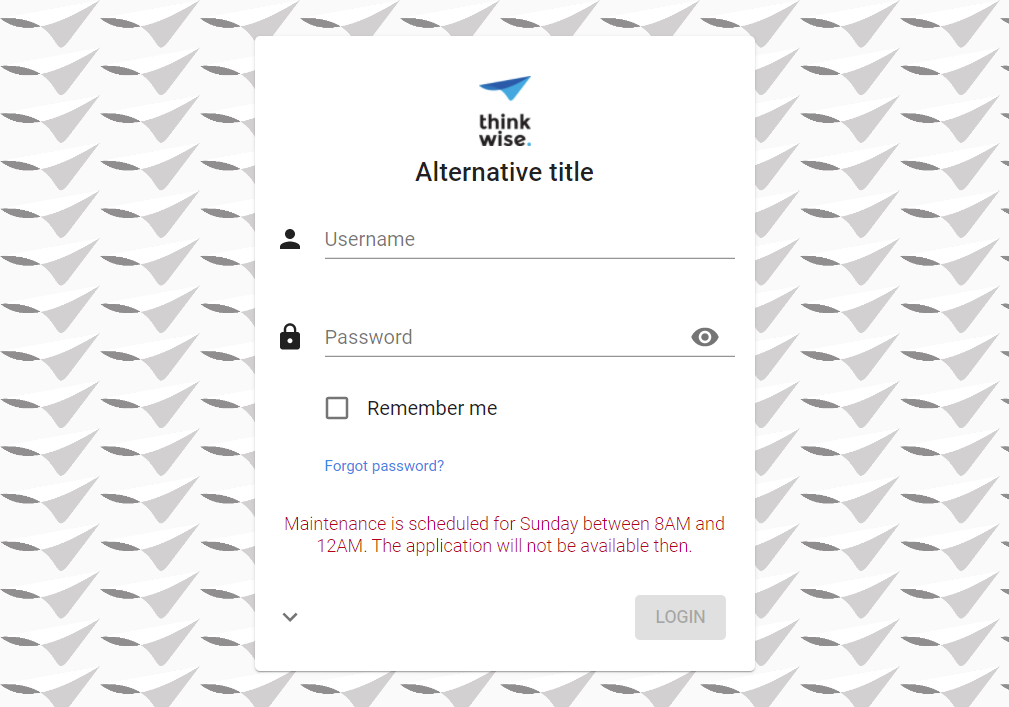
Add a background image
/* Add a background image */
.form__container {
  background-image: url('https://docs.thinkwisesoftware.com/img/thinkwhite.png');
  background-size: 5em;
}
Replace the logo
/* Hide the original logo */
.login__group--icon {
  display: none;
}

/* Display an alternative logo */
.login__group--icon-container {
  background: url('https://office.thinkwisesoftware.com/thinkwise2.png');
  background-position: center;
  background-size: contain;
  background-repeat: no-repeat;
  height: 4em;
  width: 4em;
  margin-bottom: 8px;
}
Replace the title
/* Hide the original title */
.login__group--title {
  display: none;
}

/* Display an alternative title */
.login__group--header::after {
  content: 'Alternative title';
  font-weight: 500;
  font-size: 1.3125rem;
  font-family: Roboto, Helvetica, Arial, sans-serif;
  padding-bottom: 9px;
}
Display a message
/* Display a message */
.card-content__login::after {
  content: 'Maintenance is scheduled for Sunday between 8AM and 12AM. The application will not be available then.';
  font-weight: 300;
  font-size: 0.9rem;
  font-family: Roboto, Helvetica, Arial, sans-serif;
  color: #ba000d;
  display: inline-block;
  text-align: center;
}
Hide the menu and header
You can also customize the styling of the main screen with CSS, for example to hide the menu and header and only show a dashboard or other start-object.
/* Hide the sidebar menu */
#root > .sidebar {
    display: none;
}

/* Hide the header */
#root > main > header {
  display: none;
}

/* Resize and reposition the main screen*/
#root > main > div {
  height: calc(100% - 16px);
  width: calc(100% - 16px);
  left: 0px;
}
Do you have any additional examples or ideas? Please post them in the comments!


