
When merging, the fields are fairly small. this way I always need to click to click the lookup and select correct branch.
Make this wider, so i can read the whole field.
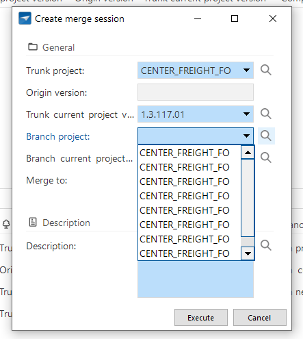
Also, perhaps when a branch is selected, auto fill the branch current project… with the latest version of the branch. Rarely one merges an older version?
Hi,
Certainly agree we can make the popup more readable. When you have a lot of branches this list can be too large.
With your second suggestion, we did make it intentionally not automatically fill in the current branch version to make sure it is selected by hand and with full attention of the developer. If perhaps you selected the wrong branch and it would automatically fill in the version, it could lead to merging the wrong branch by accident. If you also need to select the current version, you may notice that the current version presented is not equal to the current version of the branch you intend to merge, therefore saving the headache
Do you agree with this?
I definatly agree with the width of the field, this goes for a lot of project_id / application_id fields in the SF and IAM, could you please check more popups like this when addressing this issue?
In my experience, you always merge to the newest active versions of the trunk and the branch. :)
When this idea was first pitched, the model name was still included in the branch name. Nowadays, the model/branch structure has been modified, and this is no longer the case. This should generally reduce the length of the name. Additionally, I widened the fields a bit more. This combination should ensure that this idea is resolved in the next version.