
Howdy everyone, the time has come for another Universal development update and we have got some treats for you! The Universal GUI has had some major changes, both visually and functionally. With edit mode we're getting closer and closer to a replacement of the Mobile GUI. Try the demo here
You can expect these blogs to come every six weeks from now on.
Alpha build
Like with every blog, we've released an alpha build so you can test Universal out for yourself. Don't forget the documentation and be sure to keep the following in mind:
- Universal must be deployed on the same server as Indicium. Browser security prohibits us from deploying this otherwise. For now.
- Universal only works with version 2018.3 of the Thinkwise Platform.
- Furthermore, make sure you run all hotfixes on the IAM and SF that you plan to use for Universal.
- Make sure you are on the latest version of Indicium.
- This is an Alpha version, there is no compatibility plan in place for Universal just yet. Indicium updates and IAM hotfixes will eventually break this Alpha release.
Download your alpha build here
Add / Edit implementation
According to our design, we've implemented the technical details for working with add and edit mode.
We've added the options to add a new record, or update an existing record. This works as you'd expect, using the buttons in the action bar:

Adding a new row
Editing an existing row
You'll notice in the images above that the action bar also reacts to edit mode. The save and cancel buttons are only visible in edit mode, and the edit button is only visible in non-edit mode.
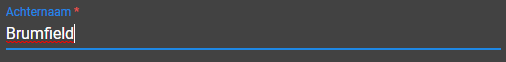
The asterisk that indicates that a field is mandatory is only shown in edit mode.
Controls
We've created a base control which helps all other controls handle events like when a users leaves a field or when the value changed. This makes developing other controls much easier.
Implemented controls
We're working hard on implementing edit mode for each control. As you can imagine this takes quite a lot of work and care to ensure each control works as expected. Besides the base control, we've already implemented the following controls:
Text
A text control in edit mode
Multiline
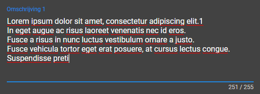
A multiline control in edit mode
Numeric
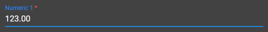
A numeric control in edit mode
Combo
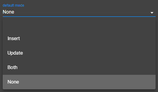
A combo control in edit mode
Checkbox
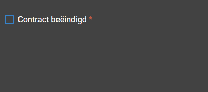
A checkbox control in edit mode
We'll continue to work on implementing the remaining controls and supporting lookups in edit mode.
Layouts / defaults
We've also implemented layouts and defaults. For now the layout is executed when a field loses focus. We'll be making this more immediate in the future.
Visibility
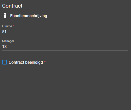
The field 'Beëindigd per' is only visible when 'Contract beëindigd' is checked
Also notice in the above image that the date is filled by default with the current date.
Mandatory
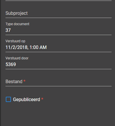
'Verstuurd door' becomes mandatory if 'Gepubliceerd' is checked.
Tooltips
Because we don't have resizable components like splitters or the columns in the grid, it's possible that data gets hidden. To ensure it's still possible to read all the data, we've added tooltips.
A tooltip is shown on overflowing elements
The general idea is that the tooltip is only shown when the content doesn't fit. It shouldn't matter what the content exactly is. There are some exceptions of course, like prefilters where you only see the icon, and always want to see the name on hover.
Another exception is open documents. These always show a tooltip, and the tooltip also has the context when the open document is zoomed.

Tooltip on a zoomed document, more on this in the next section
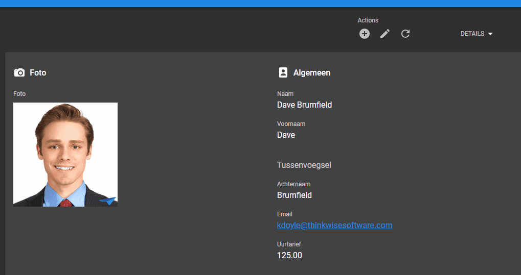
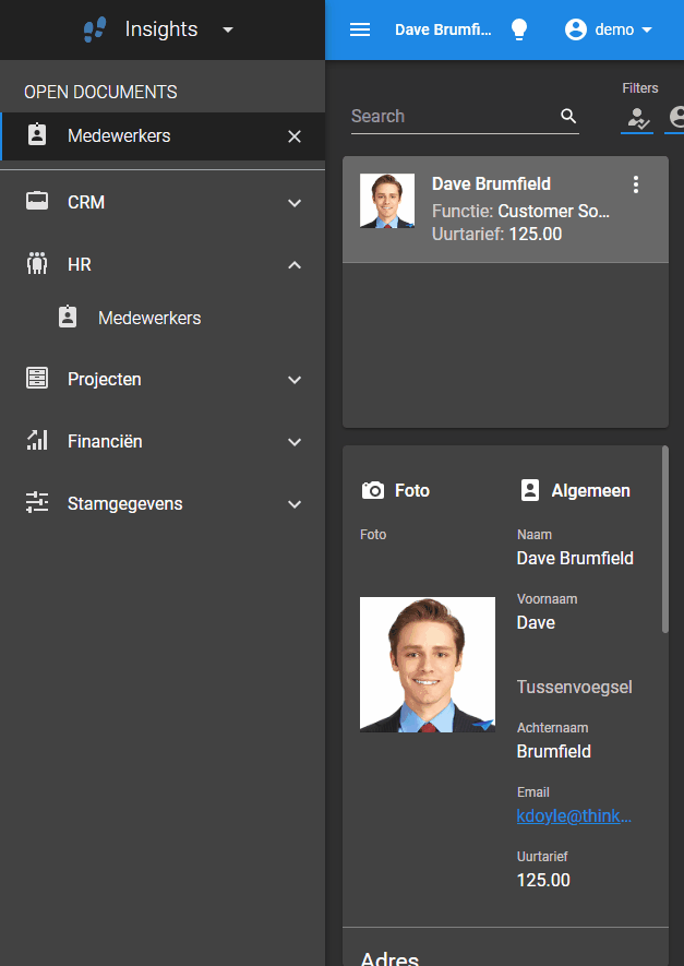
Zoomed details in open documents
The name of the currently open document got pushed away very quickly because we prepended the path, especially when you zoomed in multiple times. We've opted to simply show the name of the opened detail document. The user gets to see the path she took to get to that detail in the tooltip. The icon of the zoomed document is now correctly shown, rather than the icon of the parent.
It looks like this:

'Emails' is a detail of 'Medewerkers', showing the parent row (Dave Brumfield)
Zooming multiple times shows the path the user took to get to the current subject:
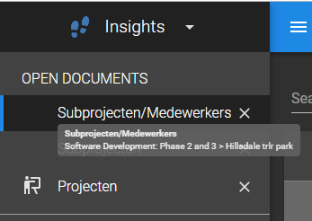
Zoomed in multiple times, each parent subject separated with a '>'
Papers
To better distinguish visually between components, we've put papers around them. We already had papers around the login component and around detail tiles, but now the grid, form and cardlist components also have them. It looks like this:
Papers around the cardlist and the form
And the same screen in dark mode (use the lightbulb in the topbar to switch modes):

Papers around the cardlist and the form in dark mode
The paper has been put around the entire form, and the sections (what now are tabs) have been separated with a divider line.
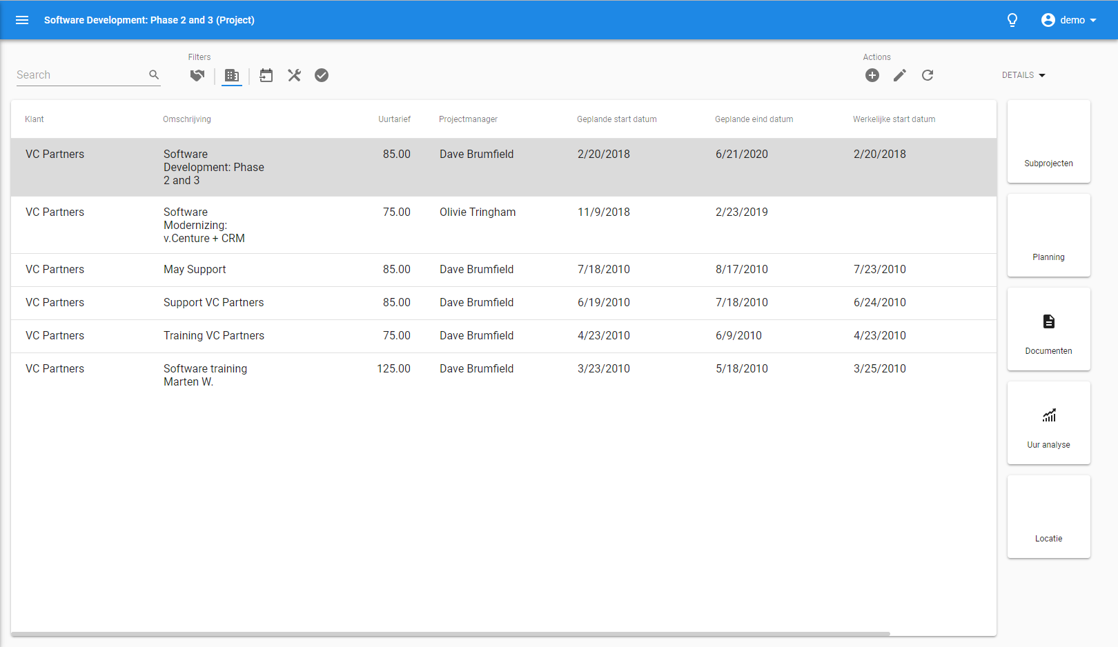
Papers around the grid and detail tiles
And the same screen in dark mode:
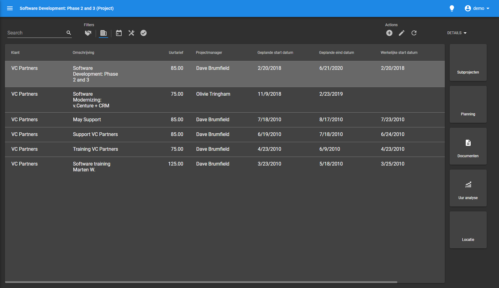
Papers around the grid and detail tiles in dark mode
Adding paper to components makes it easier to see where one component ends and the next starts. It makes the screen look a lot cleaner and less cluttered because components are being lifted from the surface by papers.
Lots of minor fixes / tasks
A lot of work has been done to ensure that the Universal GUI has the highest quality.
- Fixed checkbox styling
- Fixed the selected and hover state of rows in the grid with conditional layout
- Made the 'Open documents' text animation
- Fixed nested lookups sometimes not being translated
- Put form controls closer together
- Only the available applications per platform are loaded, rather than all applications
- Fixed issue where there was no dataset available
- Fixed logout request not being sent when logging out
- Hide columns based on context filter in zoomed documents
- Fixed max-length property for multiline controls
- Fixed form multiline controls not showing on one line
- Several code and development improvements